Jumat, 30 Maret 2012

How to Make Aluminum Stronger Than Steel

Via Tom's Guide:


This week, HTC is showing us that microarc oxidation process in action. The metal starts off as aircraft 6000 series aluminum, which is then hit with "10,000 volts of energy ... almost like lightning striking the phone." This causes a chemical reaction that creates the ceramic surface on the phone. HTC says the process makes the phone's housing three times stronger than stainless steel and even suggests users won't even need a case. See for yourself:


Utter coolness. If it has a good battery, it will be very hard to even consider looking at other mobile phones, but that's more a function of Koomey's Law....

Kamis, 29 Maret 2012

Spring 2012 Edition: Who Really Owns the U.S. National Debt?

The U.S. Treasury has revised its data indicating which nation's institutions through the end of the U.S. government's 2011 Fiscal Year, which ended on 30 September 2011. With that revision, we've updated our chart revealing who the biggest holders of all the U.S. government's public debt outstanding were as of 30 September 2011:

Revised: To Whom Does the U.S. Really Owe Money?

Compared to the preliminary version of this chart, we see a large decrease in debt appearing to be held by the United Kingdom, but large increases in debt actually held by other foreign entities. This is due to the role of financial institutions in the U.K. acting as international intermediaries for the interests of other foreign entities. The Treasury Department's annual revision of this data accounts for the actual foreign ownership of U.S. government-issued debt.

We note that some $1,773 billion of the U.S. government-issued debt we've recorded as being held by U.S. individuals and institutions as of 30 September 2011 was held by the U.S. Federal Reserve.

The U.S. Federal Reserve then accounts for 28% of all the debt held by U.S. individuals and institutions and works out to be nearly 12% of all the nation's public debt outstanding, as the Federal Reserve increased its U.S. debt holdings by $807 billion during the U.S. governments 2011 fiscal year.

Combined, the U.S. government-issued debt holdings of foreign individuals and institutions account for just shy of one-third of all the U.S. government's public debt outstanding.

Previously on Political Calculations

Who Owns the U.S. National Debt To Whom Does the U.S. Government Really Owe Money? Summer Update: To Whom Does the U.S. Really Owe Money Winter 2011 Edition: Who Owns the U.S. National Debt? Spring 2012 Edition: Who Really Owns the U.S. National Debt?

Data Sources:

Board of Governors of the Federal Reserve System. Monthly Report on Credit and Liquidity Programs and the Balance Sheet, October 2011. Table 1. Assets, liabilities, and capital of the Federal Reserve System.

Board of Governors of the Federal Reserve System. Monthly Report on Credit and Liquidity Programs and the Balance Sheet, October 2010. Table 1. Assets, liabilities, and capital of the Federal Reserve System.

U.S. Treasury Department. Major Foreign Holders of Treasury Securities. Accessed 24 March 2012.

U.S. Treasury Department. Monthly Statement of the Public Debt of the United States, September 30, 2011. Table III – Detail of Treasury Securities Outstanding, September 30, 2011.

Rabu, 28 Maret 2012

The Next Scary Hockey Stick Chart

If Michael Mann's infamous hockey stick graph should be taken seriously as evidence that human activity is causing global climate change that must be stopped, or else it will trigger positive feedback effects that will result in a catastrophe that will ruin the lives of millions of people, what then are we to make of the following chart showing how the U.S. federal government is running up its own debt for the sake of loaning out money to college students?

Net Borrowing to Support Federal Direct Student Loan Program, FY1997 - FY2011

Here, we find that the federal government has sharply increased the amount of money it borrows for the sake of loaning it right back out to college students since 2008. Beginning in 2009, the net increase in those borrowings account for 2.9% of the entire increase in the U.S. national debt observed since 2008. That amount is above and beyond the amount directly added to the nation's total public debt outstanding by the federal government's annual budget deficits.

In this case, the disaster that would directly affect the lives of millions of people means being forced at the direction of government bureaucrats into a dramatically lower standard of living for the sake of being able to make the payments on their student loans to the U.S. federal government, without any real hope of being able to discharge that debt through bankruptcy.

That, in turn, has the real potential to indirectly hurt millions of other people, because student loan payments are rising at the rapid pace supported by the government-subsidized cost of tuition, even though college graduates are entering into jobs that pay far below what is required to both live well and to support their super-sized student loan debt.

It is quite possible then that we have reached a point where higher education hurts the economic growth of the nation, rather than helps it:

Student loans could be the next asset class to school the United States about poor debt management. Graduates are now forking over more of their disposable income in repayments than 10 years ago, defaults are rising and with Uncle Sam now directly holding $450 billion of student debt, taxpayers are on the hook again. That could put U.S. higher education in the embarrassing position of hindering, rather than helping to fuel, economic growth.

Here's how: first, the size of the student loan market has mushroomed. Bachelor-degree debt at graduation has grown 250 percent over the past decade, according to finaid.org. At $867 billion, it exceeds both credit-card and auto debt in the United States, according to a study by the New York Federal Reserve. If this trend continues, by 2021 it'll be equivalent to 1.3 percent of GDP, triple its current level, assuming GDP cleaves to its 4.5 percent 15-year average nominal growth.

Next, average payments have risen by 83 percent over the past decade while median income for those aged 25 to 34 has increased by just a fifth, according to the Bureau of Labor Statistics. That leaves less money for graduates to spend or save. Extrapolate ahead 10 years, and former students will be paying $125 billion extra a year. By then, that would equate to two-thirds of a percentage point of GDP.

We wonder how the higher education bubble and federal budget crisis deniers will react to this hockey stick chart....

Data Sources

U.S. Treasury. Monthly Statement of the Public Debt of the United States, September 30, 2011.

U.S. Treasury. Monthly Statement of the Public Debt of the United States, September 30, 2008.

U.S. Treasury. Final Monthly Treasury Statement of Receipts and Outlays of the United States Government for Fiscal Year 2010 through September 30, 2011, and Other Periods.

U.S. Treasury. Final Monthly Treasury Statement of Receipts and Outlays of the United States Government for Fiscal Year 2010 through September 30, 2010, and Other Periods.

U.S. Treasury. Final Monthly Treasury Statement of Receipts and Outlays of the United States Government for Fiscal Year 2009 through September 30, 2009, and Other Periods.

U.S. Treasury. Final Monthly Treasury Statement of Receipts and Outlays of the United States Government for Fiscal Year 2008 through September 30, 2008, and Other Periods.

U.S. Treasury. Final Monthly Treasury Statement of Receipts and Outlays of the United States Government for Fiscal Year 2007 through September 30, 2007, and Other Periods.

U.S. Treasury. Final Monthly Treasury Statement of Receipts and Outlays of the United States Government for Fiscal Year 2006 through September 30, 2006, and Other Periods.

U.S. Treasury. Final Monthly Treasury Statement of Receipts and Outlays of the United States Government for Fiscal Year 2005 through September 30, 2005, and Other Periods.

U.S. Treasury. Final Monthly Treasury Statement of Receipts and Outlays of the United States Government for Fiscal Year 2004 through September 30, 2004, and Other Periods.

U.S. Treasury. Final Monthly Treasury Statement of Receipts and Outlays of the United States Government for Fiscal Year 2003 through September 30, 2003, and Other Periods.

U.S. Treasury. Final Monthly Treasury Statement of Receipts and Outlays of the United States Government for Fiscal Year 2002 through September 30, 2002, and Other Periods.

U.S. Treasury. Final Monthly Treasury Statement of Receipts and Outlays of the United States Government for Fiscal Year 2001 through September 30, 2001, and Other Periods.

U.S. Treasury. Final Monthly Treasury Statement of Receipts and Outlays of the United States Government for Fiscal Year 2000 through September 30, 2000, and Other Periods.

U.S. Treasury. Final Monthly Treasury Statement of Receipts and Outlays of the United States Government for Fiscal Year 1999 through September 30, 1999, and Other Periods.

U.S. Treasury. Final Monthly Treasury Statement of Receipts and Outlays of the United States Government for Fiscal Year 1998 through September 30, 1998, and Other Periods.

Selasa, 27 Maret 2012

The Internet: Somebody Here Is Wrong....

Carpe Diem's Mark Perry has been highlighting positive signs of economic recovery and expansion in the U.S. economy, including some indications that some the regions where the U.S. housing market has fallen the most may finally be bottoming out. Here, he points to a Wall Street Journal article that looks at the housing market of Phoenix, Arizona:


As home prices continue to drop in most cities, a nascent real-estate rebound here holds lessons for the rest of the country. This sprawling desert metropolis was one of the hardest hit housing markets during the bust. Phoenix home prices declined 55% from 2006 through the end of 2011, and Arizona's foreclosure rate jumped to No. 3 in the nation in 2009. Hundreds of thousands of homeowners are underwater, meaning they owe more than their homes are worth.


Now real-estate economists across the country are studying an early but surprisingly broad Phoenix turnaround. The sharp drop in home prices has brought new buyers into the market. Unlike other markets where housing recoveries have been snuffed out by big overhangs of homes for sale and foreclosed properties, inventories are lean here.


Phoenix has hit a bottom," says Thomas Lawler, an independent housing economist who was one of the first to warn six years ago that prices in overbuilt metros were poised to fall.


BloodhoundBlog's Greg Swann is a real-life real estate professional in the Phoenix metropolitan area market. Surprisingly, he has a very different perspective on the state of that housing market:


Don't you love reading all that good news about the the Phoenix real estate market's recovery? Guess what? You're being lied to — as always.


This is what's really happening: FannieMae and FreddieMac are holding foreclosed houses off the market, in anticipation of "selling" them to campaign donors.


Meanwhile, the town is being picked clean, with prices being bid up by buyers convinced that houses are going out of style — a story we've heard before, yes?


As an example, my BargainBot search, which is shared with hundreds of investors all over the world, is at less than 5% of it's peak. A search I use to select premium rental homes produces one listing this morning, where it stood at 45 homes in April of 2011.


If Fannie and Freddie "sell" the homes they own to politically-connected "investors," the rental market in Phoenix will be slaughtered.


And if they release the homes they have been hoarding into the MLS, Phoenix will hit a third bottom before the market can finally recover.


You can call the news media idiots or you can call them liars. But any news from any official source about Phoenix real estate is dangerously misleading.


While we know that Greg's typing "it's peak" will specifically annoy Mark on grammatical grounds, if we go past the post into the comments, he provides more observations that would seem to support his claim:


> I know of REO real estate agent/teams who are starving for transactions now, another proof of shadow inventory.


I started to see the demand-side shortage in April of last year, which is why I noted the numbers from then. We can track that Fannie/Freddie withholding starting in July of 2011, a huge drop-off in the number of homes released into the MLS. If you look at what they’ve dribbled out since then, it’s clear they’re cherry-picking.


He also provided the following data to back his observation that both Fannie Mae and Freddie Mac are restricting the supply of housing in the Phoenix market:


This chart


Greg Swann: Month-by-Month Releases of Phoenix-metropolitan area Lender-Owned Homes January 2010 - January 2012

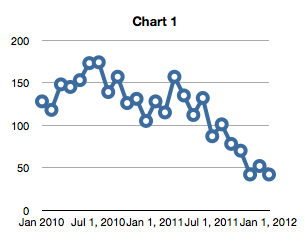
shows month-by-month releases of lender-owned homes into the MLS from January 2010 to January 2012. This is our Market-Basket search, a subset of the market at large, but that search looks at precisely those bread-and-butter homes that matter most to us: Single-story stucco-and-tile 3-bedroom homes built since 1998. We can’t isolate reliably by owner in an MLS search, but the missing sellers are FannieMae and FreddieMac. They’re hoarding houses, and the artificial shortage they have created is what accounts for the current alleged “recovery.”


But then, another Phoenix area real estate professional, Elizabeth Evans, did her own back-of-the-envelope calculations and found that the apparently restricted supply of lender-owned housing may not be that big of a factor in the Phoenix market:


Fannie and Freddie have around 200,000 properties in their collective inventory. I can’t immediately find how many are in Arizona, so I will make a generous guesstimate. According to a March 1 article on Housing Wire, at the end of 2011 more than 23 percent of the Fannie Mae inventory was in California and the state with the second highest Fannie Mae inventory was Florida at 11.5 percent. There is no way the Arizona inventory could approach that of these two states, but let’s assume a worst case scenario of 8 percent of the GSE inventory situated in Arizona, or 16,000 properties. Some of these properties are located in other parts of Arizona, but let’s assume 75 percent of them, or 12,000 are located in the Greater Phoenix market.


Some of these properties are not fit for occupancy, have residual title issues, or are otherwise unsaleable. Knock off 10 percent as unsaleable, and you are left with 10,800 properties. Not even the most efficient private sector company could do the paperwork amd fix up necessary to get 10,800 properties on the market at once, so let’s give the GSE’s a year to process and list all 10,800 properties in their existing inventory. That’s, ummmm, 900 properties a month.


As of this morning, there are around 9,300 single family homes in Maricopa County and 11,400 in the entire MLS system listed as active. Even if 75 percent of the 900 monthly new listings by the GSE’s, or 675, are single family residences, they aren’t exactly going to dilute the inventory or significantly impact the imbalance of supply and demand.


Last year, Fannie took back around 200,000 homes. I can’t quickly find how many Freddie acquired, but let’s assume these highly efficient agencies could process and sell another 200,000 properties in the same year. That means another 675 single family houses for a total of 1,350 a month that will go on the market. Dilutive? A little, but in an improving economy, I’m pretty sure these properties would be absorbed without a huge impact on price.


If this guesstimate is anywhere near accurate, it proves how unnecessary the bulk sale program is in Arizona. The existing and pipeline inventory could be absorbed with minimum impact on or disruption of the market. This process is called an orderly liquidation. Orderly liquidation realizes the highest price for assets of an entity that must liquidate, exactly what the GSE’s need to accomplish.


The bottom line is that one of these people here on the Internet is wrong. We just don't know which one. The only certainty we have is that Mark Perry will be also be very specifically annoyed by Elizabeth Evans typing of "exactly what the GSE's need to accomplish"....


xkcd: Duty Calls

Image Credit: xkcd

Senin, 26 Maret 2012

What President Obama Believes Will Happen With Iran

On Friday, 23 March 2012, President Obama stated that tension with Iran was adding $20-$30 to oil prices:


"The key thing that is driving higher gas prices is actually the world's oil markets and uncertainty about what's going on in Iran and the Middle East, and that's adding a $20 or $30 premium to oil prices," Obama said in an interview with the American Automobile Association (AAA) published Friday.


Map: Persian Gulf and Oil Transport Systems, Source: EIA

So just how much tension is the world pricing in to each barrel of oil?


One way to find out is to estimate how much the world's oil supplies might be disrupted if tensions escalate. To do that, we've re-engineered the math from one of our recent tools so that we can find out how much oil would need to be either added or removed from world production in order to change the price of a barrel of oil by the amount that President Obama, or you, might enter.


Most of the other oil-related default data in the tool applies to the most recent figures we have from the U.S. Central Intelligence Agency, which at this writing, applies to 2010, and which we'll assume is similar to today's production figures. If you have more current data, enter it (the same applies for the values of the supply and demand elasticities for oil....)


Since the tensions to which President Obama refers would primarily affect the supply of oil originating from Iran and the Middle East, the price of a barrel of oil should be that recorded for Dubai crude, which would be the benchmark for the region.


Got all that? Great! Let's do some math!...


Oil Production and Economic Data
Input Data Values
Daily Oil Production Data
"Premium" in Today's Oil Price (per Barrel)
Current Oil Price (per Barrel)
Demand Elasticity
Supply Elasticity


Estimated Price Change
Calculated Results Values
Estimated Change in the Supply of Oil [barrels]


For tensions with Iran or within the Middle East to add $20 to the price of a barrel of oil, that would suggest that the world's oil markets are expecting that the world's supply may be reduced by 5,574,855 barrels per day as a result of those tensions. If $30 has been added to the price of a barrel of oil, that would mean that the world expects the world's supply of oil to be reduced by 9,332,835 barrels per day.


Strait of Hormuz, Source: EIA

Using that latter figure, since Iran itself would account for 4,252,000 barrels of daily production, or 45.6% of the potential reduction in world oil supplies, that lower quantity suggests that President Obama believes that the tensions to which he refers are so great that they will negatively affect the supply of oil from additional nations in the region.


Looking around the Persian Gulf, which would the the likely focus of such tensions, we find that the nations of the United Arab Emirates (2,813,000 barrels), Kuwait (2,450,000 barrels), Qatar (1,437,000 barrels) and Oman (867,900 barrels) would be the most affected, as these nations transport their oil by sea to world markets through the Strait of Hormuz. Combined with Iran, that would put the supply of 11,819,900 barrels of oil per day to the world's markets at potential risk of being cut off.


The 9,332,835 barrels per day figure suggested by our back-of-the-envelope calculations is 79% of that value. One way to interpret this value is that the world's markets believe that the 11,819,900 barrels of oil output per day may indeed be affected, but they are currently factoring in a 79% chance that will actually happen.


It could also mean that the world's markets are factoring in 100% odds that these oil supplies will be disrupted, but that a portion of the oil produced in these nations may reach world markets through other supply outlets other than through the Strait of Hormuz, such as through land-based pipelines.


Regardless, it appears that a likely conflict involving Iran that cuts off that much oil through the chokepoint of the Strait of Hormuz would seem to account for the President's belief that as much as 30 U.S. dollars is currently being added as a "premium" to world oil prices. He's certainly factoring in quite a lot of supply disruption to arrive at that figure.

Jumat, 23 Maret 2012

Will Your Favorite Celebrity Couple Stay Together?

Brain Trust - Source: Random House

Five years ago, Garth Sundem and John Tierney worked together to come up with a mathematical formula to predict which celebrity couples were doomed to split apart.


Five years later, that original equation did an okay, but not great job in predicting which celebrity couples would survive the next five years.


So Sundem and Tierney returned to the drawing board to take advantage of the new data the world had accumulated about the success of celebrity relationships over the previous five years, and have now come up with a new and improved mathematical formula that seems to work better, at least if the backtested results are any indication.


Here's what changed in their own words:


While the 2006 equation did a good job over all of identifying which couples were most likely to divorce, some of the specific predictions proved too pessimistic. Because Demi was so famous — and much more famous than Ashton — we gave their marriage little chance of surviving a year, but they didn't split until 2011. We were similarly bearish on Tom Cruise and Katie Holmes (because of his fame, his two failed marriages and their age gap), but they're still together.


What went right with them — and wrong with our equation? Garth, a self-professed über-geek, has crunched the numbers and discovered a better way to gauge the toxic effects of celebrity. Whereas the old equation measured fame by counting the millions of Google hits, the new equation uses a ratio of two other measures: the number of mentions in The Times divided by mentions in The National Enquirer.


"This is a major improvement in the equation," Garth says.


"It turns out that overall fame doesn't matter as much as the flavor of the fame. It's tabloid fame that dooms you. Sure, Katie Holmes had about 160 Enquirer hits, but she had more than twice as many NYT hits. A high NYT/ENQ ratio also explains why Chelsea Clinton and Kate Middleton have better chances than the Kardashian sisters."


More on the Kardashians later. For now, here's our newest tool, which is based on Sundem and Tierney's new and improved formula for predicting which celebrities are riding on the relationship Titanic.


Celebrity Relationship Factors
Input Data Values
"Good" Fame: Number of search results since 1990 in New York Times archives
"Bad" Fame: Number of search results since 1990 in National Enquirer archives
Husband's Age
Wife's Age
Overexposure: Number of scantily-clad photos among the top five photos returned in a Google image search for the wife's name
Dating: Number of months the celebrity couple dated before getting married
Time: Years after getting married for which to calculate the percentage odds that the couple will still be married.


Odds of Celebrity Marriage Survival
Calculated Results Values
"Good" to "Bad" Fame Ratio
Percentage Chance of Still Being Married After Entered Number of Years


Tierney describes how these factors can influence the outcome of the new formula:


Garth's new analysis shows that it's the wife's fame that really matters. While the husband's NYT/ENQ ratio is mildly predictive, the effect is so much weaker than the wife's that it's not included in the new equation. Nor are some variables from the old equation, like the number of previous marriages and the age gap between husband and wife.


In the fine tradition of Occam's razor, the new equation has fewer variables than the old one. Besides the wife's tabloid fame, the crucial ones are the spouses' combined age (younger couples divorce sooner), the length of the courtship (quicker to wed, quicker to split), and the sex-symbol factor (defined formally as the number of Google hits showing the wife "in clothing designed to elicit libidinous intent").


Now, back to the Kardashians. The default data in the tool above apply to the celebrity coupling of Khloe Kardashian and Lamar Odom, with the results using this default data indicating the probability that the couple will celebrate their 50th wedding anniversary.


And from here, we'll let Garth Sundem describe the results:


"I've calculated the chance of Khloe Kardashian and Lamar Odom celebrating their golden anniversary," he says, "Even when I extend it to 15 decimal places, the probability is still zero."


To be fair, if any of the Kardashians could celebrate a 50th wedding anniversary, it probably would be Khloe. She'll just have to beat some very steep odds to do it though....

Kamis, 22 Maret 2012

The Failure of Pigou's Taxes

Cigarette Smoking in Hawaii Once upon a time, economist Arthur C. Pigou proposed that by imposing taxes upon things that might create excess social costs, those costs could be reduced.


Called a "Pigovian Tax", a classic example of this kind of tax in action would be the special excise taxes that many states impose upon tobacco products, where the excess social costs might be the increased spending for health care to deal with smoking-related ailments.


Here, if Pigou's taxes really work, we should see the consumption of tobacco products fall as the taxes imposed on them are raised substantially enough to affect the purchasing decisions of those who might consume them.


Let's use the state of Hawaii as a case study here, because Hawaii has been greatly increasing their taxes on tobacco products over the last several years. Here, the typical excise tax imposed by the upon a pack of cigarettes has increased from $1.00 in 2000 to $3.20 per pack in 2011, with 60% of that increase having taken place since 2008. During that same time, the federal excise tax on tobacco has increased from $0.34 per pack to $1.01 per pack, and the typical retail price of a pack of cigarettes in Hawaii has risen from $4.05 in 2000 to $9.27 in 2011.


Nominal Taxes and Retail Price of a Pack of Cigarettes in Hawaii, 2000-2011

But unlike every other state in the U.S., Hawaiians can't just jump in their cars and make a quick run for the border for the sake of buying bootleg tobacco products to avoid their state's very high tobacco taxes, which has risen to now rank fourth in the nation, behind only New York, Rhode Island and Connecticut.


That means that if Pigovian taxes can really work to significantly reduce the consumption of tobacco products anywhere, they're going to work in the islands in the middle of the Pacific Ocean that make up the state of Hawaii.


We've tapped the state's most recently issued report on its tax revenue collections from its excise tax on tobacco products for each of its fiscal years from 2000 through 2011. We then used that data, along with the state's tax on each 20-count pack of cigarettes, to calculate the equivalent quantity of packs of cigarettes consumed in the state for each of those years.


Our chart below reveals what we found:


Tax Revenues and Equivalent Quantity of Cigarette Packs Taxed in Hawaii, 2000-2011

Here, we see that the consumption of tobacco products actually rose in every year from 2000 through 2005, before beginning to fall in the years from 2005 through 2009.


But we see that 2009 really marked a bottom in consumption - the consumption of tobacco products has bounced back in 2010 from that low point and has held steady 2011, despite the state continuing to increase its taxes on tobacco products in each of those years.


What this data indicates is that whatever benefits that Pigovian taxes might be able to provide have diminishing returns. Past a certain point, they will fail to achieve their objectives of meaningfully reducing the excess social costs for the ails they are meant to fix. Instead, these kinds of taxes would appear to simply become a vehicle by which politicians may raise tax revenue by imposing a discriminatory tax policy aimed at an "undesirable" minority.


This outcome is quite different from what we anticipated might happen when we last looked at Hawaii's taxes on tobacco. We're definitely surprised.


References


State of Hawaii. Department of the Attorney General. Report on the Tobacco Enforcement Special Fund. Fiscal Year 2010-2011. [PDF document]. 9 January 2012.

Rabu, 21 Maret 2012

The Effect of Apple's Dividend Announcement on the Future

Apple Computer Logo - Source: ddp.nist.govOne day later, and we're still blown away by the effect of Apple's dividend announcement upon stock prices.


Here's why. This is the only time we've ever observed stock prices leading a change in expected future dividend payments since we began regularly tracking dividend futures in December 2008!


Most often, we either see changes in the expected future for dividends lead changes in stock prices, or alternatively, stock prices reacting to the effect of noise events that are of limited duration - with the most significant one being the reaction of stock prices to the Federal Reserve's first quantitative easing program.


But this marks the first time in the years we've been watching dividend futures that the metaphorical cart actually led the horse!


To mark the occasion, we've animated the "before" and "after" view of the future for both stock prices and dividends per share for the S&P 500 as it relates to Apple's 19 March 2012 dividend announcement. (Click the links above for larger, clearer versions of the image frames.)


Before and After Effect of 19 Marc 2012 Apple Dividend Announcement Upon S&P 500 Dividend Futures


Here, we can see why investors would seem to have been focused on the expected dividend futures connected to the third quarter of 2012 in setting stock prices - with Apple's first dividend since 1995 to be paid out in July 2012, that event falls in the period covered by the dividend futures contracts for 2012-Q3.


In the absence of noise, the change in the expected growth rate of stock prices will closely pace the signal given by the change in the expected growth rate of dividends per share. In the "before" frame of the animated chart, we see that the average of stock prices recorded throughout March 2012 to date would seem to be inflated above that value.


But in the "after" frame of the animated chart, we can see that it is really closing in on where the S&P 500's expected change in the growth rate of dividends per share for the third quarter of 2012 would put them.


To put that another way, investors are setting stock prices "rationally"!


The Dark Cloud on the Horizon?


Here's another view of the change in expected future dividends per share:


Expected Future Trailing Year Dividends per Share, as of 20 March 2012

Do note the comment on the right half side of the chart. We've just witnessed Item #1 with Apple's announcement. With this change now behind us, Item #2 now becomes the likely driver of major changes in stock prices.


The only questions left are "which future will investors select?" and "when will they select it?" Our animated chart shows two possibilities for "which future", but doesn't have anything to say about the answer to the second question....


Yes, we already know which future, and also have a pretty good idea of when, but we no longer publicly offer such predictions....

Selasa, 20 Maret 2012

The New 800-lb Dividend Gorilla of the S&P 500

On 19 March 2012, Apple (NYSE: APPL) announced that it would initiate paying regular dividends to its shareholders for the first time since 1995, effective with the end of the second quarter of 2012.


Gorilla Route 66 - Source: Albuquerque Public Library

Beginning in July 2012, the company will pay $2.65 in cash dividends per share each quarter to each of its stockholders. Using the stock's market opening price on 19 March 2012 of $598.56 per share, just after the company's announcement was made, we calculate that the annualized dividend yield for the stock is 1.77%.


The effect of this change in the company's policy toward dividends will be felt in two ways. First, in the short term, because investors have been bidding AAPL shares upward in anticipation of the move, the immediate change will be for the company's shares should be fairly small, with the size of the move depending upon how closely investors anticipated the size of Apple's announcement - the more off they were in anticipating the actual change, the larger the effect of the announcement will be upon Apple's stock price.


As that happens, we can expect that the value of the S&P 500 index will also adjust accordingly. At least, until other new information affects stock prices!


Second, given that the company is presently the second-largest component of the S&P 500, which ranks companies according to their market capitalization, any changes in Apple's projected future dividend will have an immediate and pronounced effect upon the value of the S&P 500 index.


Just see what effect the announcement had:


And that's what now makes Apple the newest 800-lb dividend gorilla on Wall Street!

Senin, 19 Maret 2012

Visualizing the Actual Price of Gasoline Across the U.S.

We've been playing around with Google's Fusion Tables data visualization tools, which have been improved since our last experience in test driving them, and in doing so, we've created three interactive maps showing the price of gasoline around the United States.


First up, using GasBuddy's list of average gasoline prices by state, our map showing the average price a motorist can expect to pay for a gallon of gas as of 18 March 2012:


Next, here is our map showing the average combined federal, state and local excise taxes per gallon for each state in the U.S. as of 1 January 2012, as per the American Petroleum Institute:


Our final chart shows the actual average price of a gallon of gas per state, removing the increases in cost imposed by federal, state and local government taxes throughout the United States:


You might be pretty surprised to see that the price of a gallon of gasoline in Montana is the lowest in the United States, followed closely by Wyoming and Colorado, which is all the more remarkable because only Wyoming is ranked as an oil producing state. There is a big reason for this observed pattern, which we can illustrate using the following map of major crude oil pipelines in North America from 2001:


Allegro Energy Selected Crude Oil Trunklines, 2001

As we can see, Montana (along with Wyoming and Colorado) directly benefit from their direct connection to low-cost oil being produced in Canada that is fed through multiple pipelines into those states, where it is then refined into the gasoline and other products that consumers use.


So if you ever wonder what a President can do to lower the price of gas at the pump, especially one who believes that "we can't just drill our way to lower gas prices", just remind them that one thing they can do is to remove the barriers to building the pipeline infrastructure needed to inexpensively transport oil across the nation from where its cost is lowest to where it is highest. That would be, in fact, a constructive economic activity that would help secure the nation's ability to deal with the political instability that can affect world energy prices by their potential to disrupt energy supplies.


You know, the sort of things that a President ought to take seriously and work to achieve if they're serious about being President.


Even if the easiest path to achieving that national security goal mostly means moving themselves and the government's bureaucracy out of the way....

Jumat, 16 Maret 2012

Three of Ten Things You Don't Need on St. Patrick's Day

It's a little known fact that in addition to being the patron saint of Ireland, Nigeria and the excluded, St. Patrick is also the patron saint of engineers.


Because of that, celebrating St. Patrick's Day is about more than wearing green and drinking beer. It's also about drinking away the sorrows and memories that go with really bad engineering.


To that end, we're going to highlight three beer-drinking related inventions that really deserve to be forgotten on this St. Patrick's day. In fact, they appeared among InventorSpot's Luke McKinney's list of Ten Things You Don't Need on St. Patrick's Day, a list of things that might have seemed like they would be good inventions when their respective inventors were drinking, some heavily, but weren't for the reasons Luke identifies....


First up, the engineering disaster that is... "beer shorts":


Beer Shorts Straight from a college movie, a sneaky way to smuggle beer into guarded or expensive areas. The reason it works in movies is because you don't see the awkwardness of wearing them, or feel the terrible sensations of walking with loose sacks of liquid strapped to your nether regions. To say nothing of the shame of being caught in what look like floppy cyber-diapers . And if you can't see the problem in wearing large sacks of booze around your crotch in public, then you're likely too drunk to even read this right now.


We know what you're thinking: "What about the ladies? Surely there must be some other invention that required some really bad engineering to put together so women can also have an invention for secretly transporting beer on their persons! One that wouldn't make their hips look bigger, because apparently, that's not necessarily a good thing."


And you would would be right. Let's call that badly engineered invention: "The Beer Rack":


Beer Rack Hey there lady, do you wish you could simultaneously carry free beer and have bigger breasts? Then congratulations, you don't need to buy anything because you're a figment of a teenage boys imagination! Thrillist, however, are ready should you ever exist with the Winerack. They point out how smuggling bladders of booze on your chest makes your breasts look bigger. They don't say anything about dealing with mammaries that deflate and turn wrinkly over the course of the night - though you could view it as training for life.


Finally, another really badly considered beer containment and transportation device that sets the bar for really bad engineering ideas in action. Ladies and gentlemen, we give you the "Beer Belly":


Beer Belly Truly, we have advanced as a culture. My father had to drink his way to an unsightly beer belly the old-fashioned way. Now you can buy your own, and apply liters of sloshing alcohol to your gut directly! Featuring everything that's wrong with the Beer Bra without even pretending there's an upside. Bonus points for the male model in the picture. "Yes, I'm an alcoholic just like you! I mean, whenever I'm not spending five hours a day in the gym, I'm definitely in - er, pubs, right?"


Happy St. Patrick's Day!

Kamis, 15 Maret 2012

The Natural Rate of Unemployment in the U.S.

Given today's economic situation, what is the natural rate of unemployment in the U.S today?

Jobs - Source: post.ca.gov

To answer that question, we're dusting off an old tool today, which we originally developed back in August 2007 to find out how much slack there was in the job market at that time.

Back then, the U.S. economy was still growing, which it did all the way through the end of that year, as the economic expansion peaked in December 2007 before heading south toward recession in January 2008.

But in August 2007, there were questions of whether the economy was becoming too heated, which is something that might be determined if the official unemployment rate dropped below the "natural" rate of unemployment. In August 2007, we found that the natural rate of unemployment was 4.31%, while the official rate of unemployment was 4.53%, indicating that the economy was not in danger of overheating.

In retrospect, with a recession beginning just five months later, that seems like an understatement.

Today though, the news media is filled with reports that the jobs market has finally turned positive, so our question then has more to do with finding out what its potential for improvement might be.

And that's why we're asking what the natural rate of unemployment might be, because that would define the best case scenario for today's unemployment rate.

To answer the question, we'll be extracting the following data from the following sources:

Employment Situation (EMPSIT)

This report is produced monthly and contains the number of employed and the number of unemployed for the total U.S. civilian workforce. The appropriate data is found in Table A-1 in the data section of the report.

Job Openings and Labor Turnover (JOLTS)

This report is produced quarterly and provides the numbers of those newly hired or who have recently separated from their previous employment in the civilian workforce. This data is found in Table A of the main body of the report.

In using the tool below, the best results will be obtained if all the entered data applies for the same month. With that in mind, our updated default data in the tool below applies for January 2012, as the JOLTS data is only current through that month at this writing (you can update the data yourself with more current data as it is published):


BLS Employment Situation Table A-1 Data
Input Data Values
Total, Civilian Labor Force, Employed (thousands)
Total, Civilian Labor Force, Unemployed (thousands)
BLS Job Overview and Labor Turnover Table A Data
Total Hires (thousands)
Total Job Separations (thousands)


Natural Rate of Unemployment Results
Calculated Results Values
Ratio of New Hires to Number of Unemployed (%)
Ratio of Job Separations to Number of Employed (%)
Natural Rate of Unemployment (%)
Official Unemployment Rate (%)
How much slack is there in the labor market?

In the tool, the labor market is considered to be overheating when the official rate of unemployment is below the natural rate of unemployment. That's definitely not the case for January 2012, with a natural rate of unemployment of 7.87% and an official rate of unemployment of 8.26%.

The natural unemployment rate of 7.87% also suggests that the current pace of job creation as given by the JOLTS data will not be sufficient to significantly lower the official rate of unemployment, which we've already seen with the February 2012 employment situation report, where the official rate of unemployment came in at 8.27%, up slightly from the previous month.

That outcome agrees with our tool's finding for the data of January 2012: there's not a lot of slack in the job market, so there will be little prospect of significantly altering the official unemployment rate data in the short term.

Rabu, 14 Maret 2012

Inside the S&P 500's Fun Ride

On 13 March 2012, the S&P jumped upward by nearly 2%, rising by 24.86 points to 1395.95, mainly on the news that the Federal Reserve was giving a passing grade to 15 of the 19 largest banks in the United States.


Morningstar: WFC 13 March 2012

What makes this more than just a noise event was the subsequent action taken by Wells Fargo (NYSE: WFC to almost double the amount of its quarterly dividend for the first quarter of 2012, increasing it from 10 cents per share to 22 cents per share. The Federal Reserve's announcement at 3:00 PM EDT had essentially opened the door to allow Wells Fargo to act upon what were previously whispered rumors.


Because Wells Fargo is currently the 12th largest component of the S&P 500, the company's market capitalization weighted dividend increase has a significant effect upon the expected dividends for the entire index.


In our first chart, we can see the impact of WFC's dividend increase through all the dividend futures we have available through the first quarter of 2013. These are the expected trailing year dividends per share for the S&P 500 through 15 March 2013:


Expected Future Trailing Year Dividends per Share for the S&P 500, 14 March 2012

Our next chart shows the amount of dividends per share that have been recorded since the first quarter of 2009 through the fourth quarter of 2011, and also investors now believe that the publicly traded companies of the S&P 500 will pay out for each quarter through the first quarter of 2013:


S&P 500 Quarterly  Dividends per Share, 2009-Q1 Through 2011-Q4, with Expected Future Dividends per Share Through 2013Q1

And, for good measure, our final chart add S&P's historic quarterly dividend data going back to the first quarter of 1988:


S&P 500 Quarterly  Dividends per Share, 1988-Q1 Through 2011-Q4, with Expected Future Dividends per Share Through 2013Q1

One important thing to note in this this last chart is that the current period, since the recession was declared to have ended in June 2009, also marks a period of essentially jobless recovery.


In previous periods, such jobless recoveries coincide with flat levels of dividends per share, but in the current post-recession period, we've seen rising levels of dividends per share.


This is largely a consequence of the nature of the fiscal crisis that accompanied the recession, where the U.S. Treasury and Federal Reserve forced the nation's largest banks to cut their dividends to extremely low levels in the latter portion of 2008 and early in 2009 for the sake of trying to preserve the solvency of the most troubled large banks. Instead of making payments to stockholders, the banks instead built up their reserves.


The action by the U.S. Treasury and the Federal Reserve forced otherwise healthy large banks to also cut their dividends to build up their reserves, which was done in an attempt to prevent the outright failure of the much more troubled institutions by hiding which were in direct and immediate danger of failing, making it appear that all were at a similar level of distress.


As U.S. banks have seen their fortunes improve in the period since, the federal government and Federal Reserve has allowed a number of banks to increase their dividend payments to stockholders. A very good portion of the rise in dividends seen since the fourth quarter of 2010 may be attributed to banks being allowed to turn their dividends back on, rather than an improving economic environment.


And that's how we can have a jobless recovery *and* rising dividends. If the healthiest large banks in the U.S. had been free to set their own dividend payments during this period, we would very likely see the same flat level for dividends that accompanied other jobless recoveries.

Selasa, 13 Maret 2012

The Changing Futures for S&P 500 Earnings

S&P Q2, 2012 Operating Earnings per Share Estimates, April 18, 2011 through 8 March 2012 The current edition of Standard and Poor's S&P 500 Earnings and Estimates spreadsheet features a pretty remarkable chart, showing how the future expectations for the index' operating earnings per share for the second quarter of 2012 has changed from 18 April 2011 through 8 March 2012.


In the chart, we can see that the future for expected earnings in 2012-Q2 isn't as bright as it used to be, as the forecast future operating earnings per share for the S&P 500 is more than $2.00 per share less than it was when it peaked just seven months ago!


What a difference that seven months can make!


But those are operating earnings per share - what about actual (or "As Reported") earnings per share? The sum of all the actual earnings that the 500 companies that make up the S&P 500 index will collectively record in their financial statements, divided by their collective number of shares outstanding?


Here, we've been periodically sampling the data from S&P's Earnings and Estimates spreadsheet to create the following chart showing the expected future for S&P 500 earnings per share at various snapshots in time, from 2009-Q1 through 2013-Q4.


Snapshots of the Expected Future For the S&P 500's Trailing Year Earnings per Share, 2009Q1 Through 2013Q4

In this chart, we can see that the future for the S&P 500's earnings per share in 2012 really lost steam between June and October 2011, closely matching what S&P has recorded it its chart showing the expected future for operating earnings per share.


We'll see just how closely the future for earnings per share plays out as compared to what S&P predicts!


Standard and Poor. S&P 500 Earnings and Estimates. [Excel Spreadsheet]. 8 March 2012.

Senin, 12 Maret 2012

Teens Absent from Job Gains

It's happened again! In a month that saw job gains for all other age groups, American teens saw their numbers in the U.S. workforce decline. Again.


Change in Number of Employed by Age Group Since Total Employment Peak Reached in November 2007

Here, we see that the number of employed teens has fallen by 18,000 from January 2012 to February 2012, while the number of young adults increased by 60,000 and the number of Americans with jobs Age 25 or older increased by 386,000.


Compared to November 2007, when the level of total employment peaked in the U.S. ahead of the most recent recession, there are 1,556,000 fewer teens counted among the employed as of February 2012. For all practical purposes, there has been no meaningful in the job market for U.S. teens since that recession ended in June 2009.


Or perhaps more significantly, there has been no meaningful improvement in the employment situation for American teens since January 2010, some six months after the most recent increase in the U.S. federal minimum wage. (Six months is the typical period of time we've observed it takes employers to fully adjust to a change in the minimum wage.)


It's pretty interesting that this phenomenon keeps happening - especially now two months in a row with job reports that are being trumpeted as "good news".


It's not like President Obama doesn't know about the problem. Like his plans for economic stimulus or health care, he just doesn't care enough to follow through to make sure his plans help get Americans back to work.

Jumat, 09 Maret 2012

Beer Taxes By State

How much tax will you pay on a can of beer?


The answer is: it depends. Specifically, it depends upon which U.S. state you might be in when you buy that 12-ounce container of 4.7% alcohol-by-volume beer that you'll be taking "off-premise" to consume. The good news is that the Tax Foundation has mapped it all out for you!


Tax Foundation: State Beer Excise Tax Rates

As we can see, both Alabama and Georgia are by far the most expensive places in the U.S. to buy and consume a beer "off-premise". Which perhaps explains why these two states stand out so much among their neighboring states when annual beer consumption is mapped out for each state (HT: Sloshspot):


Sloshdot: Beer Consumption per State, 2009

Looking over the map, it appears that state excise taxes for beer have quite a bit to do with how much beer is consumed within the states!

Kamis, 08 Maret 2012

Brain Trust

Mapping the Brain - NIH

Once upon a time, we were referred to as the "brain trust over at Political Calculations". From that moment on, we've always referred to ourselves as "we", not because we have some royal delusions of adequacy, but because we recognized that it was true. Political Calculations is a genuinely collaborative effort involving some of most intelligent and insightful people alive today, whose various contributions to the posts that appear here and elsewhere around the Internet ought to be acknowledged.


A lot of them are people who simply blogged about problems they solved in their everyday lives. Some of them are our regular readers, who asked some good questions that we couldn't resist answering. Others are among the top professionals in their fields. They make us possible!


The best part? Many of them have absolutely no idea who we are! And that's the way we like it, but if you must know more about us, you might start with our online profile, because it's all true....


Now, that's us, but what about you? What if you had your own brain trust, where you knew that everyone in it was truly one of the top people in their lines of work? People who have devoted years to what they do, and because they have, could answer almost any question you might ask them. Wouldn't that be pretty cool?


Brain Trust - Source: Random House

It so happens that Garth Sundem, for many practical purposes, "one of us", has assembled his own brain trust and asked them almost anything!


The results of that effort have now been published in the new book Brain Trust.


In it, Garth shares what he learned after asking some 93 scientists the secrets to things like how to surf better, how to grow a man-eating plant, how to go about bribing a police officer to get out of a ticket, and how to build a world-record paper airplane. Oh, and how to get a job, along with getting their dating and dieting tips!


And perhaps most intriguingly for some of our readers - which lotteries in the U.S. are worth playing?


But it's the people he asked who make up Garth's Brain Trust. They're not just your ordinary, everyday, run-of-the-mill scientists, but Nobel prize winners and MacArthur "geniouses". People who have been awarded real medals for science.


Who are they? Well, they're people with whom we might be collaborating someday or have already, so we won't say. If you really must know though, the book is available through Amazon.


Highly recommended. You can tell them that the "brain trust over at Political Calculations" said so!


Previously on Political Calculations


Tools and posts inspired by Garth Sundem's Geek Logik:


Our Reviews of Other Books by Garth Sundem