Tampilkan postingan dengan label politics. Tampilkan semua postingan

Kamis, 10 Oktober 2013

How Much Would a Federal Default Affect the U.S. Economy?

Since the single topic of the press conference that President Obama staged with his party's media collaborators on Tuesday, 8 October 2013 revolved around the topic of what could happen if the U.S. government chooses to default on its debt obligations, or as will more likely be the case, doesn't default on those obligations and instead doesn't spend as much as U.S. politicians would like it to spend, we thought we would go straight to the bottom line and find out how much the U.S. economy would be affected.

But first, we'll need some numbers, which CNBC tracked down for us:

Treasury Secretary Jack Lew is about to face the very same choices confronted by any financially struggling American household: Which bills to pay and when to pay them.

If Congress fails to raise the debt ceiling by around Oct. 17, Lew, who has been in the job less than a year, will have to sit at his desk and figure out how to make due on roughly one-third less in the way of government funds for the bills he has to pay. Because he can no longer borrow, according to the Bipartisan Policy Center, government spending will fall by about 32 percent, or $108 billion in the first month.

On a side note, to put that situation in context, this is no different from what could very well happen just 20 years from now when Social Security's trust fund has been fully depleted, as expected. At that time, the federal government will reduce all payments to Social Security beneficiaries by roughly 26%, unless it significantly increases the amount it borrows. And that's if everything goes as U.S. politicians have promised without any spending reform - this is one reason why the political fight over the debt ceiling and government spending levels is taking place now, because waiting will make needed reforms so much more painful. Not to mention, more necessary.

Back now to the question at hand: how much would a government spending cut of that magnitude affect GDP?

The good news is that we can answer that question with just back-of-the-envelope math! And we can do it on a "daily" basis.

The Multiplier Effect - Source: Lion Investing That $108 billion reduction in federal government spending works out to be $3.6 billion per day. We know that the GDP multiplier for all government spending in the U.S. is 0.6, which we know from research published by the U.S. Federal Reserve applies when the nation's official unemployment rate is over 7.5%. Which is the case at present, thanks to the furloughing of federal government employees! If it were under 7.5%, we would need to use a GDP multiplier of 0.5 to account for the shock of a sudden change in government spending, as government spending is considered to deliver even less of an impact to GDP when the economy is in a healthier state.

Taking our potential government spending reduction of $3.6 billion per day, and multiplying it by our GDP multiplier for government spending of 0.6, we find that the U.S. economy will lose out the equivalent of $2.16 billion worth of GDP per each day that Uncle Sam doesn't have his credit limit reset to a higher level.

Now, to measure the impact upon GDP, just multiply that number by the number of days the U.S. federal government operates in that situation!

If played out through the remaining 78 days of 2013, assuming we stick with President Obama's planned schedule for putting the U.S. federal government into default, that would reduce the nation's GDP for the fourth quarter of 2013 by $168.48 billion.

To put that number into perspective, the fiscal drag produced by the $56.3 billion by which U.S. federal taxes will be higher in the fourth quarter of 2013 than they were in the fourth quarter of 2012 thanks to President Obama's tax hikes that took effect back in January 2013, GDP in the U.S. will be nearly $168.92 billion smaller in 2013-Q4 than it would otherwise have been given the GDP multiplier for taxes.

Why, that's almost exactly the same amount! Perhaps that explains why President Obama has been so intent on doubling down on his "no negotiation with the duly elected representatives of American citizens" strategy - he'll produce twice the negative fiscal drag on the U.S. economy in 2013-Q4 if only he and his supporters can stick with it!

And yes, numbers like those mean a recession, as the Federal Reserve's quantitative easing programs won't produce enough juice for the economy to offset that kind of fiscal drag, offsetting only somewhere between $250 billion and $290 billion of the hit if the debt ceiling isn't increased by 31 December 2013.

Of course, if the debt ceiling situation is resolved sooner than than, it is very much possible that the U.S. will have positive economic growth in 2013-Q4 - only seeing slower growth than it would have had instead. Which is pretty much the story for every quarter during President Obama's entire tenure in office.


Selasa, 08 Oktober 2013

The Noisy Irritant Strikes Again!

Take a look at the following chart, a snapshot of the trading activity on 8 October 2013 through 2:02 PM EDT:

Snapshot of S&P 500 Index Value, 8 October 2013, through 2:02 PM EDT - Source: Google Finance

Now, looking at that chart, we can identify 10:46 AM EDT as the approximate point in time, give or take a minute, at which the investors suddenly reacted negatively to some event. Since it typically takes investors just two to four minutes to react to an event they weren't expecting, that actually market the end of the period of time in which we would need to look for a market moving event. Want to guess what major market moving news hit the wires within that window of time?

We won't keep you in suspense. The noisy irritant in the White House is behaving as we expected. USA Today's David Jackson reports:

President Obama called House Speaker John Boehner on Tuesday, again telling the Ohio Republican he will not negotiate on budget items until the GOP-run House ends the shutdown and raises the debt ceiling.

Obama also scheduled a White House statement on the budget shutdown for 2 p.m.; he will also take questions from reporters.

"The president is willing to negotiate with Republicans -- after the threat of government shutdown and default have been removed -- over policies that Republicans think would strengthen the country," said a White House readout of the 10:45 a.m. phone call to the House speaker.

The readout noted that Obama "repeated what he told (Boehner) when they met at the White House last week."

Boehner spokesman Brendan Buck confirmed the conversation, saying that "the president called the speaker again today to reiterate that he won't negotiate on a government funding bill or debt limit increase."

Now, that's what we would describe as a presidential-class tantrum, especially because the President had to go out of his way to deliver it.

Senin, 07 Oktober 2013

Nice Market You Have There. Shame If Something Should Happen To It.

We're not going to update our favorite chart this week, as we're still busy modifying it to cover the activity we anticipate into 2014. So instead, we thought we'd analyze the biggest market action, or non-action as the case really was, from last week!

Our story all begins with President Obama's interview with CNBC at market close on Wednesday, 2 October 2013 (transcript available):

By the next morning, the market had reacted in such a way to the President's comments that CNBC was compelled to report how investors were interpreting them, which is reflected in our original headline for this post. CNBC's Finance Editor Jeff Cox writes in Wall Street wonders if Obama wants a selloff:

In an exclusive interview with CNBC, the president warned Wall Street that this shutdown could be different. Previous halts in nonessential government activities have caused little market reaction, with major averages actually rising most of the time in the month after the shutdowns are settled.

Obama's remarks indicated to some observers that he is trying to push investors out of the relative complacency they have shown so far. Futures were broadly lower Thursday, indicating markets may be taking heed.

"They feel that a severe market selloff would be helpful to break the logjam," said Greg Valliere, chief political strategist at Potomac Research Group in Washington. "It would be helpful in making the Republicans sue for peace. Obama and [Senate minority leader] Harry Reid believe that."

If President Obama was looking to trigger a selloff for Thursday, he succeeded. The chart below shows the trajectory of the S&P 500 from Monday, 30 September 2013 through Friday, 4 October 2013. Note the movement on Thursday, 3 October 2013:

S&P 500 from 30 September 2013 through 4 October 2013 - Source: Google Finance

In the first hour after opening, the S&P 500 index fell 10 points in the first hour before stabilizing, holding at a level of about 1678 until 11:26 AM EDT. That was the point in time at which the news broke that Christine Lagarde, the head of the International Monetary Fund, who shares political connections with President Obama in Chicago, was warning of the potential impact that a debt default by the Obama administration would have on the world economy (the linked article was originally posted at 11:26 AM EDT).

That news was sufficient to take the S&P to its low of 1671 for the day, hitting bottom just after noon had keeping near that level until 12:26 PM EDT.

What happened next was perhaps the most remarkable event of the day. At 12:19 PM EDT, he New York Times reported that the Speaker of the U.S. House of Representatives, John Boehner, had told colleagues that he was "determined to avoid a federal default and is willing to pass a measure through a combination of Republican and Democratic votes", which investors apparently took several minutes to absorb before reacting.

Their reaction was sufficient to wipe out the effect of IMF head Christine Lagarde's comments, and the market bounced back up to the 1680 level before trading in a narrow range between 1678 and 1682 for the rest of the day, closing at the low end of that range. By the end of trading on Friday, 4 October 2013, the market had wiped out the negative impact of President Obama's threatened default altogether, as it recovered to its pre-Obama threatening warning level.

Who's Afraid of the Big Bad Wolf Record - Source: Wikipedia

What we find interesting in all this is that there was so little effect on the market from the noise contributed by each of these political actors. The current President of the United States of America, Barack Obama, in seeking to create a market selloff to exploit for his own political advantage, couldn't huff and puff enough to make the S&P 500 blow down by much more than 10 points. Meanwhile, the comments of the head of he International Monetary Fund, Christine Lagarde, who owes her position to President Obama's patronage, only succeeded in pushing it down another seven points.

By contrast, the Speaker of the House of Representatives John Boehner's comments reassured the markets enough to recover by anywhere from 7 to 12 points. Put another way, his calming influence cancelled out the negative influence of head of the IMF and, for good portion of that Thursday afternoon, periodically exceeded the negative influence of the President in terms of total point movement.

Perhaps things will change and President Obama's negative influence will grow as we get closer to the President's planned default date. For now though, it's pretty plain that the market isn't reacting the way that President Obama wants, as the market's action on Thursday, 3 October 2013 indicates that it largely views him as a noisy irritant. That's not something that the President can long afford to continue if he wants avoid an early lame duck status, so we think it's likely that he'll instead increase his level of apparent irrationality in refusing to compromise on implementing his increasingly-troubled "affordable" health insurance initiative and his desire to sustain excessive levels of government spending.

Consequently, we expect the political noise affecting the markets to continue and grow louder. We're pretty sure that the markets would really rather get back to real business and not have to continue paying attention to irrational and ineffective executive leadership in Washington D.C. But then, that's the kind of leadership that emanates from the nation's capitol these days.

Rabu, 02 Oktober 2013

How Much Will Furloughed Government Employees Reduce GDP?

How much will the furloughing of a reported 815,932 federal government employees, or 18.5% out of its estimated total of 4.4 million employees, which includes all military and postal service employees in addition to its civilian executive branch employees, reduce the United States' GDP?

Government Shutdown: What You Need To Know - Source: Department of Defense

Since most of the federal government's spending will be quickly caught up once the partial government shutdown ends, most of the negative impact to the nation's GDP will be felt through the loss of income that is not earned by the furloughed federal government employees. Consequently, we'll just focus on this aspect of the federal government shutdown.

Since the 815,932 furloughed employees are part of the 2,005,239 civilian members of the executive branch of the U.S. government, we'll use the average federal employee annual income of $74,436 for this portion of the federal government workforce to estimate the scope of the furlough upon the U.S. economy.

Readers should note that the average income of federal government employees is over 24% greater than the average income of $59,804 that is earned by Americans who work all-year-round in full-time jobs, and does not include the $40,000 worth of benefits that the average federal government employee also receives in compensation. We will not consider the value of these benefits in this analysis because the furlough is unlikely to last long enough for the furloughed federal employees to lose any of these benefits.

On a side note, if you'd like to see what your percentile ranking would be among the civilian employees of the federal government's executive branch, we have an app for that!

Since the impact will be measured by the number of days that these federal government employees are furloughed, we'll need to determine just how much each earns on average per work day. Since federal government employees are paid for not working on federal holidays, which is one of their benefits, we will not include federal holidays in our calculation, which means that we are assuming that federal employees will work on just 251 days in 2013, which puts the average income earned per furloughed federal government employee per work day at $296.56.

From here, we've built a tool to do the relevant math to find out how much the nation's GDP might be reduced just from furloughing these 815,932 federal government employees. You're welcome to modify the input fields to consider your own hypothetical scenario - for our part, we've entered 21 days as the hypothetical work day duration of the furlough, which would correspond to the partial federal government shutdown lasting one calendar month (because most federal government employees work only five days per week).

As always, if you're reading this article on a site that republishes our RSS news feed, click here to access a working version of this tool!


Furloughed Federal Employee Information
Input Data Values
Civilian Executive Branch Employees to be Furloughed [USD]
Average Annual Income of Civilian Executive Branch Employees
Number of Workdays per Year
Number of Workdays Federal Employees Will Be Furloughed
Nominal U.S. Gross Domestic Product [billions USD]


Impact Upon GDP
Calculated Results Values
Average Federal Employee Income per Workday
Total Income Not Earned by Furloughed Federal Employees
Percentage of U.S. GDP for Total Income Not Earned

For the default values in our tool, we find that the United States' nominal GDP would be reduced by 0.030% if the furlough of these 815,239 federal government employees extends for as long as 21 work days, which would fully cover the entire first calendar month in which the federal government might be partially shut down.

That would be a worst-case scenario.

Unemployment Line - Source: labor.mo.gov

The first thing to keep in mind is that like the public school employees who aren't considered to be employed during their schools' spring breaks, federal government employees being furloughed for an extended period of time are likely to apply for and receive unemployment insurance benefits, which will not be affected by the federal government shutdown in states that were prepared for it, and which will partially offset the impact of any loss income for these individuals.

The amount of unemployment compensation they might receive will vary by where they are stationed, their annual income and also by how long they are furloughed. Since most federal government employees are stationed in Washington D.C., Maryland and Virginia, the maximum weekly benefit they might be paid in unemployment compensation is $405, $410 or $378 respectively, which is likely what most would receive since federal employees are in the top tier of all income earners in the U.S.

While they would likely file their initial unemployment insurance claim this week, they wouldn't receive any unemployment benefits unless and until they have not been working for seven calendar days. Assuming that the furlough extends at least that length of time, once they do begin receiving this compensation, the negative economic effect to the nation of their being furloughed would be reduced by roughly 25%.

So, instead of a negative impact of 0.030% on the nation's GDP, the U.S. economy would instead experience a negative impact of just 0.022% as the result of the furloughed federal government employees not earning any income. Of course, that also doesn't consider other welfare programs of which furloughed federal government employees might soon get to take advantage, such as the Supplemental Nutrition Assistance Program (a.k.a. "food stamps"), which also is not affected by the shutdown.

The answer then to the question we asked in the original title for this post is "yes, there will be a very small and negative effect on GDP", but with numbers like these, even if the partial U.S. government shutdown continues for an extended period of time, the negative effect will be almost indistinguishable from noise.

And we're afraid that the Federal Reserve's decision to not begin tapering its QE programs sooner, when many had expected it to trim the program by $10 billion per month, almost double the amount of income that furloughed federal employees would not earn in that time, means that the Fed has already effectively acted to neuter the negative effects of the partial federal government shutdown on the U.S. economy by keeping its QE programs going at the levels they are.

Elsewhere on the Interwebs

National park expert Warren Meyer weighs in on the single most negative aspect of the partial federal government shutdown, and also on one analyst's estimate of the impact to the national government if it lasts one month. Somebody at Moody Analytics needs to do a better job in putting their decimal points in the right places!...


Kamis, 29 Agustus 2013

The Rise of the American Fascista State

Have you ever heard of the 70-year cycle in history? Here's an excerpt from an essay by Eric A. that introduces the concept:

Many of you may be familiar with the Foundation series by Issac Asimov. In it, mathematician "Hari Seldon spent his life developing a branch of mathematics known as psychohistory. Using the laws of mass action, it can predict the future, but only on a large scale; it is error-prone on a small scale."

In practice, we can see that this would be theoretically correct: we study history precisely because human nature is relatively the same and the same events recur with the same predictable responses. If history really were chaos--a muddle of events appearing randomly and being resolved in unpredictable ways--there would be no point in studying it.

So what of 70 years? It seems that American politics goes through a roughly 70 year long cycles where it swings from one side of the political pendulum to the other. For example, if we start in 1789, which marks the real beginning of the United States as a single nation with the inauguration of George Washington as the nation's first president under the Constitution, the passage of 70 years suddenly puts us on the cusp of the U.S. Civil War in 1859 as the nation was getting set to try to tear itself apart.

From then, Random Jottings' David Weidel notes a general 70-year cycle in American politics:

The theory says that America became a Republican country starting about the year 2000. (From 1860 Republicans were dominant, and then the Dems starting about 1930.) Each cycle is about two political generations. The 70 years before 1860 don't have today's parties, but they fit otherwise, with the Revolutionary generation and then a follow-on generation stuck in old habits of thought. And then a problem that needed a new political alignment to solve.

1943 Newspaper Headline: Italy Surrenders - Source: nationalmuseum.af.mil

But what if it's not just American politics? What if it's really a cycle that's driven by opposing ideologies in conflict?

For example, in 1896, the U.S. Supreme Court made it legal to institutionalize racial segregation in the United States. Almost 70 years later, the U.S. Congress was undoing the damage in the landmark Civil Rights Act of 1964.

This is 2013. What sort of conflict was the U.S. engaged in 70 years ago?

Well, that would put us in 1943. And in 1943, the United States fought and succeeded in forcing fascist Italy to surrender and switch sides in World War 2.

The Concise Encyclopedia of Economics explains what fascism in Italy was all about, emphasis ours:

As an economic system, fascism is socialism with a capitalist veneer. The word derives from fasces, the Roman symbol of collectivism and power: a tied bundle of rods with a protruding ax. In its day (the 1920s and 1930s), fascism was seen as the happy medium between boom-and-bust-prone liberal capitalism, with its alleged class conflict, wasteful competition, and profit-oriented egoism, and revolutionary Marxism, with its violent and socially divisive persecution of the bourgeoisie. Fascism substituted the particularity of nationalism and racialism—“blood and soil”—for the internationalism of both classical liberalism and Marxism.

Where socialism sought totalitarian control of a society’s economic processes through direct state operation of the means of production, fascism sought that control indirectly, through domination of nominally private owners. Where socialism nationalized property explicitly, fascism did so implicitly, by requiring owners to use their property in the “national interest”—that is, as the autocratic authority conceived it. (Nevertheless, a few industries were operated by the state.) Where socialism abolished all market relations outright, fascism left the appearance of market relations while planning all economic activities. Where socialism abolished money and prices, fascism controlled the monetary system and set all prices and wages politically. In doing all this, fascism denatured the marketplace. Entrepreneurship was abolished. State ministries, rather than consumers, determined what was produced and under what conditions.

Now that you've read what fascism entails, consider the following excerpt from an article yesterday at The Huffington Post, noting how nearly 40% of U.S. CEOs have come to have a very large portion of their income paid for by U.S. taxpayers:

WASHINGTON -- More than one-third of the nation's highest-paid CEOs from the past two decades led companies that were subsidized by American taxpayers, according to a report released Wednesday by the Institute for Policy Studies, a liberal think tank.

"Financial bailouts offer just one example of how a significant number of America's CEO pay leaders owe much of their good fortune to America's taxpayers," reads the report. "Government contracts offer another."

IPS has been publishing annual reports on executive compensation since 1993, tracking the 25 highest-paid CEOs each year and analyzing trends in payouts. Of the 500 total company listings, 103 were banks that received government bailouts under the Troubled Asset Relief Program, while another 62 were among the nation's most prolific government contractors.

Meanwhile, that all would be occurring as American entrepreneurs would appear to be harder and harder to find:

The US entrepreneurial spirit may be faltering. Check out these data points from The Wall Street Journal: a) In 1982, new companies made up roughly half of all US businesses, according to census data. By 2011, they accounted for just over a third; b) from 1982 through 2011, the share of the labor force working at new companies fell to 11% from more than 20%; c) Total venture capital invested in the US fell nearly 10% last year and is still below its prerecession peak, according to PricewaterhouseCoopers.

The United States would appear to be well on its way to adopting fascist Italy's political-economic system, favoring the politically-connected while starving entrepreneurs out of the economy. Although today in America, we call it "crony capitalism". And the people who practice it "progressives".

Do you think we should start calling it what it really is?

Recommended Reading

Elsewhere on the Web

Previously on Political Calculations

Kamis, 15 Agustus 2013

The Twenty Percent President

According to the carefully crafted plan of the Obama administration, there would be one million electric cars cruising around America's streets and highways by 2015. According to the plan, almost half of those vehicles would be Chevrolet Volts.

So how well are President Obama's industrial policy plans working out in the real world?

The easiest way to find out is to count up the number of Chevrolet Volt sales over time. Electric vehicle industry observer InsideEVs provides a monthly scorecard of the number of sales recorded for each primarily electricity-powered automobile in the U.S., from which we extracted the data for GM's Chevrolet Volt and visualized in the following chart:

Chevrolet Volt Sales, December 2010 - July 2013

Through July 2013, we find that GM has sold a total of 43,111 Chevrolet Volts, which is about 161,889 vehicles short of the number that would need to be sold through this point of time to meet President Obama's planned sales total of 495,000 for these vehicles by 2015. That shortfall might help explain why GM has recently moved to mark down their recommended sale price for the Chevy Volt by $5,000.

Considering all of the primarily electricity-powered vehicles listed on InsideEVs monthly sales scorecard, through July 2013, some 117,788 electric vehicles have been sold in the United States. To reach President Obama's target of 1,000,000 electric automobiles sold by the end of 2015, some 882,212 more electric cars will have to be sold by December 2015.

That means that the number of sales of electric automobiles from August 2013 through December 2015 will have to average 30,421 per month between now and then. Through July 2013, the rolling twelve-month average for electric vehicle sales is 6,689 per month, a difference of 23,732 sales per month, which is about 78% below the average pace needed to hit President Obama's planned goal of having one million electric cars on the road by that time.

At present, the rolling twelve month average of Chevy Volt sales is nearly 80% below President Obama's planned average figure of 10,000 per month.

Put another way, there would appear to be an eighty percent difference between what President Obama promises and the reality of what he delivers.

And that would make Barack Obama the twenty percent President.

Update 16 August 2013: Writing at Innocent Bystanders, Geoff notes that we should have included one more graph in our analysis, which he has been kind enough to create: a comparison of President Obama's projected cumulative number of Chevy Volts that were supposed to be sold, and harsh reality:

Thanks Geoff!

References

U.S. Department of Energy. One Million Electric Vehicles by 2015, February 2011 Status Report. February 2011.

InsideEVs. Monthly Plug-In Sales Scorecard. Accessed 10 August 2013.

Previously on Political Calculations

  • Is the Government Subsidizing the Chevy Volt Enough? - we find that the $7,500 tax credit that the U.S. government was giving every buyer of GM's Chevrolet Volt was more than adequate to cover the relatively higher cost to the consumer for the Volt's electricity-driven engine.

  • Comparing MPGs for Alternative Fuel Vehicles - GM claimed the Chevy Volt will go 230 miles for every gallon of gasoline that it consumes. We built a tool to determine just what kind of mileage that consumers could really expect to get out of the electric car with the backup gasoline-powered engine.

  • Barack Obama: Crony Capitalist in Chief? Part 2 - after setting the stage in Part 1, we tell the sad story of a failing car company and how its electric car concept was used as the bait to commit a willing politician looking to grease the wheels of crony capitalism in America for political advantage into providing a massive taxpayer-funded bailout of the company.

  • Is GM Headed Back to Bankruptcy? - despite the President Obama's bailout of the company, we find that GM's financial situation is such that it is still in the danger zone for going through bankruptcy again.

Jumat, 26 April 2013

Stranded in the Food Desert

Science is a wonderful tool for understanding how our world really works. But if the science supporting a given understanding is flawed, or worse, if it is slanted in favor of a politically-favored outcome, it can become the justification for excessively wasteful activities. When science crosses that line, it is transformed from something that is worthy of respect into junk science.

This is the story of Michelle Obama and her fight against the food deserts of America. The story begins on 24 February 2010, when the First Lady of the United States of America used her White House platform to introduce the little-understood concept of the newly-discovered "food deserts" of America to Americans as part of a media blitz:

As part of Lets Move!, the campaign to end childhood obesity, First Lady Michelle Obama is taking on food deserts. These are nutritional wastelands that exist across America in both urban and rural communities where parents and children simply do not have access to a supermarket. Some 23.5 million Americans – including 6.5 million children – currently live in food deserts. Watch the video below and learn what the First Lady is doing to help families in these areas across the country.

Food deserts sound horrible. Isn't it good that the First Lady is doing something about this awful problem that would appear to be plaguing America's most poor, yet obese citizens, who suffer because they are deprived from having large supermarkets stocked with nutritious foods within walking distance of where they live?

Big Pine Canyon, Big Bend National Park - Source: National Park Service

Or is the First Lady relying upon junk science to justify the wasteful expenditure of taxpayer money to benefit her and the President's political cronies? After all, there was already plenty of evidence back in 2010 that indicated that food deserts were more a junk science-fueled political talking point than a real factor that significantly contributed to making poor Americans obese, as the original 2006 study proclaiming the crisis in President Obama's home base of Chicago was funded by LaSalle Bank of Chicago, then the largest business lender in the city, who would directly profit from investments to "remedy" the situation.

Fortunately, respectable science can help provide the answers to these questions. The U.S. Centers for Disease Control very recently published a peer-reviewed scientific study of the impact that a lack of nearby access to nutritious foods, such as might be found in one of the First Lady's food deserts, actually has upon the Body Mass Index (BMI) of the Americans who live within such regions. Here are the results and conclusion for their study of 97,678 adults in the state of California (home to 1 out of every 8 Americans):

Results

Food outlets within walking distance (≤1.0 mile) were not strongly associated with dietary intake, BMI, or probabilities of a BMI of 25.0 or more or a BMI of 30.0 or more. We found significant associations between fast-food outlets and dietary intake and between supermarkets and BMI and probabilities of a BMI of 25.0 or more and a BMI of 30.0 or more for food environments beyond walking distance (>1.0 mile).

Conclusion

We found no strong evidence that food outlets near homes are associated with dietary intake or BMI. We replicated some associations reported previously but only for areas that are larger than what typically is considered a neighborhood. A likely reason for the null finding is that shopping patterns are weakly related, if at all, to neighborhoods in the United States because of access to motorized transportation.

Economist Jacob Geller reviewed the study's statistical results:

If you look at the statistical tables, they’re pretty striking. Even where there is statistical significance — which is the exception to the rule — the size of the effect is so tiny, it’s like practically nothing. For example, on the margin, adding one full-service supermarket within a one-mile radius of your house is associated with an average BMI decrease in your neighborhood of .115. That is a difference of just one pound. (see back-of-the-envelope calculations here)

So there is really no relationship, according to this one recent study of nearly 100,000 Californians, between the distance between your body and a full-service supermarket (or any other kind of food store), and whether or not you are obese. Distance, which is a proxy for access (the idea of a food desert is that the nearest supermarket, which has fresh produce, is distant), is for all practical purposes a non-factor.

We created the following tool so you can see what Michelle Obama's publicity campaign to direct large and/or politically well-connected retailers to spend millions of dollars to open or expand stores in the "disadvantaged" regions identified by the U.S. government as supposed food deserts would have in terms of your own weight. And the cool part is that the math is such that we can figure out just how much that would be for you from just your height!


Your Height
Input Data Values
Your Height [inches]


Your "Food Desert" Weight
Calculated Results Values
Amount in Weight [pounds]

If you're accessing this tool on a site that republishes our RSS news feed, please click here to access the original, functioning version of this tool!

Our tool indicates how much of your weight would be affected by whether you lived within a food desert. If you live in an area identified by the U.S. government as a food desert, it indicates how much more you would weigh, and if you were to move out of that area, it is how much you would lose. To put your result into proper context, the weight of an adult American normally fluctuates by up to 5 pounds during the course of a single day.

Did we mention large and/or politically well-connected retailers are involved? That's actually how we know that the whole food desert publicity campaign is really about crony capitalism more than it is about dealing with the health problems of obesity. Because in truth, if it were a real problem that could be fixed by opening new store locations, it would be a lot easier, cheaper and faster for small "Mom and Pop"-style grocery businesses to fit themselves into the already existing and available retail spaces within such deprived communities as the supposed food deserts of America.

But since the whole food desert concept would seem to be based on junk science rather than the more respectable kind, it is perhaps too much to ask for the solutions advanced by the politicians taking charge of the crisis to solve a legitimate problem.

References

Carras, Michelle Colder. Normal Body Weight Fluctuation. LiveStrong.com. http://www.livestrong.com/article/29567-normal-body-weight-fluctuation/. 7 May 2011.

Croft, Cammie. Food desert? What’s a food desert? White House Blog. http://www.whitehouse.gov/blog/2010/02/24/taking-food-deserts. 24 February 2010.

Gallagher, Mari. Examining the Impact of Food Deserts on Public Health in Chicago. http://www.marigallagher.com/site_media/dynamic/project_files/Chicago_Food_Desert_Report.pdf. Mari Gallagher Research & Consulting Group, sponsored by LaSalle Bank. 2006.

Geller, Jacob A. The Problem of "Food Deserts" Is Not All About Access. http://jacobageller.com/2013/04/the-problem-of-food-deserts-is-not-all-about-access/. 3 April 2013.

Hattori A, An R, Sturm R. Neighborhood Food Outlets, Diet, and Obesity Among California Adults, 2007 and 2009. Prev Chronic Dis 2013;10:120123. DOI: http://dx.doi.org/10.5888/pcd10.120123. 14 March 2013.

McWhorter, John. The Root: The Myth of the Food Desert. National Public Radio. http://www.npr.org/2010/12/15/132076786/the-root-the-myth-of-the-food-desert. 15 December 2010.

Mooney, Alexander. First Lady Takes on 'Food Deserts'. CNN: The 1600 Report. http://whitehouse.blogs.cnn.com/2011/07/20/first-lady-takes-on-%E2%80%98food-deserts%E2%80%99/. 20 July 2011.

Political Calculations. How To Detect Junk Science. http://politicalcalculations.blogspot.com/2009/08/how-to-detect-junk-science.html. 19 August 2009.

White House. Transcript of President Obama's Remarks at 2013 White House Science Fair. White House Photos and Video. http://www.whitehouse.gov/photos-and-video/video/2013/04/22/president-obama-tours-2013-white-house-science-fair#transcript. 22 April 2013.

Wright, Ann. Interactive Web Tool Maps Food Deserts, Provides Key Data. http://www.letsmove.gov/blog/2011/05/03/interactive-web-tool-maps-food-deserts-provides-key-data. LetsMove.gov. 3 May 2011.


Jumat, 22 Februari 2013

The Difference Between Being Pro-American and Anti-American at the U.S. Box Office

Movie Night - source: libraries.ne.govIt's not often that we can measure something like pro or anti-American political bias in American movies, but we can today because of a unique experiment conducted by Hollywood!

The reason why is because of the uneven level of quality of most movies, which can make it extremely difficult to make direct comparisons of a characteristic like political bias between them using the measure of how well they do at the box office. For example, one movie in a given genre might have good acting, but suffers from bad writing or poor direction. Another movie might have only okay acting and direction, but features really good writing.

That's often because different movies get made by different people, which introduces a lot of random elements into their production that can affect their quality, which in turn, affects their money-making potential. And then there's the matter of what audience the movie is aimed at - a movie targeted for teens will have a different box office performance than a movie targeted toward a older segment of the movie-going public.

But what happens when you put the same creative team to work behind movies that target the same basic audience demographic in the U.S., but are very different in their pro or anti-American political sentiment?

What happens is that you take out a lot of the randomness that might otherwise make a comparison between the movies produced by the same team invalid. You get a consistency of quality in all the other elements that can affect box office performance that makes it possible to measure just how much having a pro or anti-American political bias can have at the U.S. box office.

And that's exactly what we have today, thanks to the former Academy Award for Best-Picture winning The Hurt Locker and the current Academy Award Best-Picture nominee Zero Dark Thirty!

Both movies were made by same production team, including the director and screenwriter. Although they feature different actors, the overall quality of acting in The Hurt Locker and Zero Dark Thirty is also consistent, as measured by Academy Award nominations for the lead characters in each film.

Where they differ is in their political bias in how they present their stories, in which the post 9/11 U.S. war against terror is the backdrop. The Hurt Locker suggests that U.S. military servicemen conducting operations against terrorists are psychologically-impaired, irresponsible rogue elements who are dangers to themselves and others. Zero Dark Thirty portrays American spies and secret military operatives as devoted avengers of a horrific act of terror against the United States.

Same quality movie, made the most of the same people, different political bias. Our chart below shows the cumulative U.S. box office receipts as reported by Box Office Mojo for both The Hurt Locker and Zero Dark Thirty against the number of days since release in their original theater runs. We also show the inflation-adjusted box office for The Hurt Locker in terms of constant 2012 U.S. dollars:

The Difference Between Being Pro-American and Anti-American at the U.S. Box Office

Through their first 65 days of release, Zero Dark Thirty has made over seven times as much in U.S. box office receipts as did The Hurt Locker, with nearly $90 million in receipts just in the United States. That figure then represents the real difference between being pro and anti-American at the U.S. box office.

As for why Hollywood keeps making anti-American movies even though it would appear to cost them so much at the U.S. box office, well, when it comes to America, it seems they have other values....

Jumat, 04 Januari 2013

Eleven Minutes and 2.3 Miles Away

Following NRA spokesman Wayne LaPierre's call for placing trained armed guards in each of the nation's public schools, gun control advocates went on the attack and refused to give the idea any meaningful consideration. We thought it might help to review the timeline of the shootings on 14 December 2012 to see if it might be a good idea.


TimeEvent
9:30:00 AM:Classes begin at Sandy Hook Elementary School in Newtown, Connecticut.
9:35:53 AM:First known dispatch call - 911 Dispatch: "Sandy Hook School, Caller's indicated she thinks someone is shooting in the building."
9:36:15 AM:Shooting continues - Dispatch: "The individual I have on the phone is continuing to hear what he believes to be gun shots."
9:38:10 AM:Pause in shooting - "The shooting appears to have stopped. The school is in lock down."
9:38:50 AM:Police call for SWAT team - "We'll stage up the SWAT and go from there."
9:40:30 AM:Reports of shots fired - "Shooter's apparently still shooting in office area. Dickerson Drive."
9:40:55 AM:Connecticut State Police receive call and begin sending emergency units from western part of the state - "Troop 8 personnel, take Exit 10, left on 34, turn on Riverside Drive. Make sure you have your vests on."
9:43:45 AM:Female confirmed shot - Dispatch: "We have one female in Room 1 who has gunshot wound to the foot."
~9:45 AM:First responders/SWAT team arrive - begin an "active shooter search, checking every door, crack and crevice."
9:46:20 AM:Another report of person shot - Dispatch: "We've got an injured person in Room 9 with numerous gunshot wounds."
9:49:05 AM:Shooting finally stops approximately around 9:46 AM - "Negative on description. Shots were fired about three minutes ago."
9:53:25 AM:Suspect reported down - "Newtown's reporting one suspect down. The Building has now been cleared."
9:55:25 AM:Weapons report - "Be advised, we have multiple weapons. One rifle and a shotgun."
9:57:25 AM:Police notice to officers responding to call in plain clothes - "Any plain clothes responding, make sure you have you raid gear on, your raid gear on."
10:00:15 AM:Police complete search for any other potential suspects - "Ask the custodian, get a team up on the roof and clear the roof."

As best as we can tell from the timeline of the event, it took roughly 11 minutes for the first responders and police SWAT team to arrive at the school after the event began, after traveling the 2.3 miles to reach the school from the Newtown police station - a trip that in ordinary conditions would take approximately 7 minutes, not counting the time needed to get prepared to deal with the event. Their arrival precipitated the end of the event, as the suspect, Adam Lanza, committed suicide shortly after realizing that armed police had arrived and were closing in on him.

Driving Directions from Newtown Connecticut City Hall/Police Station to Sandy Hook Elementary School

During those eleven minutes before the police arrived and finally closed in on his position, Lanza was completely unopposed by any armed individual, using the time to fire over a hundred rounds to kill 26 people - 6 adults and 20 children.

Would placing trained armed guards or police officers in the nation's public schools then really be so unreasonable? Shouldn't public officials have a special obligation to ensure the safety of our children when they are compelled to be placed in their care? Can there possibly be a good reason why the pro-gun control Brady Campaign to Prevent Gun Violence's extensive 41 page-long list of all on and off-school campus shooting incidents since 31 January 1997 contains just one mention of any kind of security guard (for a 22-year old student offender, Law Thien Huynh, who first argued with, then killed security guard training class instructor Roberto Herrera, who had negatively criticized Huynh on previous occasions)?

Or is it good enough for public officials to place that kind of protection some eleven minutes and 2.3 miles away from the children in their care?

Update 6 January 2013: We incorrectly identified the identity of the Sandy Hook Elementary offender as Ryan Lanza, the brother of the actual homicide offender Adam Lanza, which has been corrected in the text above (shown in boldface type). Our apologies for the error, which was the result of the police's misidentification of the shooter in their original reporting for the incident.

Kamis, 01 November 2012

Comparing Presidents by Average Number of Regulations Issued per Year

We decided to revisit the Mercatus Center's RegData database, this time to compare recent U.S. Presidents. Although the database only goes back to 1997 and covers the period through 2010, that's enough to span at least a portion of the terms of three Presidents: Bill Clinton (3 years), George W. Bush (8 years) and Barack Obama (2 years). The chart below shows what we found when we calculated the average number of new rules, regulations and restrictions imposed upon Americans per year by each President:

Average Number of Rules and Restrictions Added per Year By President, 1998-2010

Under which President do you suppose the U.S. economy performed the best for each indicated period of time?

Also note: the chart above doesn't even begin to consider the growing regulatory burden of ObamaCare! (HT: Newmark's Door) Or all those really ugly regulations the Obama administration is holding off on issuing until after the election....

Senin, 26 Maret 2012

What President Obama Believes Will Happen With Iran

On Friday, 23 March 2012, President Obama stated that tension with Iran was adding $20-$30 to oil prices:


"The key thing that is driving higher gas prices is actually the world's oil markets and uncertainty about what's going on in Iran and the Middle East, and that's adding a $20 or $30 premium to oil prices," Obama said in an interview with the American Automobile Association (AAA) published Friday.


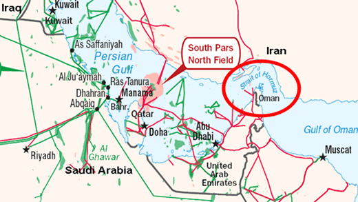
Map: Persian Gulf and Oil Transport Systems, Source: EIA

So just how much tension is the world pricing in to each barrel of oil?


One way to find out is to estimate how much the world's oil supplies might be disrupted if tensions escalate. To do that, we've re-engineered the math from one of our recent tools so that we can find out how much oil would need to be either added or removed from world production in order to change the price of a barrel of oil by the amount that President Obama, or you, might enter.


Most of the other oil-related default data in the tool applies to the most recent figures we have from the U.S. Central Intelligence Agency, which at this writing, applies to 2010, and which we'll assume is similar to today's production figures. If you have more current data, enter it (the same applies for the values of the supply and demand elasticities for oil....)


Since the tensions to which President Obama refers would primarily affect the supply of oil originating from Iran and the Middle East, the price of a barrel of oil should be that recorded for Dubai crude, which would be the benchmark for the region.


Got all that? Great! Let's do some math!...


Oil Production and Economic Data
Input Data Values
Daily Oil Production Data
"Premium" in Today's Oil Price (per Barrel)
Current Oil Price (per Barrel)
Demand Elasticity
Supply Elasticity


Estimated Price Change
Calculated Results Values
Estimated Change in the Supply of Oil [barrels]


For tensions with Iran or within the Middle East to add $20 to the price of a barrel of oil, that would suggest that the world's oil markets are expecting that the world's supply may be reduced by 5,574,855 barrels per day as a result of those tensions. If $30 has been added to the price of a barrel of oil, that would mean that the world expects the world's supply of oil to be reduced by 9,332,835 barrels per day.


Strait of Hormuz, Source: EIA

Using that latter figure, since Iran itself would account for 4,252,000 barrels of daily production, or 45.6% of the potential reduction in world oil supplies, that lower quantity suggests that President Obama believes that the tensions to which he refers are so great that they will negatively affect the supply of oil from additional nations in the region.


Looking around the Persian Gulf, which would the the likely focus of such tensions, we find that the nations of the United Arab Emirates (2,813,000 barrels), Kuwait (2,450,000 barrels), Qatar (1,437,000 barrels) and Oman (867,900 barrels) would be the most affected, as these nations transport their oil by sea to world markets through the Strait of Hormuz. Combined with Iran, that would put the supply of 11,819,900 barrels of oil per day to the world's markets at potential risk of being cut off.


The 9,332,835 barrels per day figure suggested by our back-of-the-envelope calculations is 79% of that value. One way to interpret this value is that the world's markets believe that the 11,819,900 barrels of oil output per day may indeed be affected, but they are currently factoring in a 79% chance that will actually happen.


It could also mean that the world's markets are factoring in 100% odds that these oil supplies will be disrupted, but that a portion of the oil produced in these nations may reach world markets through other supply outlets other than through the Strait of Hormuz, such as through land-based pipelines.


Regardless, it appears that a likely conflict involving Iran that cuts off that much oil through the chokepoint of the Strait of Hormuz would seem to account for the President's belief that as much as 30 U.S. dollars is currently being added as a "premium" to world oil prices. He's certainly factoring in quite a lot of supply disruption to arrive at that figure.