Tampilkan postingan dengan label national debt. Tampilkan semua postingan

Kamis, 10 Oktober 2013

How Much Would a Federal Default Affect the U.S. Economy?

Since the single topic of the press conference that President Obama staged with his party's media collaborators on Tuesday, 8 October 2013 revolved around the topic of what could happen if the U.S. government chooses to default on its debt obligations, or as will more likely be the case, doesn't default on those obligations and instead doesn't spend as much as U.S. politicians would like it to spend, we thought we would go straight to the bottom line and find out how much the U.S. economy would be affected.

But first, we'll need some numbers, which CNBC tracked down for us:

Treasury Secretary Jack Lew is about to face the very same choices confronted by any financially struggling American household: Which bills to pay and when to pay them.

If Congress fails to raise the debt ceiling by around Oct. 17, Lew, who has been in the job less than a year, will have to sit at his desk and figure out how to make due on roughly one-third less in the way of government funds for the bills he has to pay. Because he can no longer borrow, according to the Bipartisan Policy Center, government spending will fall by about 32 percent, or $108 billion in the first month.

On a side note, to put that situation in context, this is no different from what could very well happen just 20 years from now when Social Security's trust fund has been fully depleted, as expected. At that time, the federal government will reduce all payments to Social Security beneficiaries by roughly 26%, unless it significantly increases the amount it borrows. And that's if everything goes as U.S. politicians have promised without any spending reform - this is one reason why the political fight over the debt ceiling and government spending levels is taking place now, because waiting will make needed reforms so much more painful. Not to mention, more necessary.

Back now to the question at hand: how much would a government spending cut of that magnitude affect GDP?

The good news is that we can answer that question with just back-of-the-envelope math! And we can do it on a "daily" basis.

The Multiplier Effect - Source: Lion Investing That $108 billion reduction in federal government spending works out to be $3.6 billion per day. We know that the GDP multiplier for all government spending in the U.S. is 0.6, which we know from research published by the U.S. Federal Reserve applies when the nation's official unemployment rate is over 7.5%. Which is the case at present, thanks to the furloughing of federal government employees! If it were under 7.5%, we would need to use a GDP multiplier of 0.5 to account for the shock of a sudden change in government spending, as government spending is considered to deliver even less of an impact to GDP when the economy is in a healthier state.

Taking our potential government spending reduction of $3.6 billion per day, and multiplying it by our GDP multiplier for government spending of 0.6, we find that the U.S. economy will lose out the equivalent of $2.16 billion worth of GDP per each day that Uncle Sam doesn't have his credit limit reset to a higher level.

Now, to measure the impact upon GDP, just multiply that number by the number of days the U.S. federal government operates in that situation!

If played out through the remaining 78 days of 2013, assuming we stick with President Obama's planned schedule for putting the U.S. federal government into default, that would reduce the nation's GDP for the fourth quarter of 2013 by $168.48 billion.

To put that number into perspective, the fiscal drag produced by the $56.3 billion by which U.S. federal taxes will be higher in the fourth quarter of 2013 than they were in the fourth quarter of 2012 thanks to President Obama's tax hikes that took effect back in January 2013, GDP in the U.S. will be nearly $168.92 billion smaller in 2013-Q4 than it would otherwise have been given the GDP multiplier for taxes.

Why, that's almost exactly the same amount! Perhaps that explains why President Obama has been so intent on doubling down on his "no negotiation with the duly elected representatives of American citizens" strategy - he'll produce twice the negative fiscal drag on the U.S. economy in 2013-Q4 if only he and his supporters can stick with it!

And yes, numbers like those mean a recession, as the Federal Reserve's quantitative easing programs won't produce enough juice for the economy to offset that kind of fiscal drag, offsetting only somewhere between $250 billion and $290 billion of the hit if the debt ceiling isn't increased by 31 December 2013.

Of course, if the debt ceiling situation is resolved sooner than than, it is very much possible that the U.S. will have positive economic growth in 2013-Q4 - only seeing slower growth than it would have had instead. Which is pretty much the story for every quarter during President Obama's entire tenure in office.


Senin, 30 September 2013

Assessing the Real Risk of a U.S. Debt Default

In our previous analysis of the S&P 500, we indicated that we expected that stock prices might fall in the very near term in response to both profit-taking and the arrival of a new negative noise event associated with the possibility of a partial federal government shutdown in October 2013.

Sure enough, we can say we saw it coming! We'll squeeze just a little bit more information into the current version before we officially revise it to move past the third quarter of 2013 to show how these things have played out:

Change in Growth Rates of Expected Future Trailing Year Dividends per Share with Daily and 20-Day Moving Average of S&P 500 Stock Prices, through 27 September 2013

The profit-taking is pretty easy to understand, as the stock market enjoyed a run up in prices through much of September 2013 in anticipation that the Fed would not cut back on its current quantitative easing programs. But what about the possibility of a new negative noise event?

That's tougher to tell. Here, we're going to start our analysis today by looking at a bit of data being advanced by at least one uncritical left-wing economist that markets believe that the United States is at a sharply increasing risk of defaulting on its national debt.

Here's what the WSJ article he cites says:

President Barack Obama repeated Thursday that he won't negotiate on the debt ceiling and won't sign any bill that defunds or delays the health-care law. He lashed out at Republicans for what he said were moves endangering the full faith and credit of the country. "You don't mess with that," he said in a speech in Largo, Md.

The Congressional Budget Office has estimated that if the debt ceiling isn't raised, the government will be unable to pay all its obligations sometime in late October.

Investors appear to be eyeing the possibility that the issue won't be resolved, judging by the sixfold increase in the past week—to its highest level since 2011—of the annual cost of derivatives some investors use to hedge against the risk the U.S. will default on its debt.

The WSJ's chart shows how the value of the investment derivatives tied to the risk of a U.S. government debt default have changed since July 2013. But this bit of information is why we describe the left-wing economist as being uncritical, because he is taking it at face value without any apparent understanding of what it is really communicating.

Once upon a time, these kind of credit derivatives, or as they are more commonly known, Credit Default Swaps (CDS), were used by investors to hedge against the risk that an entity, say a firm or a sovereign nation, would default on its debt.

Back in 2011, they were very successful in communicating the risk that a number of European nations were increasingly at risk of defaulting on their debts. So much so that the people who run the European Union scapegoated the trading of credit derivatives for the problems of its failing nations and took steps to effectively ban them by starving them of the liquidity they would need to function as a tool that clearly communicates the risk of default.

This is significant because, as you'll note on the WSJ's chart, that risk is denominated in Euros, not U.S. dollars.

As a result of the EU's actions, credit default swaps are no longer capable of communicating the real risk of whether a nation might default on their debt. Reuters explains:

"Sovereign CDS volumes and liquidity are down massively," said Michael Hampden-Turner, credit strategist at Citigroup. "Part of that is because investors are more optimistic about risk generally, but the EU ban has also hurt liquidity."

"The market tends to be fairly one-way round, leaving it vulnerable to gapping spreads when there is activity. Dealers are not prepared to run big positions as there is nowhere to lay the risk off, which makes it worse. Every quarter volumes slide and CDS becomes less liquid, and that looks set to continue."

[...]

This is a marked change from the pre-ban era, when CDS trading would pick up when a sovereign became more stressed and it was viewed as an important pricing point.

So, if these kinds of credit derivatives are no longer effective communicators of the degree of risk that a nation might potentially default on its debt, what is? Reuters answers:

"People pricing sovereign risk now look at the bonds, so why would you look at the CDS if bonds are where the information lies? Back in the day it was the other way around, with CDS levels being the crucial signal - it's a fundamental change," said Paul McNamara, investment director at GAM.

So, let's look at the yields of U.S. government-issued bonds. Here, if the risk of the U.S. government really defaulting upon its debt had really increased, we would see a spike in bond yields - the interest rates that the U.S. government pays to its lenders. Our first chart shows the yield for the benchmark 10-Year U.S. Treasury for the past year through 27 September 2013:

10-Year U.S. Treasury Yield - Source: Yahoo! Finance

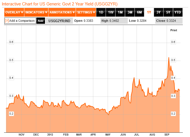
Let's next look at a shorter term bond - the 2-Year U.S. Treasury, which might show a more pronounced response to the near term risk of a U.S. default:

2-Year U.S. Treasury Yield - Source: Bloomberg

It doesn't do us much good to look at shorter-term U.S. Treasuries, because the Federal Reserve's Quantitative Easing (QE) program has pushed their yields down to near-zero levels. This outcome is specifically the result of what we describe as QE 4.0, which is the portion of the Fed's current QE programs that buys up U.S. Treasuries. QE 4.0 was announced back on 12 December 2012 to offset the imminent risk of a sharp contraction in the U.S. economy resulting from President Obama's desired tax hikes going into effect in 2013, and it has largely succeeded in keeping the U.S. economy out of a full-fledged recession.

In both these charts, we see the effect of the risk of the Fed cutting back on its purchases of U.S. Treasuries through its QE programs. From the beginning of May 2013, the yield on U.S. Treasuries rose in direct response to the likelihood that the Fed would begin tapering as early as September 2013, which was largely based on the perception of a strengthening U.S. economy. That probability peaked in early September, after which it became clearer that the Fed was less likely to act to taper its QE programs in September as the economy isn't recovering from being in microrecession as strongly as some data would indicate.

Stock Market Chaos Through this period, both President Obama and the U.S. Treasury Secretary Jack Lew have made statements indicating that they would refuse to negotiate with congressional leaders to avoid a government shutdown or a default on the U.S. national debt, which they targeted to occur in mid-October 2013. The yields of U.S. Treasuries did not react meaningfully to their statements as we should expect if markets really believed that the risk of a U.S. default had increased.

Their most recent statements came on Friday, 27 September 2013, once again emphasizing that President Obama would refuse to negotiate to avoid either a debt default or a partial shutdown of federal government operations. The yields for both the 2-Year and 10-Year U.S. Treasuries declined in response. If President Obama's claims had more credibility, yields on U.S. Treasuries would have risen in response.

But the spreads of the very lightly-traded CDS spreads for U.S. sovereign debt did, suddenly, within the last week - a jump so pronounced in the absence of any confirmation of a similar change in the yields of U.S. Treasuries that it is most likely attributable to a very small change the trading volume for it.

That kind of volatility is often a characteristic of low-volume trading activity in a market with low liquidity. It simply doesn't take very much money to create significant price changes.

It's kind of like how Intrade's prediction market for the 2012 U.S. Presidential election outcome was briefly manipulated to favor Mitt Romney following one of the presidential debates, only here, the manipulator of the market for U.S.' sovereign credit default swaps would appear to find President Obama's statements and policies to be credible.

The good news, if you can call it that, is that because of that fact, we know it wasn't the Russians, Iranians or Syrians. In this day and age, you have to take the good news where you can find it!

Rabu, 25 September 2013

The Zero Deficit Line: 1967-2012

How much would the U.S. federal government need spend per household to even come close to balancing the annual U.S. federal budget?

The answer is presented in a single picture below:

U.S. Total Federal Government Spending per Household vs Median Household Income, 1967-2012

Comparing the relative location of the Zero Deficit Line on the chart, which is based on the overall trend of the U.S. federal government's total receipts with respect to median household income from 1967 through 2008 (before President Obama was sworn into office), with the level of spending done by the U.S. federal government in 2012, we find that the federal government would have to reduce its spending by $7,690 per U.S. household to even get anywhere close to a balanced budget.

To get a sense of how much money that really is, please consider that in 2012, there were 122,438,420 U.S. households.

Also keep in mind that the U.S. national debt will only continue to rise if the amount of federal government spending keeps falling on the wrong side of the Zero Deficit Line.

References

White House Office of Management and Budget. The Budget for Fiscal Year 2014, Historical Tables. Table 1.1. - Summary of Receipts, Outlays, and Surpluses or Deficits (-): 1789-2017. [PDF Document]. 10 April 2013.

U.S. Census. Current Population Survey. Historical Income Tables: Households. Table H-5. Race and Hispanic Origin of Householder - Households by Median and Mean Income. [Excel Spreadsheet]. 17 September 2013.

Rabu, 28 Agustus 2013

A Broken Tool

Is President Obama planning to default on the U.S. national debt?

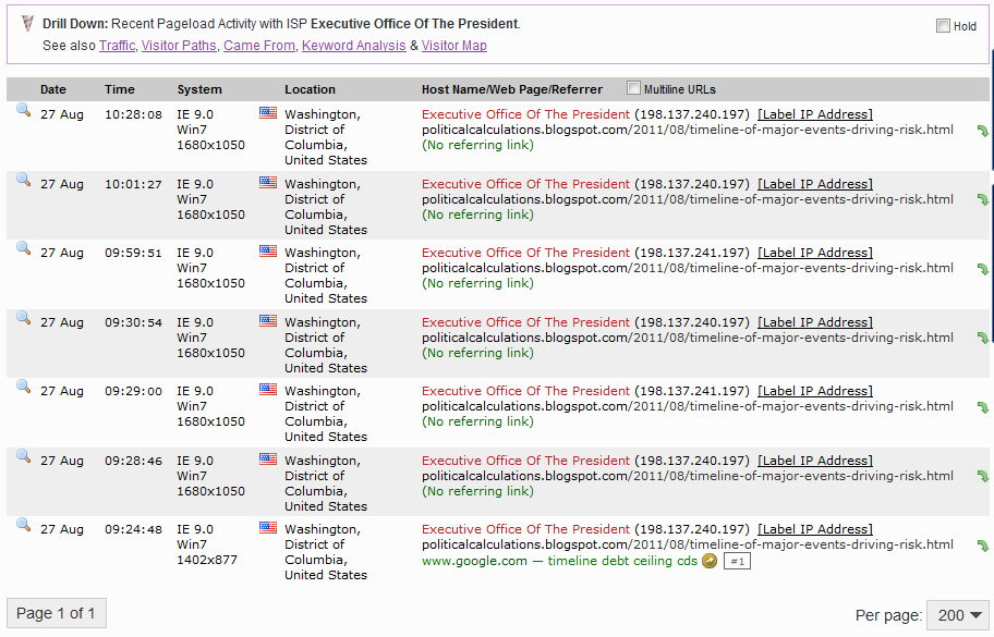
We had some interesting traffic on our site yesterday, as an individual in the Executive Office of the White House took an unusually strong interest in our Timeline of Major Events Driving the Risk of U.S. Default, which documents much of the last debt ceiling crisis that culminated in the summer of 2011.

Political Calculations' StatCounter - 27 August 2013 - ISP: Executive Office of the White House

We don't think they were very happy with our independent analysis of the White House's role in increasing the risk of a U.S. government default during that period of time, although they would seem to have appreciated it enough where they used a combination of terms that are unique to our analysis in a Google search to specifically track it down and to refamiliarize themselves with it.

More practically however, we had used Credit Default Swaps for U.S. Treasuries as a tool to measure the relative risk of a U.S. federal government default upon its national debt payments. Unfortunately, the same tool will be of little value in considering the current situation where the U.S. is once again approaching its debt ceiling. Reuters explains:

LONDON, July 8 (IFR) - Credit default swaps are no longer viewed as a reliable indicator of sovereign risk, traders say, as an EU ban on speculative activity has successfully eviscerated an instrument that European policymakers once blamed for exacerbating the eurozone crisis.

Portugal's political establishment was rocked by multiple ministerial resignations last week, causing the country's CDS to soar by more than 20% in a day to 506bp on Wednesday, its widest level in seven months, while the yield on its 10-year government bond almost reached 7.5%.

But in stark contrast to previous examples of sovereign stress, traders professed to be largely ignoring CDS spreads, as a huge drop off in volumes and liquidity has undermined the price discovery value of the product.

"People pricing sovereign risk now look at the bonds, so why would you look at the CDS if bonds are where the information lies? Back in the day it was the other way around, with CDS levels being the crucial signal - it's a fundamental change," said Paul McNamara, investment director at GAM.

To translate, because they were unhappy that the market had a tool that clearly communicated the risk of a sovereign government defaulting on its debt payments, the people who run the European Union chose to scapegoat the trading of credit default swaps for its problems and banned them.

It's kind of like how the people who are successful in shorting stocks are blamed for the problems of the failing companies whose stock prices are falling because of bad business decisions made by the insiders running the companies. Only here, the insiders of the failing entities have the ability to shut down that kind of trading.

The E.U. ban directly affects U.S. credit default swaps because it eliminates much of the source of liquidity and volume needed to make its price a good signal of the level of perceived risk of default.

And so, we go into the U.S. federal government's next debt ceiling crisis with a broken tool. We could perhaps use the yields of the 10-Year U.S. Treasury as a substitute, but that has been rising ever since May 1, as the market has been progressively pricing in the end of the Federal Reserve's current round of quantitative easing (QE).

10-Year U.S. Treasury Yield, 2 January 2013 through 27 August 2013

In fact, we would say that virtually all of the increase in the yield of the 10-Year U.S. Treasury since 1 May 2013 may be attributed to speculation associated with when the Fed will begin to act to end its QE programs. Although the Obama administration is targeting mid-October in its plans for when the U.S. Treasury will reach the nation's debt ceiling, the market pretty much shrugged off the news as Treasury yields fell, which indicates that they aren't placing very much stock in the administration's pronouncements.

It would seem then that President Obama will need to behave much more irresponsibly in taking actions that will boost Treasury yields if he hopes to send the market a signal that the U.S. will default on its debt at his direction.


Jumat, 23 Agustus 2013

Summer 2013: Who Really Owns the U.S. National Debt?

It's time again to check in on who really owns the U.S. national debt. This edition of our occasional series is different however, because the official size of the U.S. national debt hasn't meaningfully changed over the last three months.

That's because of the deal struck between President Obama and the U.S. Congress, which allowed the national debt to increase while both the House of Representatives and the Senate passed budget proposals, which was a real accomplishment for the U.S. Senate, since that body hadn't fulfilled its Constitutional responsibilities for passing any budget proposal for years.

But after that, the window for further debt increases closed, with the total public debt outstanding for the U.S. since then frozen within a few billion of $16.738 trillion.

If you would, please take a moment to think about how casually we're describing those very, very big numbers....

That $16.738 trillion is approximately the current level of the debt ceiling for the U.S. federal government. Since reaching that level in May 2013, the U.S. Treasury has been employing "extraordinary" measures to ensure that the official national debt of the U.S. does not exceed that level, which include such steps as delaying borrowing money to fund the pensions of federal government bureaucrats.

Meanwhile, the Federal Reserve has maintained its quantitative easing programs, where it has been acquiring an average of $85 billion per month in U.S. Treasuries (UST) and Mortgage-Backed Securities (MBS).

Both these factors account for the big changes that we observe have taken place since the end of the U.S. federal government's 2012 fiscal year on 30 September 2012.

Summer 2013: To Whom Does the United States Government Really Owe Money?

Since that time, the Federal Reserve's share of the total public debt outstanding of the United States has increased from 10.8% to 12.0%, as the share held in the U.S. Civil Service Retirement Trust Fund has declined from 5.6% to 4.4%.

With the Federal Reserve sustaining its QE bond-buying program, we also observe that the relative share of the national debt by foreign entities has declined. This is a result of the Fed's QE policy "crowding out" these other lenders from the market for U.S. government-issued debt securities.

Data Sources

Federal Reserve Statistical Release. H.4.1. Factors Affecting Reserve Balances. Release Date: 5 July 2013. [Online Document]. Accessed 20 August 2013.

U.S. Treasury. Major Foreign Holders of Treasury Securities. Accessed 20 August 2013.

U.S. Treasury. Monthly Treasury Statement of Receipts and Outlays of the United States Government for Fiscal Year 2013 Through June 30, 2013. [PDF Document].

Kamis, 30 Mei 2013

The Evolution of President Obama's Spending Proposals

How has President Obama's view of the desirable level of federal government spending evolved since he came into office?

This is the flip side to our previous analysis of the government revenue forecasting ability of U.S. Presidents, in which we found that a President risks losing credibility for their economic initiatives when government revenues fail to match the forecasts they make in their annual budget proposals.

Fortunately for President Obama, his credibility isn't at risk of falling even lower with this aspect of the federal government budget. Instead, we will evaluate his judgment.

Unlike the situation with collecting revenue, where factors outside the U.S. government's control affect how much revenue it can actually collect, the federal government is fully capable of spending every single dollar it intends to spend. As a result, a President's budget proposal really represents their view of the appropriate level of spending needed to satisfy their political priorities.

Our chart below reveals how Presidential desires for federal spending have stacked up against reality for each the budget proposals made by both President Bush or President Obama for each of the U.S. government's fiscal year from 2004 through 2014 (FY2004 to FY2014).

Forecast Federal Government Spending vs Reality, FY2004-FY2014

Looking over President Bush's record, we find that the federal government's actual level of spending was often anywhere from $60 billion to $90 billion greater than the amount originally proposed by the President. This is largely the result of the U.S. Congress adding spending on top of the amounts proposed by the President. Generally speaking, this outcome suggests that President Bush's political priorities were largely agreed to by the U.S. Congress during his tenure in office.

By contrast, President Obama's spending proposals have always been considerably out of whack with respect to the general consensus within the United States for the appropriate level of federal government spending, which we can observe in the vertical separation between President Obama's desired level of spending and the actual amount of spending that has occurred during his time in office. Politically, we can observe just how out of whack President Obama's desires for spending have been in the near universal margins by which his budget proposals have been rejected in the U.S. Congress.

That however appears to have changed somewhat with his most recent budget proposal for Fiscal Year 2014, the first following his re-election, where President Obama would appear to have finally begun to rein in his ambition for higher spending to fund his political initiatives, as the amount of federal spending would appear to be anywhere from $100 to $200 billion more per year than what the U.S. government would have spent under an extended projection of President Bush's FY2007 budget proposal.

While the President's FY2014 budget proposal is anywhere from $100 billion to $300 billion less than what President Obama has previously proposed for the U.S. government to spend in any of his first-term budgets, it still runs a minimum of $475 billion above the President's historically non-credible forecasts for the federal government's revenue collections.

That's progress in evolving toward a more financially-sound budget, whose priorities are more in tune with those of the American people, but there is still a lot of room left for President Obama to continue his evolution in that direction.


Rabu, 17 April 2013

Visualizing FY2014 Federal Budget Spending Proposals

Veronique de Rugy has analyzed the various federal government budget spending proposals now floating around Washington D.C. In the chart below, she shows how much each would spend from now through 2023:

Mercatus Center: FY2014 Budget Proposals Spending through 2023

As always, the challenge in really understanding what these numbers mean is to put them into a more "human" scale. To do that, we've added up the spending for each proposal for each of the ten years spanning the federal government's 2014 through 2013 fiscal years, then divided the result by the combined number of U.S. households per year.

The result, presented graphically below, is the average amount of federal spending per U.S. household being proposed in the nation's capitol.

Average Federal Spending per U.S. Households, FY2014-FY2023

The horizontal black line on the chart represents the Congressional Budget Office's projected total of the amount of taxes that the federal government is likely to collect per U.S. household from FY2014 through FY2023. As you can see, both President Obama's and the Senate's budget proposals fail to come anywhere close to being in balance, as both only provide for token spending cuts. Both instead rely upon large tax hikes to try to close the projected deficits, however this would require the U.S. federal government to maintain its tax collections at levels it has historically not been able to sustain for more than a few years.

By contrast, the House's budget proposal comes close, but is still slightly in the red over the ten year period. We should note however that the House's budget proposal actually does achieve balance at the end of the 10 year period - the reason it's slightly in the red over the ten years from 2014 through 2023 is because of higher deficits that are run the early years of the period. There are no new tax hikes associated with this proposal, which assumes that the federal government's tax collections will be maintained at their post-World War 2 historic average.

Meanwhile, Senator Rand Paul's alternative budget is the only one that achieves balance by a significant margin, primarily due to large spending cuts. Since Senator Paul's proposed budget also reduces taxes, we should note that the resulting surplus would not be as large as indicated.

Projecting the Number of U.S. Households

We built on previous work we did to model the number of U.S. households. You can access those projected numbers using the modified version of that original tool below:


Year of Interest
Input Data Values
Select Year


Number of U.S. Households
Calculated Results Values
Estimated Number of Households


Selasa, 09 April 2013

Who Really Owns the U.S. National Debt? (Final Edition for FY2012!)

The U.S. Treasury Department has revised its estimates of the foreign ownership through the end of Fiscal Year 2012, which means that we can now finalize our picture of just who the major holders of the 16.027 trillion dollars of the outstanding U.S. government debt issued through 30 September 2012 are:

Fiscal Year 2012: To Whom Does the U.S. Government Owe Money?

Overall, U.S. entities own 66% of all debt issued by the U.S. federal government. Ranking the major U.S. entities from high to low, we find that:

  • U.S. individuals and institutions, which includes regular Americans, banks, insurance companies and other government entities, own 30.5% of the nation's debt.

  • The U.S. Social Security Trust Fund claims 16.7%.

  • The U.S. Federal Reserve, thanks to its quantitative easing programs of recent years, has racked up holdings equal to 10.8% of the total U.S. national debt.

  • The U.S. government's civilian employee retirement fund accounts for another 5.6% of the nation's debt.

  • The U.S. government's military retirement fund owns 2.4% of the national debt.

Meanwhile, foreign entities own 34% of all U.S. government-issued debt, with the following nations' individuals and institutions representing the five biggest holders of that debt, again ranked from the highest to lowest share of ownership:

  • China (including Hong Kong): 7.9%

  • Japan: 7.0%

  • "Oil Exporters", which includes Ecuador, Venezuela, Indonesia, Bahrain, Iran, Iraq, Kuwait,Oman, Qatar, Saudi Arabia, Algeria, Gabon, Libya, Nigeria and the United Arab Emirates: 1.7%

  • Brazil: 1.6%

  • United Kingdom: 0.9%

All other nations hold approximately 15% of the U.S. outstanding national debt.

The Federal Reserve's Growing Share of the U.S. National Debt

Following President Obama's being sworn into office on 17 January 2009, the U.S. national debt has grown by over 51%, or by 5.4 trillion dollars to $16.066 trillion at the end of the U.S. government's 2012 fiscal year on 30 September 2012.

Thanks to the Federal Reserve's various quantitative easing programs of recent years, where the U.S. government-chartered central bank has purchased large quantities of U.S. government-issued debt in its attempts to keep the U.S. government's spending elevated and the U.S. economy stimulated by lowering long-term interest rates, the Federal Reserve "loaned" the U.S. government over half that amount.

Here, the Fed boosted its holdings of U.S. Treasury securities from a low of $474 billion on 18 March 2009 when it launched its first quantitative easing program to a peak of $1.684 trillion on 21 December 2011, which fell back to $1.676 trillion by 26 September 2012 - just before the end of the U.S. government's 2012 fiscal year.

The Fed has also boosted its holdings of other federal agency debt securities from $48 billion on 18 March 2009 to a peak value of $169 billion on 10 March 2010, which has slowly declined to $83 billion as of 26 September 2012. All told, the Federal Reserve held an additional $1.21 trillion of the U.S. national debt compared to what it did before it began its quantitative easing programs.

Consequently, the U.S. Federal Reserve has gone from holding less than one-twentieth of all U.S. government-issued debt as of 18 March 2009 to now holding nearly one-ninth of it as of the end of the U.S. government's 2012 fiscal year. During the peak of its quantitative easing programs, the Federal Reserve succeeded in crowding out almost every other potential purchaser of U.S. government-issued debt.

This analysis does not reflect the results of the Fed's most recent round of quantitative easing, which it first announced on 13 September 2012, then later expanded on 12 December 2012.

At present, the Federal Reserve is accumulating U.S. government issued debt in the form of mortgage-backed securities, such as those issued by government-supported enterprises like Fannie Mae and Freddie Mac, at a rate of roughly $40 billion per month while also accumulating U.S. Treasuries at a rate of $45 billion per month. In March 2013, the Fed's combined acquisition rate of $85 billion per month for U.S. government-issued debt accounted for 56% of the net increase in the U.S. national debt recorded during the month.

The U.S. National Debt Halfway in Fiscal Year 2013

Through 29 March 2013, the halfway point of the U.S. government's 2013 fiscal year, the total public debt outstanding of the United States has grown to $16.771 trillion - an increase of more than $744 billion in just six months time.

Meanwhile, on 3 April 2013, President Obama pledged to donate an amount equal to 5% of his $33,333 per month salary as President of the United States of America to the U.S. Treasury, which only accepts such voluntary payments to "help reduce the public debt". Nearly a year earlier, on 10 April 2012, the White House's official spokesman Jay Carney described such a gesture as a "gimmick" when proposed by opponents of the President's ongoing calls for higher taxes, which the President later succeeded in obtaining on 3 January 2013.

Data Sources

U.S. Federal Reserve. U.S. Treasury securities held by the Federal Reserve: All Maturities. Accessed 15 March 2013.

U.S. Federal Reserve. Federal agency debt securities held by the Federal Reserve: All Maturities. Accessed 14 January 2013.

U.S. Treasury. Major Foreign Holders of Treasury Securities. Accessed 14 January 2013.

Selasa, 15 Januari 2013

Who Really Owns the U.S. National Debt? [Preliminary FY2012 Edition]

Today, we're taking a preliminary look at just who owns all the debt issued by the U.S. federal government through 30 September 2012 - the end of the U.S. government's fiscal year. Our chart below visualizes what we found:

Preliminary Fiscal Year 2012: To Whom Does the U.S. Government Owe Money?

The information presented in our chart above is preliminary, as the U.S. Treasury typically revises its foreign entity debt ownership data in March of each year.

Overall, U.S. entities own just 65.8% of all debt issued by the U.S. federal government. Ranking the major U.S. entities from low to high, we find that:

  • The U.S. government's military retirement fund owns 2.4% of the national debt.

  • The U.S. government's civilian employee retirement fund accounts for another 5.6% of the nation's debt.

  • The U.S. Federal Reserve, thanks to its quantitative easing programs of recent years, has racked up holdings equal to 10.8% of the total U.S. national debt.

  • The U.S. Social Security Trust Fund claims 16.7%.

  • U.S. individuals and institutions, which includes regular Americans, banks, insurance companies and other government entities, own 30.4% of the nation's debt.

Meanwhile, foreign entities own 34.2% of all U.S. government-issued debt, with the following nations' individuals and institutions representing the five biggest holders of that debt, again ranked from low to high:

  • United Kingdom: 0.9%

  • Brazil: 1.6%

  • "Oil Exporters", which includes Ecuador, Venezuela, Indonesia, Bahrain, Iran, Iraq, Kuwait,Oman, Qatar, Saudi Arabia, Algeria, Gabon, Libya, Nigeria and the United Arab Emirates: 1.7%

  • Japan: 7.0%

  • China (including Hong Kong): 8.1%

All other nations hold approximately 15% of the U.S. outstanding national debt.

The Role of Quantitative Easing in Offsetting Foreign Ownership of the U.S. National Debt

The Federal Reserve's various quantitative easing programs of recent years, where the U.S. government-chartered central bank has purchased large quantities of U.S. government-issued debt in its attempts to keep the U.S. government's spending elevated and the U.S. economy stimulated by lowering long-term interest rates, are especially interesting in the degree to which they've succeeded in offsetting the share of the U.S. national debt owned by foreign interests.

Here, the Fed boosted its holdings of U.S. Treasury securities from a low of $474 billion on 18 March 2009 when it launched QE 1.0 to a peak of $1.684 trillion on 21 December 2011, which fell back to $1.676 trillion by 26 September 2012 - just before the end of the U.S. government's 2012 fiscal year.

The Fed also boosted its holdings of other federal agency debt securities from $48 billion on 18 March 2009 to a peak value of $169 billion on 10 March 2010, which has slowly declined to $83 billion as of 26 September 2012. All told, the Federal Reserve held an additional $1.21 trillion of the U.S. national debt compared to what it did before it began its quantitative easing programs.

As a result, the U.S. Federal Reserve has gone from holding 4.7% of all U.S. government-issued debt as of 18 March 2009 to holding 10.8% of it as of the end of the U.S. government's Fiscal Year 2012. During the peak of the program, the Federal Reserve crowded out almost every other purchaser of U.S. government-issued debt.

Assuming that other U.S. entities would have been unable to accumulate more of the U.S. national debt than they did during this period and that the U.S. government would have spent as much money as it did, if not for the Federal Reserve's quantitative easing programs, the share of the U.S. national debt held by foreign entities would have increased to 41.7%, with the bulk of the foreign acquisitions going to China.

As it stands, a little over 1 out of every 3 dollars borrowed by the U.S. federal government is now owned by foreign interests.

Data Sources

U.S. Federal Reserve. U.S. Treasury securities held by the Federal Reserve: All Maturities. Accessed 14 January 2013.

U.S. Federal Reserve. Federal agency debt securities held by the Federal Reserve: All Maturities. Accessed 14 January 2013.

U.S. Treasury. Major Foreign Holders of Treasury Securities. Accessed 14 January 2013.

Kamis, 29 November 2012

Transforming Student Loans from Taxes Back into Debt

James Pethokoukis notes the skyrocketing ratio of student loan debt to household income, the currently spiking default rate on student loans, and wonders if a new federal government bailout is in the works:

See where this is heading? When you take into account America’s burgeoning bailout culture and the rising political power of younger voters, it’s no surprise that Citigroup thinks taxpayers might end up riding to the rescue:

Taxpayers already (or will) indirectly subsidize both the housing and healthcare sectors by covering GSE losses and paying for a healthcare system that pays out more than it receives in revenues. If the continued misalignment of educational resources ultimately leads to government “forgiveness” of student loan debt, it will simply be one more example of fiscal subsidies for a narrow demographic.

Citigroup estimates that writing off defaulted student loans would cost $74 billion, though such a move might nudge other borrowers to strategically default in hopes of a bailout of their own.

We have a very easy solution for this scenario, which enterprising politicians might use to both ride to the rescue of distressed student loan borrowers while avoiding the moral hazard issue of encouraging other borrowers to strategically default on their student loans: restore the ability of distressed borrowers to have their student loan debt discharged in bankruptcy!

In one fell swoop, it would be possible to both relieve the genuine distress of the excessive debt held by these individuals in such a way that would stop other less-distressed but really opportunistic people from considering strategic defaults on their student loans, thanks to the restrictions and higher costs of future borrowing activity that would be placed upon them in bankruptcy proceedings.

Plus, this reform would have the unique benefit of forcing the undoing of one of the biggest political power grabs of recent years: the federal government's takeover of the student loan industry.

Here, the unspoken goal of President Obama's policy has been to fully exploit the restriction of borrowers from being able to discharge their student loan debts in bankruptcy court as a backdoor means by which he could increase the amount of money that the federal government collects from low and middle income earners. All, we might add, without having to go through the hassle of fighting the political battle that would come from attempting to directly increase their income tax rates.

Just in case you wondered why President Obama has always been so keen to push "cheap" student loans....

That's also why President Obama has been so focused on increasing the tax rates of just those with high incomes, while pushing to keep the Bush-era tax cuts in place for low and middle income earners, even though such a strategy will do very little to reduce the federal government's annual budget deficits or the national debt. Since most income in the United States is actually generated by people who earn much less than $200,000 (or $250,000 per household), the President is simply using the old deceptive magician's trick of distraction in an attempt to keep low and middle class earners from recognizing how much of their income they're really paying in total to the federal government.

It doesn't matter that it's called "debt". If you cannot discharge it in bankruptcy and you owe it to the federal government, which sets the size of your payments according to the amount of your annual income, then the money that you're paying to the government should more properly be called "taxes".

At the very least, the federal government should require student loan borrowers to write that number somewhere in the "taxes you paid" section of their tax returns....

Image Source: ZeroHedge.

Senin, 05 November 2012

President Obama's Debt, Measured in Gold

How much gold would the U.S. Treasury have to pay out from the nation's bullion depository at Fort Knox to fully pay off the national debt of $16.222 trillion (as of 1 November 2012)?

Quick side note: That figure is some $5.595 trillion higher than the $10.627 trillion it was back on 20 January 2009, when Barack Obama was sworn into office.

To answer the question, we've updated our tool for converting cash into an equivalent value in gold! Now, in addition to figuring out how big a solid gold cube would have to be to correspond to a given amount of gold at current spot market prices, it will now figure out how many standard 20-feet long by 8.5 feet wide by 8.0 feet tall intermodal shipping containers would need to used to transport the gold to all the people to whom the government owes all that government-issued debt!

What we find when we plug in the numbers as of 1 November 2012 is that the entire national debt of the United States is the equivalent of a solid gold cube that is nearly 80 feet tall by 80 feet long by 80 feet wide. Transporting all that gold would require over 431 of those standard 20-foot long intermodal shipping containers.


Federal Spending and Gold Price Data
Input Data Values
Amount of National Debt [billions U.S. dollars]
Spot Price of Gold [U.S. dollars per ounce]


Equivalent Quantity of Gold
Calculated Results Values
Equivalent Weight [pounds]
Side Dimensions of Solid Gold Cube [feet x feet x feet]
Percent of All Gold Ever Found
Number of Standard 20-Foot Shipping Containers That Gold Would Fill
Shipping Containers at Port - Source: Department of Transportation

The only problem with that is that all of the gold that has ever been mined on Planet Earth would only make a solid gold cube that is 66.1 feet high by 66.1 feet long by 66.1 feet wide, which would work out to fill just over 249 of those 20-foot standard shipping containers. Even if Fort Knox held all the gold in the world, the U.S. Treasury would still be more than 182 shipping containers short of being able to pay off the national debt in gold at today's spot prices.

President Obama's contribution of $5,595 billion to the U.S. national debt during his term in office through 1 November 2012 would be represented by a solid gold cube that is 55.7 feet high by 55.7 feet long by 55.7 feet wide, which would represent about 60% of all the gold that is known to exist in the world. It would take just over 149 standard shipping containers to hold all that gold if each container were completely filled with no air gaps.

Laid out end to end, those 149 standard shipping containers would be almost six-tenths of a mile in length. That's just over one-third of the length of the 431.5 shipping containers that would hold all the gold representing the United States' entire public debt outstanding.

Image Source: Juwelier Lachenmann GmbH

Senin, 01 Oktober 2012

President Obama's Debt Achievement

How does President Obama's contribution to the national debt compare to those of other modern Presidents?

To answer that question, we're going to express the United States' total public debt outstanding in the more human scale terms of U.S. households, for which the U.S. Census provides data going back to 1967. Our chart below summarizes what we find when we calculate the national debt per U.S. household for each of the U.S. government's fiscal year from 1967 through the just ended fiscal year for 2012, both in nominal and real (inflation-adjusted) terms.

Total U.S. Public Debt Outstanding per U.S. Household, 1967-2012

Here's how much each President since 1969 added to the U.S. national debt burden per household on average for each year they were in office, after adjusting for inflation (note: we're omitting the data for 1967 and 1968 since it coincides with only part of Lyndon Johnson's term in office):

Average Inflation-Adjusted Annual Change in U.S. National Debt Burden per Household for Modern U.S. Presidents, 1969-2012

After accounting for the effect of inflation, we find that President Obama is racking up national debt at a rate that's nearly three times faster than any other U.S. President in the modern era since 1969.

That's quite an achievement.

Selasa, 25 September 2012

The Zero Deficit Line in 2012

Now that the U.S. Census has released its newest estimate of median household income in the United States, it's time to consider where the U.S. federal government spending per U.S. household stands with respect to the Zero Deficit Line, which is the amount of spending that the typical American household can actually afford. The chart below shows those two measures for each year since 1967, when the Census first began reporting its median household income figure:

Looking at the chart, we see that for the third year in a row, the amount of U.S. federal government spending per household is hovering just below $30,000 per U.S. household. Our tool below will reveal how much spending can actually be supported by the typical American household given its annual income of $50,054 (or whatever median household income level you might choose to enter!)


Median Household Income Data
Input Data Values
Median Household Income


How Much Federal Spending Per Household Can the U.S. Really Afford?
Estimated Results Values
Federal Spending per U.S. Household

Using our tool, we find that in reality, the typical American household can only afford to have the federal government spend no more than $21,059.

On a side note, do you remember the old Warner Brothers' Road Runner cartoons? The ones where Wile E. Coyote would be chasing after the bird, then suddenly find himself suspended in mid-air beyond the edge of a cliff, until he looked down and finally crashed back to earth?

The level of federal spending per household since 2008 and the lack of meaningful growth in the incomes of U.S. households under President Obama, combined with all the talk these days of the approaching "fiscal cliff" suggests that there is one giant "splat" sound in the near future for the U.S.

Kamis, 13 September 2012

Summer 2012: To Whom Does the U.S. Government Owe Money?

Through 30 June 2012, the U.S. government had racked up some $15.855 trillion in debt. Our chart below shows to whom most of it was owed:

Summer 2012: To Whom Does the U.S. Government Owe Money?

Although the United States' total public debt outstanding has now exceeded 16 trillion dollars, at least as of 31 August 2012, the relative percentages for the major holders of all the debt issued by the U.S. government shown above are likely unchanged.

Taking that larger national debt figure into account, as well as the likely growth in the number of U.S. households, we estimate that the current national debt burden per U.S. household is roughly $131,113. Over the last four years, that's up by $49,129 per U.S. household from the $81,984 per U.S. household figure set in 2008.

Data Sources:

U.S. Treasury Department. Major Foreign Holders of Treasury Securities. Accessed 8 September 2012 (with data shown through 30 June 2012).

U.S. Treasury Department. Monthly Statement of the Public Debt of the United States, June 30, 2012. Table III – Detail of Treasury Securities Outstanding, June 30, 2012.

Kamis, 06 September 2012

Enabling Disability Fraud - Part 2

Americans Receiving Social Security Benefits, January 1967 through June 2012

Today, we're going to demonstrate that the policies of multiple agencies of the U.S. federal government are responsible for enabling criminal disability fraud in the United States, with the cost of the fraud accelerating the pending insolvency of Social Security's Disability Insurance Trust Fund, which will put the program's legitimate beneficiaries at high risk of having their benefits cut after the fund has been exhausted.

Current projections indicate that the Social Security trust fund for disability will be fully depleted in 2016, just four years from the present. The projections from the previous year had indicated that would not happen until 2018. The large shift in the timing of the projected trust fund depletion toward the present in just a year's time indicates a strongly deteriorating fiscal situation for the government "safety net" program.

In Part 1 of our series, we discovered that the U.S. Social Security Administration has effectively established a "no-challenge" policy for disability insurance claims made by applicants over the age of 50, which allows these individuals to obtain Social Security disability benefits far more easily than individuals Age 49 or younger. This arbitrary policy is what enables these individuals to receive Social Security disability insurance payments, even though they might not otherwise be able to obtain those benefits if they were held to the same standards as those under Age 50.

Increase in Number of Social Security Disabled Workers from Previous Year's One Year Younger Age Group, 2005-2011

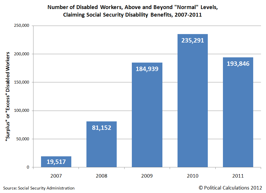
We observe the likely greater incidence of disability fraud as we more closely examine the surge in the number of Social Security disability beneficiaries in the years since 2007, which coincide with the Great Recession. Here, we found that approximately 695,000 more individuals have been added to the nation's government disability rolls during this time than the level that would be consistent with those of pre-Great Recession years.

Number of Disabled Workers, Above and Beyond

The chart above, showing the number of "surplus" or "excess" Social Security disability beneficiaries added in each year since 2007, indicates that the recession is the driving factor behind the increased number of individuals obtaining government disability payments, as the timing of the surge coincides with the expiration of government unemployment insurance benefits for individuals who were negatively impacted by the economic contraction, which officially ran from December 2007 through June 2009. The nation's sluggish economic recovery accounts for the decline in the number of surplus or excess Social Security disability program beneficiaries measured in 2011.

That connection between unemployment insurance benefits and disability insurance benefits brings us to where outright fraud is taking place today:

As many as 117,000 Americans simultaneously collect unemployment benefits and federal disability each year, a form of double-dipping that investigators say costs taxpayers $850 million annually and should be ended.

To understand why such "double-dipping" constitutes fraud, please note the following general requirements for each program:

  • To receive unemployment insurance benefit payments, claimants must state that they are able to work.

  • To receive disability insurance benefit payments, claimants must state that they are unable to work.

While there can be some small overlap in the detailed eligibility requirements for these programs that would legitimately allow a handful of individuals to receive benefits from both simultaneously, the vast majority of individuals currently receiving both unemployment insurance benefit payments and disability insurance payments do not fall within that narrow category and are therefore committing acts of fraud. In general, legitimate beneficiaries of these social safety net programs can draw funds from one program, or the other, but not both at the same time.

That multiple government agencies are involved in enabling this form of fraud is confirmed because the U.S. Department of Labor is responsible for administering the unemployment insurance program, while the Social Security Administration administers the Disability Insurance program. But worse than that is the reason why the fraud has been allowed to continue:

The reason for the double-spending, investigators at the Government Accountability Office reported this week, is good old-fashioned lack of communication.

Put simply, the Labor Department that funds unemployment benefits and the Social Security Administration that funds disability payments don't compare notes, leavings tens of thousands of Americans each month to collect two checks from a stretched-thin government treasury.

It would seem that the bureaucrats and politicians who are responsible for overseeing these programs learned nothing from the failure of government agencies to share information among themselves that enabled the criminal terrorist murders of 2,996 Americans on 11 September 2001 to proceed unchallenged.

This time however, the Government Accountability Office's report indicates that the annual savings that might be realized by ending this kind of fraud adds up to $850 million.

That's a savings of roughly 1 dollar out of each $1400 that is currently projected to be consumed in the nation's projected deficit of 1.21 trillion dollars for 2012! And it would be painless, because the people who are honestly playing by the rules would not be affected!

This is exactly the sort of thing that should be a no-brainer for a fiscally responsible politician - it's as close to low-hanging fruit as there is to be found anywhere in the U.S. federal government's budget. We wonder if any political candidate will rise to the occasion of acting to end the government's practices and policies that enable such costly fraud.

Jumat, 17 Agustus 2012

Accounting for the National Debt

On 15 August 2008, the total U.S. public debt outstanding was just over $9.6 trillion (or if you're a stickler for accuracy, $9,606,975,957,798.46). Four years later, on 15 August 2012, the total public debt outstanding for the United States had risen to just over $15.9 trillion (or rather, $15,919,488,010,442.70). In four years then, the U.S. national debt rose by more than $6.3 trillion, or by 65.7% of its value in 2008.

To put those numbers on a more human scale, the amount of the U.S. national debt per American household has increased from $81,984 to $131,113 - the latter number being nearly equal to the cost of a 3 bedroom, 1-1/2 bath house in Hartville, Ohio. This represents a 59.9% increase over the last four years, as we estimate that the number of households in the U.S. has increased over the same time from 117,181,000 in 2008 to about 121,418,000 in 2012.

U.S. National Debt per Household, 2008 and 2012 (15 August of each year)

A good question to ask is how much of this increase in the national debt might be attributed to President Barack Obama, who was sworn in as the 44th President of the United States on 20 January 2009?

Typically, an incoming President bears little responsibility for the spending that occurs during their first year in office, since the budget that applies for that fiscal year will usually have been approved by the U.S. Congress in the previous year and signed into law by their predecessor.

How the U.S. government's budget for 2009 became law however was anything but typical.

Here, the Democratic Party-controlled Congress in 2008 only sent three of 12 appropriations bills for the 2009 budget year to President George W. Bush for his signature before he left office, deliberately withholding the remaining nine bills until after President Obama assumed office to avoid likely vetoes given the level of spending proposed in them. In 2009, the incoming Democratic Party-controlled Congress combined those nine bills into one "omnibus" bill, which President Obama signed into law on 11 March 2009.

Congressional Quarterly has a fairly detailed report of the FY2009 budget omnibus' appropriations bill history, but that requires a subscription to access. Here's the key quote from the article:

the omnibus provided a total of $1.05 trillion — $410 billion of it for discretionary programs — and included many of the domestic spending increases Democrats were unable to get enacted while George W. Bush was president.

So that accounts for $1.05 trillion of the U.S. government's spending in its 2009 fiscal year, which works out to be 32.6% of all federal spending in its 2009 fiscal year.

But that doesn't yet account for President Obama's economic stimulus package of 2009, which added some $825 billion to federal spending over its lifespan, above and beyond the U.S. government's annual budget.

Adding those two figures together, we find that Barack Obama, as President of the United States, may be held directly accountable for $1.875 trillion of the U.S. government's spending in 2009, or 53.3% of that year's federal spending. As a result, the federal government's spending during its 2009 fiscal year more closely represents President Obama's spending priorities than it does the previous President Bush's spending priorities.

That fact is especially driven home once we consider the voting record of Barack Obama in the U.S. Senate, where from 2006 through 2008, he supported or approved nearly every appropriations bill the Congress advanced. Or in the case of 2008, where he was often not present to vote for the increases in spending during this period as he ran for President, where he instead signed on to the massive increases in spending he desired after becoming President.

It is therefore reasonable to conclude that the combination of his voting record for government spending while in the U.S. Senate along with his spending record as President makes President Obama uniquely responsible for virtually all the federal government's spending and accumulated debt from Fiscal Year 2007 onward.

And that means that President Obama is uniquely and directly accountable for increasing the national debt burden of American households by $49,129 per household from 2008 through 2012.

References

U.S. Treasury. The Debt to the Penny and Who Holds It. [Online Application]. Accessed 16 August 2012.

U.S. Census. Historical Income Tables: Households. Table H-5. Race and Hispanic Origin of Householder--Households by Median and Mean Income: 1967 to 2010. [Excel Spreadsheet]. September 2011.

Project Vote Smart. President Barack Hussein Obama II's Voting Records. Accessed 16 August 2012.

Notes

Note: We projected the number of U.S. households by adding 1,368,000, the average annual change in the number of U.S. households from 1967 through 2010, to the recorded figure for 2010, twice (once for 2011 and again to estimate the number of households for 2012). The Census' official data for the number of households in 2011 will be published sometime in September 2012.