Tampilkan postingan dengan label stock market. Tampilkan semua postingan

Senin, 23 September 2013

The Conveyance Effect

Occasionally, our readers keep us on our toes by asking really good questions. Today, we're going to share part of an e-mail exchange we recently had, in which we get into the nature of when, where, why and how the analytical methods we've developed to anticipate what stock prices will or should be will work. We reckon its a good time to fit that discussion into a regular post since we doubled up on our ongoing series of weekly observations on how the S&P 500 is behaving last week, and because its always a great time to identify and describe a phenomenon that many professional investors may not even know exists.

Here's the e-mail that kicked off the discussion, followed by our response, which we've enhanced by adding links and charts, as well as some text for clarification in boldface font. Enjoy!

I have really been enjoying the S&P 500 posts lately concerning index value vs. trailing year dividends.

Not to make things more complicated than they need to be, but have you ever considered breaking it down into sectors? Would that help to explain even further what is going on in the market?

I ask this question because I think of things like the 2007-2009 market decline. If you just look at the S&P500 index value, you may not have realized the market was in a major decline until early to mid 2008. If you looked at the sectors (e.g., XLB, XLE, XLF, XLI, XLK, XLP, XLU, XLV, XLY) you would have seen that most of the market sectors were in decline since 2006 or 2007, except for energy and basic materials. They were keeping the index afloat. It would only be a matter of time before they collapsed, too.

I realize that looking at your index vs. trailing year dividends, it's much more obvious that something was up with the market, going from order, to disorder. I just wonder if it would be even more clear if it was broken down on a sector by sector basis.

Thanks for your comments and question!

The main challenge for what you describe is the available data. While it's easy to get the market-cap weighted values for each sector's stock prices, getting market-cap weighted dividend data for the various sectors is a little more difficult (we would have to take each component stock's projected future dividends per share for each sector and weight them according to their market cap within the sector, which would be pretty time consuming.)

Aside from that, we would also see greater volatility in the price portion of the data, since we would be looking at a smaller section of the market.

Apple provides a pretty good example of what we mean here. Individual stock prices, like Apple's, are really volatile over time, as there is often a lot of speculation (or noise) affecting them in addition to the more fundamental driver of their dividends (or signal). If you recall last year, Apple's stock price ran up considerably in the months and weeks leading up to their announcement that they would initiate a cash dividend on the speculation that they would do so.

Percentage Change in APPL and SP500 Stock Prices from 16 December 2011 through 09 April 2012

After they announced it, Apple's stock price began to fall. But the S&P 500, of which it became the largest component, did not, even though it had been rising with it.

Percentage Change in APPL and SP500 Stock Prices from 16 December 2011 through 09 April 2012

The reason why is because of an effect that we'll call "conveyance". Here, Apple's stock price rose on the speculation of investors who on having bought on the rumor, after their dividend announcement, sold on the news.

Much of that money stayed in the stock market, going to buy other stocks as investors sold off their shares of Apple as they rebalanced their portfolios. That rebalancing, in turn, allowed the S&P to keep rising (and sustain its value), keeping in tune with the index' increased level of dividends. In effect, Apple's dividend was conveyed throughout the entire index, supporting its (the index') valuation, even though Apple's stock price itself fell in the weeks and months that followed.

We capture that effect in looking at the entire index, but can lose the strong correlation when looking at sectors or individual stocks, where the conveyance effect can be affected by investors rotating into or out of particular sectors or stocks, making them much more volatile than the index as a whole.


S&P 500 Average Monthly Index Value vs Trailing Year Dividends per Share, December 1991 through August 2013

Quick history: The starting and ending dates we selected for our charts above coincide with the date at which dividend futures contracts for 2011-Q4 and 2012-Q2 expired. The serious speculation that Apple would initiate a dividend began after the expiration of the 2011-Q4 futures contracts. Apple made the announcement that it would begin paying a dividend on Monday, 19 March 2013.

Its stock price was buoyed up for another three weeks as the speculative bubble inflated (see our third chart in this post), peaking on 9 April 2012 as investors finally began to realize that the company's stock price was getting too disconnected from where its own fundamentals would place it, after which the conveyance effect really kicked in.

You can see that in the second chart that we've added to our original exchange above, where most of the conveyance effect took place between 9 April 2012 and 30 April 2012, after which Apple's stock price and the rest of the S&P 500 resumed following mostly matching trajectories, which is what we should expect for the new 800-pound gorilla of the S&P 500.

Since the end of the Apple speculative bubble in May 2012, the S&P 500 has mostly followed a stable trajectory, as the market has largely continued in the period of relative order that began in August 2011.

Rabu, 11 September 2013

Dividends: U.S. Economy Now Out of Recession

According to the number of publicly-traded U.S. companies announcing cuts to their dividends, as of August 2013, the private sector of the U.S. economy has now fully exited the period of microrecession that it first entered in July 2012.

Number of Public U.S. Companies Announcing Decreasing Dividends Each Month from January 2004 through August 2013

This new data confirms our call last month that the U.S. economy was exiting the recessionary conditions that had bogged it down since the third quarter of 2012.

Not uncoincidentally, this period of time also coincides with the Fed's latest quantitative easing programs. If not for the Fed's QE efforts, the U.S. economy would have experienced a full-fledged recession, rather than the more limited microrecession that it did.

Nominal U.S. GDP, With and Without QE 3.0 and 4.0, 2012-Q1 through 2013-Q2 (Second Estimate), Updated 10 September 2013

Now that the U.S. economy is leaving those recessionary conditions behind, is it any wonder that the Federal Reserve is ready to begin trimming back the acquisitions of mortgage-backed securities and U.S. Treasuries that make up its current quantitative easing programs?

If you're looking for something fun to consider, try answering this question: If the Federal Reserve had not intervened to avoid the effects of a full-fledged recession in the U.S. economy in 2012, would President Obama ever have been re-elected?

References

Standard and Poor. Dividend Action Report. [Excel spreadsheet]. Accessed 10 September 2013.

Senin, 01 Juli 2013

The Fed Attempts to Walk It Back

Last week, we indicated how the Federal Reserve could avoid having a rout develop in the stock market (emphasis ours):

This analysis assumes that Bernanke's comments succeed in shifting the forward looking focus of investors to an earlier future, which would mark a shift in the expectations for the fundamentals driving the market. At this writing, it is too early to tell if such a fundamental shift has occurred, which is why we are presently classifying the market's reaction as a noise event. Depending upon how the Fed responds to the markets' reaction, it is still possible at this writing to arrest and reverse the decline in stock prices.

Now, we've gone into such basics in this article because we know that Federal Reserve Chairman Ben Bernanke and his successor are going to read it and might like to finally learn a little bit about how things like stock prices actually work. And then, maybe, do something that would shift the focus of investors back to the first quarter of 2014, in a way that ensures the Fed's credibility is not damaged.

So guess what other notable members of the Federal Reserve have been doing in the past week? Emphasis ours, again:

A top U.S. central bank official warned financial markets they’re reading the Federal Reserve wrong if they think a tightening in monetary policy has gotten closer.

"A rise in short-term rates is very likely to be a long way off" even as it's possible that the central bank may slow the pace of its bond-buying program later this year, Federal Reserve Bank of New York President William Dudley said Thursday.

The official noted a shift in market rates that's happened since the last gathering of the monetary-policy-setting Federal Open Market Committee is seen by observers as signaling rate rises could come "much earlier than previously thought." Mr. Dudley, who is at the core of Fed monetary policy decision making, said "let me emphasize that such an expectation would be quite out of sync with both FOMC statements and the expectations of most FOMC participants."

Has it worked? When combined with the unexpectedly bad GDP revision for the first quarter of 2013, which confirmed slower than expected growth for the U.S. economy in 2013, Dudley's statement appears to have been successful in redirecting investors toward the expectation that any drawdown in the Fed's net acquisition rate of U.S. Treasuries is further off in the future than they had been led to expect from Ben Bernanke's original comments that created the potential crisis. Our chart below shows how the Bernanke Noise Event has evolved:

Changes in the Growth Rates of Trailing Year Dividends per Share and S&P 500 Stock Prices, 1 October 2012 to 28 June 2013

At this juncture, it appears that the Fed has initially succeeded in arresting the decline caused by Fed Chairman Bernanke's poorly considered press conference comments. Reversing it by fully redirecting investors to focus back upon the first quarter of 2014 will require additional effort on their part, and without that ongoing effort, we wonder if a sustained split in focus might not take hold in the market.

We might observe the effect of such a split in having the change in the growth rate of stock prices fall consistently between the levels defined by the expected changed in the growth rates of dividends per share in our chart above, rather than closely paralleling the level associated with a specific future quarter as they more typically would behave.

That outcome would represent a large percentage of investors having set their expectations in accordance with future quarters in 2013, while another large percentage of investors are setting their forward-looking focus back upon the first quarter of 2014, which was the near universal future point of focus prior to investors developing concerns about the future for the Fed's QE programs.

We'll next update this chart in two weeks to see how things played out.

Senin, 24 Juni 2013

The Fed's Real QE Mistake:Timing

Mistake - Source: VA.gov Fed Chairman Ben Bernanke screwed up royally at his press conference on 19 June 2013, as he announced that the Fed's Open Market Committee had moved up its timetable for when it would beginning drawing down its QE 4.0 program.

QE 4.0, which consists of the Fed's purchases of a net total of $45 billion worth of U.S. Treasuries each month, was originally announced back on 12 December 2012 and was intended to offset the negative effects of the fiscal drag of impending tax hikes upon the U.S. economy in 2013. (Combined with the Fed's QE 3.0 program for buying up Mortgage-Backed Securities, which started back in September 2012, the Fed has been pouring $85 billion per month into the U.S. economy to avoid having it fall into a full blown recession.)

As best as we can tell, it is working as intended.

So why shouldn't the Fed begin tapering its net acquisition of U.S. Treasuries sooner? And why would making an announcement that the Fed was planning to do so be such a huge mistake.

Timing - Source: FNAL.gov In a single word: timing.

It's difficult to think of how the Fed Chairman could have handled the situation any worse, except perhaps to have put the responsibility for announcing the change in policy into President Obama's floundering hands.

But the key to understanding the huge mistake the Fed has made is not to look at the timing of when the announcement was made, as some influential people are likely to claim, but by considering how it changed the forward-looking focus of U.S. markets.

Investors in those markets are always looking ahead in time - the only real question is how far into the future are the market's most influential investors looking. And when we say "most influential investors", think of the primary owners and majority shareholders of businesses, as well as the people who make decisions at major investment banks and financial firms.

The reason why they do that is because what they expect to happen at certain points in time in the future directly drives their investment decisions. Those decisions, in turn, have tremendous influence over the prices of everything today.

That's because today's prices are really the approximate net present value of the sustainable portion of the profits that might be realized at discrete points of time in the foreseeable future (see here for a more refined definition). What that means is that if you can determine what the expectations are for given points of time in the future, you can work out exactly how far forward into the future the markets have focused in setting today's prices.

With that knowledge, you can then work out how today's prices will change based on changes in those future expectations. While that may sound challenging, in reality, it's complex, but not difficult to do.

For a stock market, the sustainable portion of profits that might be realized at discrete points of time are called "dividends". We can determine what the expectations are for a given point of time in the future by using dividend futures (via IndexArb or the CBOE) to calculate the change that is anticipated in their year-over-year growth rate. We make historic price, dividend and earnings data for the S&P 500 available for free so you can obtain that data as well.

S&P 500 Quarterly Cash Dividends per Share, 1988Q1 to 2013Q1, with Futures to 2014Q1

Since late-April/early-May 2013, the U.S. stock market, as represented by the S&P 500, has been focused on the future as given by the expectations associated with the first quarter of 2014. Until about 2:42 PM on Wednesday, 19 June 2013.

At that time, Federal Reserve Chairman Ben Bernanke metaphorically grabbed the noses of the market's most influential investors and forced them to shift their focus away from the first quarter of 2014 to instead focus on an earlier point of time in the future, to either the third or fourth quarter of 2013, which would now coincide with the timing of when the Fed will begin to taper off its QE 4.0 net acquisitions of U.S. Treasuries. Our chart below shows why the Fed's choice of timing in resetting the focus of the market's most influential investors to these particular periods of time is so poor, at least with respect to stock prices:

Change in Expected Growth Rates of Trailing Year Dividends per Share with Daily and 20-Day Moving Average of S&P 500 Stock Prices, 10 January 2013 to 18 June 2013

We estimate that in transitioning from a forward-looking focus upon the first quarter of 2014 to instead focus upon the fourth quarter of 2013, which would be the worst case scenario, stock prices for the S&P 500 would fall on the order of 45-50%, after which stock prices would stabilize at the level prescribed by the expectations for dividends in 2013-Q4. Until perhaps investors could shift their focus to a more promising quarter in the more distant future or an improvement in the outlook for that quarter.

By contrast, shifting their focus even earlier to the third quarter of 2013 would be more beneficial, as that would only involve around a 15-20% decline in stock prices from their 18 June 2013 closing level of 1651.

This analysis assumes that Bernanke's comments succeed in shifting the forward looking focus of investors to an earlier future, which would mark a shift in the expectations for the fundamentals driving the market. At this writing, it is too early to tell if such a fundamental shift has occurred, which is why we are presently classifying the market's reaction as a noise event. Depending upon how the Fed responds to the markets' reaction, it is still possible at this writing to arrest and reverse the decline in stock prices.

Now, we've gone into such basics in this article because we know that Federal Reserve Chairman Ben Bernanke and his successor are going to read it and might like to finally learn a little bit about how things like stock prices actually work. And then, maybe, do something that would shift the focus of investors back to the first quarter of 2014, in a way that ensures the Fed's credibility is not damaged.

Because we're pretty sure the Chairman and his colleagues at the Fed don't want to have to bear the full responsibility for having followed up one colossal error on their watch with another, marked by a second monster stock market rout during their tenure. We just don't think that too many people would want to be able to claim that they surpassed the accomplishments of Roy A. Young, Eugene Meyer and Marriner S. Eccles, the Fed chairmen who oversaw the formation of the Great Depression and the Great Recession of 1937-38.

Jumat, 21 Juni 2013

Now Is It Time To Sell?

So much for a boring summer for the stock market - we might actually have to go into the office. In the mean time, let's get straight to the "selling signal" charts we know you want to see after yesterday's stock market carnage.

S&P 500 Index Value vs Trailing Year Dividends per Share, 1 October 2012 Through 20 June 2013

This chart shows the most recent combination of microtrends that have existed since 15 November 2012 for stock prices with respect to their underlying trailing year dividends per share, which we're treating as if they were all a single trend by exploiting the fractal nature of stock prices. The one thing that should leap straight out at you is that the daily stock price for 20 June 2013 has fallen well below the "normal" range where we would expect stock prices to be if they were behaving, well, normally. And normally, we would take that as a signal to sell.

But as we've shown previously, this may not be as clear a sell signal as we might hope. It might, after all, just be an outlier for the overall trend in stock prices, and stock prices might quickly go back to be within their "normal" range. And if that's the case, we would find ourselves in the situation where we sold far too soon, where if we chose to re-invest, we would have to buy back into the market at a higher price than where we exited it, effectively losing money in not being able to buy the same number of shares we once owned and of course, the transaction costs.

To avoid that potentially costly situation, we'll concern ourselves more with the trajectory of the 20-day moving average for stock prices, which we'll use as our true signal to sell. Here, if we see the 20-day moving average of the S&P 500's daily closing values drop below the normal range where we would expect stock prices to be if the trend were intact, that will be our more conservative signal to sell.

By doing this, we're trading a little bit of additional short term loss for the potential upside that stock prices might turn quickly around and resume following their previous trend. The important thing to remember though is that we might still be saving ourselves quite a bit of loss to the downside if we waited for a sell signal using the macrotrend (the microtrend in our first chart covers the area inside the purple rectangle on the macrotrend chart).

S&P 500 Index Value vs Trailing Year Dividends per Share, 30 June 2011 Through 20 June 2013

The key thing to remember about this method is that it works under limited circumstances, and applies only when we've had both generally rising stock prices and more importantly, generally rising dividends per share. Its primary purpose is to help minimize losses after an established trend has clearly broken down.

For what it's worth, we don't expect that we'll see the 20-day moving average for the S&P 500 move outside the "normal" range where we should expect it to be until the middle of next week at the earliest. So certain doom isn't imminent, it's just lurking around the corner.

A couple of days ago, we wrote up an analysis of why stock prices are behaving as they are and will, which we'll be sharing here on Monday, 24 June 2013 as events catch up to it. As least there's that to look forward to next week!...

Previously on Political Calculations

Kamis, 20 Juni 2013

The Bernanke Noise Event

See if you can tell from the following chart exactly when Federal Reserve Chairman Ben Bernanke spooked the more timid among Wall Street's professional traders by moving the goalposts closer for ending QE 4.0, the Fed's purchases of up to $45 billion per month in U.S. Treasuries, which it began on 12 December 2012:

S&P 500, 19 June 2013 - Source: Google Finance

For the sake of keeping ourselves interested, we'll present the rest of our analysis in Q&A format....

What time did stock prices start crashing on 19 June 2013?

2:44 PM EDT.

How long does it take investors in the stock market to react to news they weren't expecting?

About two to four minutes.

When then did an unexpected news event occur to which investors negatively reacted?

Sometime between 2:40 PM and 2:42 PM EDT.

What was going on during that time that might have drawn the attention of investors?

Fed Chairman Ben Bernanke's press conference.

What might Bernanke have said within that small window of time to cause such a reaction?

Via the New York Times' live blog of the event:

2:42 P.M. An Unemployment Target Rate

Why did that comment spark such a reaction?

Returning to the New York Times' live blog of the event:

2:45 P.M. Bernanke Explains Unemployment Target

For what might be the first time, Ben S. Bernanke has made policy news at a news conference.

Mr. Bernanke announced an unemployment-rate target at which it might start to taper its asset purchases: 7 percent. Judging by the Fed's own projections, that would mean the taper would be coming toward the end of this year.

The purpose of the announcement is to reduce confusion, it seems. "It was thought it might be best for me to explain that," Mr. Bernanke said at the news conference.

- Annie Lowrey

Was this an accident?

Of course not. Bernanke's comments indicate that the Fed's Open Market Committee wanted it known that the Fed was moving the goalposts for triggering the tapering of QE 4.0. That is something that is projected to happen before the end of this year, which means that the Fed will start tapering off its QE 4.0 Treasury purchases much sooner than what investors had previously been told to expect.

Could this be a huge mistake?

Possibly. If by shifting the goalposts for triggering the tapering of QE 4.0 up in time to be earlier than what was previously expected, Bernanke's press conference comments could very well force investors to shift their attention to an earlier point in time in setting their expectations for stock prices.

Although investors have been focused on 2014-Q1 since early May 2013 in setting recent stock prices, if investors were to reset their focus earlier to 2013-Q4, for example, the S&P 500 would drop in value somewhere on the order of 45 to 50%, which is the big risk that we've been concerned about for some time.

That outcome would be universally perceived by all observers to be an indication that the Fed's decision to push up the timetable for beginning to taper off its QE 4.0 program was a huge mistake.

How likely is that?

It appears that the Fed expects that the unemployment rate will fall to their new 7% goalpost sometime late in 2013. If investors give the Fed a lot of credibility on that projection, then it will happen.

What about QE 3.0?

QE 3.0 began on 13 September 2012, and consists of the Fed's purchases of $40 billion worth of mortgage-backed securities per month. From all indications, it appears this portion of the Fed's current quantitative easing programs will continue, indicating that the Fed cares a great deal about continuing its efforts to boost the U.S. housing industry, and house prices, at this time.

Does the Fed care about Wall Street's professional investors?

The Fed secretly believes that they're a bunch of pansies.

What will the Fed do next?

What they said they would do. Doesn't Chairman Bernanke have your full attention now?

Where did that goalpost moving picture come from?

Connecticut Bob.

Rabu, 05 Juni 2013

The Great Dividend Raid of 2012

How much money did U.S. investors raid from the future following President Barack Obama's re-election on 6 November 2012?

We've long noted the tax-avoidance motive that investors had for taking this action, as well as the factors that drove its timing, but we've never fully quantified just how much money was involved in the great dividend raid of 2012.

Until today, that is! Our first chart shows how the amount of S&P 500 dividends per share expected to be paid out the fourth quarter of 2012 and the first three quarters of 2013 changed in the period from 21 September 2012 to 21 December 2012, while the chart immediately below it shows how the value for the S&P 500 changed during this period as well. We selected this three month long period because it covers all the time from the expiration of the dividend futures contract for 2012-Q3 on the third Friday of September 2012 through the expiration of the dividend futures contract for 2012-Q4 on the third Friday of December 2012.

S&P 500 Expected Dividends per Share for Future Quarters (Top) and S&P 500 Index Value (Bottom), 21 September 2012 through 21 December 2012

The Great Dividend Raid took place from 15 November 2012 through 18 December 2012, which we can see in the changing values of each of the quarterly dividends per share expected for 2012-Q4, 2013-Q1, 2013-Q2 and 2013-Q3. During this period, cash that had been put aside to pay dividends in the future quarters of 2013 were pulled out of those accounts to instead be paid out to investors in the fourth quarter of 2012.

Our next chart reveals the amount of dividends per share that were transferred from 2013 to the fourth quarter of 2012:

Amount and Source of Future Dividends per Share Transferred into 2012-Q4 to Avoid Higher Dividend Tax Rates in 2013

Here, we find that some 60.5 cents per share worth of dividends was transferred from the funds meant to pay dividends in 2013 into 2012-Q4's dividend total instead. 62.5% (37.8 cents per share) of this amount came from the funds established to pay dividends to investors in 2013-Q1, 19.8% (12 cents per share) came from the funds to pay 2013-Q2's dividends and the remaining 17.7% (10.7 cents per share) was raided from the funds set to pay dividends in 2013-Q3.

That's the per-share total, but how much money is that exactly? To find out, we estimated the equivalent number of shares for the entire S&P 500 by taking the total market capitalization of the S&P 500 on 31 October 2012 ($13,372,974,540,810) and 31 December 2012 ($13,630,242,851,346) and dividing these values by the closing value of the S&P 500 on those days ($1,412.16 on 31 October 2012 and $1,426.19 on 31 December 2012). Doing this math gives us an equivalent number of shares for the S&P 500 of 9,469,872,069 and 9,557,101,684 for each date respectively. We then calculated the arithmetic mean of these values, which gives us the average equivalent number of shares for the S&P during our period of interest of 9,513,486,877 equivalent shares.

Multiplying 9,513,486,877 shares by 60.5 cents per share then reveals that approximately $5,755,659,560 ($5.76 billion) worth of dividends were pulled from 2013 into 2012, thus avoiding the higher dividend tax rates that were guaranteed to take effect in 2013.

Assuming these are all qualified dividends, which would be taxed at 2012's maximum dividend tax rate of 15%, the U.S. federal government saw an extra $863,348,934 ($863 million) worth of tax revenue for 2012 as a result of this action.

If this money had been taxed at the maximum rate of 43.6% that S&P 500 investors risked facing in 2013 if U.S. companies had not taken this action, the federal government would have added as much as $2,509,467,568 ($2.5 billion) to its tax collections for the 2013 tax year. We therefore find that investors actually saved as much as $1,646,118,634 ($1.6 billion) of the money they earned through the companies they own by raiding their future dividends to avoid the future's higher tax rates, which were guaranteed with the re-election of Barack Obama as U.S. President.

Fortunately, the future for taxes on dividends played out differently than this outcome, as the fiscal cliff tax deal on 3 January 2013 set the maximum tax rate for dividends in the U.S. at 23.8%. Going by that measure, S&P 500 investors still collectively saved as much as $483,475,403 by pulling these dividends into 2012 from 2013. That tax deal also changed the relative desirability of dividends with respect to wage and salary income, which is what really lies behind the rally in stock prices that ran from 3 January 2013 into April 2013, but that's a different story....

On a closing note, let's revisit our 11 February 2013 chart showing how the changes in the rate of growth of dividends per share and stock prices fared for each of these quarters during the period of the Great Dividend Raid of 2012:

S&P 500 Index Value, 21 September 2012 through 21 December 2012

Reviewing all the charts that we have presented, we find that there is no correlation between changes in stock prices and the timing of when the Federal Reserve's various changes in the implementation of its quantitative easing programs occurred during these final months of 2012. We therefore find that the Fed's QE programs had virtually no impact upon stock prices during this period.

We do however recognize a rather screaming correlation between changes in dividends per share and stock prices during the period of the Great Dividend Raid. Here, we find that the timing of the stock market rally beginning on 15 November 2012 follows the shifting of cash dividends from being paid in the future quarters of 2013 to be paid instead before the end of 2012. We recognize that the change in the amount of dividends expected to be paid in 2012-Q4 triggered the change in stock prices because the dividend futures for 15 November 2012 were actually recorded after the U.S. stock market closed on 14 November 2012, many hours prior to the beginning of trading the next day. The sequence of this timing establishes the role of changing expectations for future dividends as the primary causal factor in driving changes of stock prices (and really, is simply a recent but prominent example of the direction of causality.)

In addition, we recognize that the actual changes in the growth rate of stock prices directly paced the changes in the year-over-year growth rate of dividends per share expected for 2012-Q4 during the period of the rally, further demonstrating the role that expected future dividends play as the fundamental driver of stock prices.

It's not often we have sufficient data to junk the "correlation does not imply causation" caveat for analysis, while also debunking a widely held view that the Fed's latest QE programs may be causing a bubble to inflate in stock prices and simultaneously validating our theory and math for describing how stock prices really work.

Seeking Alpha commenters who want to know more should begin accessing our archives here.

Rabu, 24 April 2013

A Weird Day in the Markets

What a weird day for the stock market. And the weirdness started early. Pragamatic Capitalism's Cullen Roche sets the scene:

Here’s a brief rundown of some of the data we saw in the last 12 hours:

  • U.S. Flash PMI came in at 52, weaker than expected and down from 54.6 last month.

  • German Flash PMI hit a six month low of 48.8.

  • China PMI hit a two month low of 50.5, down from 51.6 last month.

  • Richmond Fed Manufacturing came in at -6 vs expectations of a +3 reading.

  • Redbook sales were up just 1.8%, down from 2% last week.

  • New home sales came in at 417K, below estimates of 419K, but up from last month’s 411K.

So, not a great day for data. And yet the equity markets in Europe were up 1-3% and the S&P is up over 1%. No one I’ve talked to can make a whole lot of sense of this.

The big news in Europe overnight was that the ECB and Germany in particular might be easing on their austerity approach. The Euro tumbled in response and European equities soared despite very weak overall PMI data. So I think it's the Abenomics effect. As the Japanese market rallies higher almost every single day on the back of the "whatever it takes" commitment by the BOJ/MOF, there appears to be a belief that the policy is already working and worth trying elsewhere. It might just be that simple – we’re seeing market participants all over the place capitulating to the power of governments.

Now, that's what we would call a noise event, when the stock market completely goes off in a speculative direction that's not directly supported by a real (or implemented) change in their fundamental outlook, which we measure in the form of the signal provided by their announced expected future level of dividend payments.

As an example of what we mean, what is being called Abenomics is an announced policy in Japan, so it should have an affect on the fundamental outlook of the businesses that make up the Japanese stock market. But if the prospect of a similar approach being adopted in other nations affects stock prices in those nations, without there actually being a corresponding change announced for those nations' economic policies that would actually affect the fundamental outlook for the businesses within their borders, then any change in stock prices driven by such speculation is purely the result of noise.

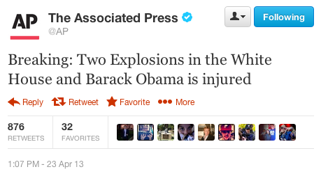
AP 23 April 2013 1:07 PM EDT Hacked Twitter headline On top of that then, the market got weirder. There was another noise event during the day, this time a negative one, after a "verified" Twitter account operated by the Associated Press was hacked with an announcement that two explosions had occurred at the White House and that President Obama was injured.

The false news hit the wires at 1:07 PM EDT. The market responded to this negative noise event by immediately losing nearly 1% of its value in first three minutes following the false news hitting the wires, then took an additional two minutes after that to fully recover as traders overrode automatic trading programs that had been set to immediately sell stocks as soon as possible in the event that news of a terror attack was made public, after they realized that the news was phony in the absence of other breaking news reports to confirm it.

Reuters describes the trading that occurred during that short window of time:

More than 620,000 front-month S&P 500 E-mini futures contracts - the most popularly traded futures contract - and more than 180,000 front-month 10-year Treasury futures contracts changed hands between 1:09 p.m. and 1:12 p.m. EDT (1709 to 1712 GMT) after the tweet.

Here's what the event looked like in the context of the S&P 500 during the day's trading on 23 April 2013:

AP 23 April 2013 1:07 PM EDT Hacked Twitter headline

The time to respond to correct the reaction to this unexpected noise event is consistent with what we've frequently observed for the market's response to "ambiguous" news - where analysis by real-life humans is needed to determine a particular course of action in trading. It normally takes anywhere from two to four minutes for the market to respond to news it wasn't expecting, and the response in the automatic selloff reaction certainly fits within that typical window of time.

That stands in contrast to how the noise event began however, as stock prices responded almost instantly to the false news report, which almost gives the impression that traders were expecting the news!

That perhaps is the danger of programming computers to automatically execute trades in certain pre-defined circumstances - where a response is triggered before any sort of confirmation has occurred. At the very least, it appears that some Wall Street quants will be reviewing and perhaps rewriting a good portion of their code for trading pretty soon!

The really bad news however is that this is exactly the sort of thing that draws Congressional attention and government investigations. We're afraid that there's also going to be some very non-value added testimony in the future for a number of trading institutions.

Finally, the day ended with some good news. As many investors have been speculating for some time, Apple is going to boost their dividend by 15%, to $3.05 per share, so the day wasn't completely lost to noise! Since Apple is still the second-largest component of the S&P 500, Apple's action to boost its dividend does lend support for today's otherwise noise-driven increase in the value of stocks.

Jumat, 19 April 2013

The "Fed Minutes" Noise Event

We love it when we can both identify and quantify a noise event in the U.S. stock market! The accidental early release of the Federal Reserve's Open Market Committee's 19-20 March 2013 meeting minutes on 10 April 2013 gives us some unique data on how the Fed can affect asset prices with its policy statements.

Here's how CNN's Annalyn Kurtz described the content of the FOMC's meeting minutes:

The minutes contained very little new information about Fed policy. The main takeaway is most Fed members think the central bank should continue buying $85 billion in assets a month, at least through midyear.

But some members argued in favor of tapering down the purchases gradually while others didn't see a need to decrease the purchases until the third quarter. Two said some purchases would probably continue into 2014.

Being a journalist, Kurtz likely wouldn't appreciate how this news might affect markets. In committing to continue its current $85 billion worth of asset purchases ($40 billion in mortgage backed securities, $45 billion in U.S. Treasuries) per month through the middle of the year, and with a general consensus that the purchases would continue through the end of 2013, whether at the current level or at a decreasing level, the FOMC eliminated a lot of uncertainty for investors.

In effect, the Fed's policy commits it to sustain long term interest rates at low levels through 2013, which is beneficial for companies that might borrow money to fund their business expansion, and particularly those that use debt to finance their growth. Investors would then gain from that expanded business activity.

Knowing that now, let's look at what the market knew before the Fed acted to remedy its accidental release at 9:00 AM EDT on 10 April 2013, some 30 minutes before the market opened:

Unlike European markets which are sharply increasing today, the S&P 500 should open in a slight rise of 0.2%. It had closed up 0.35% at 1568 points, being very close to absolute records during the day.

At economic level, traders are waiting for Crude Oil Inventories at 10.30 am EST, the Federal Budget Balance and FOMC Meeting Minutes at 2 pm EST which should confirm the continuation of asset purchases by the Fed.

That story was reported at 8:48 AM EDT. A 0.2% increase to open the market would correspond to a value of 1571, just 3 points higher than it closed on 9 April 2013. The following chart shows what happened instead, after investors had over 30 minutes to digest the information contained in the FOMC's meeting minutes, almost an eternity in market time where unexpected information typically affects stock prices within two to four minutes of becoming known, after the market opened for trading at 9:30 AM EDT:

S&P 500 8 April 2013 through 10 April 2013 - Source: Google Finance

Quite a difference! But then, all noise events eventually end - it's only ever a question of when.

S&P 500 Index Value vs Trailing Year Dividends per Share, 1 October 2012 through 18 April 2013

As best as we can tell, the response to the Fed Minutes noise event kept the rally that began after 15 November 2012 alive for a few days longer than it might have otherwise, while also marking the top for the rally.

And that will be the last time we'll feature that particular chart. What the end of order means here is simply that the most recent microtrend for the S&P 500 is over. We'll have more thoughts on that soon!

Kamis, 18 April 2013

On the Verge of a Breakdown in Order

After having a bad day on 15 April 2013, the stock market had a good day on 16 April 2013, as everything looked up. Wall St. Cheat Sheet's John Nyaradi captured the mood:

Among Tuesday’s three upbeat economic reports was the Federal Reserve revelation that industrial production rose by twice as much as expected.

Economists were expecting the U.S. Federal Reserve to report that industrial production increased by 0.2 percent in March. Investors were excited to see that industrial production actually increased by 0.4 percent. The reports on March housing starts and the Consumer Price Index were also better than expected.

Beyond that even, all the big earnings news of 16 April 2013 was good:

Now that earnings season is in full swing, investors are rightfully focusing the majority of their attention on what really matters: earnings reports. A number of the biggest companies reported today, and for the most part, the numbers look good. Positive results from Johnson & Johnson helped pull the health-care industry higher, while Goldman Sachs gave investors reason to believe in the financial industry.

With strong first-quarter results, the Dow Jones Industrial Average made a 180 from yesterday's 265-point drop and rose 157 points, or 1.08%, today. And after losing more than the Dow yesterday, the other major indexes gained more than the blue-chip average today, as the S&P 500 rose by 1.43% and the Nasdaq climbed higher by 1.5% today.

Those gains occurred in all sectors of the market.

But in all this good news, there was an important thing that didn't happen. Not one of these companies reporting such good earnings acted to boost their dividends. That's a crucial missing action that undermined the previous day's run-up in stock prices, because if they thought that the good times were going to go on, some of those great earnings would be converted into cash to benefit their shareholders.

And so, investors looking further forward into the future were left with the picture where there will be a large deceleration in the growth rate of dividends, which directly translates into a negative acceleration for stock prices. Which we certainly saw on 17 April 2013:

S&P 500 Index Value vs Trailing Year Dividends per Share, 1 October 2012 Through 17 April 2013

If you've been following our recent posts that have featured this chart, having stock prices for the S&P 500 close below the bottom red-dashed line would be a "sell signal", as it would indicate that order in the market is breaking down. (Please note that we have adjusted the period of order shown in the chart to conclude with 12 April 2013 - the last trading day before the recent outbreak of volatility.)

We should also recognize that since we're using both a power law-based regression analysis and a statistics-based approach to define these curves, there is a possibility that data points falling outside the red-dashed curves could be outliers for the established trend, rather than an indication that a state of order in the market has broken down. A more conservative approach for making a decision to sell in these circumstances would be to wait for the 20-day moving average of stock prices to fall outside the "normal" range for stock prices with respect to their trailing year dividends per share, which would be a confirmation that a previous state of relative order in the market has ended.

Speaking of which, much of the recent rally in stock prices (aka "the previous state of relative order in the market") was actually powered by changes in how many companies will be paying their top employees rather than by a rapidly improving business outlook for U.S. companies, which has apparently fooled a lot of investors. Here, many companies have really been acting to shift money that might have been paid to their highest earners in the form of wages and salaries to instead be paid out in the form of dividends, helping to keep them from being as negatively impacted by President Obama's higher income tax rates that took effect at the beginning of the year than they might have otherwise. Stock prices largely rose in response as investors also benefit from these kinds of changes in the employee compensation strategies of many corporations.

For serious market observers, the good news is that with most of this tax avoidance-driven activity now complete following the end of the first quarter of 2013, dividends are once again more accurately reflecting the business outlook for the private sector in the U.S.

On the Lighter Side

Finally, here are some fun items following a bleak day. First, for those who pay close attention to the comments we put in the margins of our favorite chart, there is now an open call for the Federal Reserve to amp up its latest quantitative easing program. We guess that only buying $85 billion per month worth of Mortgage-Based Securities (MBS) and U.S. Treasuries isn't enough to prop up the economy anymore.

Second, don't miss CNBC's executive news editor Patti Domm's article "Scary Pattern Could Be Forming on S&P 500 Chart". Knowing the state of the mainstream media these days, and at NBC-affiliated "news" organizations in particular, it's probably a serious piece of financial news reporting, but we couldn't stop laughing while reading it!

Third, have you ever heard of the DeMark 9 indicator? Well, neither had we until yesterday, but then it would also seem to be indicating that the market is on the verge of sending a rare sell signal, so the thing we just threw together a few weeks ago isn't the only game in town!

But that isn't the end of the story. CNBC is also wondering if a market sell signal could be near, based the kind of "highly informative" interview that we've come to expect from all NBC "news" outlets....

Jumat, 05 April 2013

Going Fractal with the S&P 500

When should you sell your stocks?

The Market Is Fractal - Source: Trader's Narrative Not long ago, we indicated that a 150 point decline in the value of the S&P 500 would be a "clear sell signal" for investors.

But then, a week later, we suggested that there might be a less clear sell signal, one that could be used to shrink the amount of a haircut that an investor would have to take when reacting to a pending break down in stock prices. After all, given today's stock prices, a 150-point plunge in the S&P 500's index value would represent nearly a 10% haircut for an investor. Isn't there some way to reduce the size of the hit that would allow an investor to keep more of the gains in the value of their shares after the stock market has started to turn south?

Well, sure there is! An investor could determine some other price level that if stock prices were to fall below, would signal them to sell their stocks.

But how to set that value? If an investor were to set that value too high, they might find themselves exiting the market too soon, long before the rally they had been riding really ends, such as might happen with a short term market reaction to a news (or "noise") event. If an investor were to set that value too low, they would be back to taking a large haircut before finally acting to preserve their gains and cut their losses.

Both possibilities can cost real money. In the first case, the investor not only rings up transaction costs (commissions, fees, etc.) from executing the trades to exit their positions, they also lose out on the gains that the market can still deliver before they might recognize the situation and re-enter the market, where they will pay those transaction fees all over again. In the second case, they are committing to either lesser gains or larger losses as the cost of not acting soon enough.

Today, we're going to discuss a method by which investors might set a sell signal for themselves to avoid these issues, that might minimize the pain of loss value in their investments without losing out on potential gains by reacting either too soon or too late.

But to do that, we're deliberately going to do something wrong. Again!...

"All Models Are Wrong, But Some Are Useful"

Bell Curve with Statistical Equilibrium Control Chart Style Lines Those are the immortal words of statistician George E. P. Box, who just passed away on 30 March 2013.

What we're going to do that's wrong is to assume that the relationship between stock prices and their underlying dividends per share can be described by a Gaussian statistical distribution, a.k.a. "the normal bell curve distribution".

Why that's wrong is because stock prices have been repeatedly demonstrated to not follow that kind of distribution.

There are however relative periods of order in the market where a statistical hypothesis test cannot rule out the possibility that the variation of stock prices with respect to their underlying dividends per share are following a normal distribution. Such as when both stock prices and trailing year dividends per share are closely coupled, meaning that both are generally moving in the same direction (and typically when they are both increasing in value).

At those times, using the math of statistics to model the variation of stock prices with respect to dividends per share becomes not necessarily wrong, but useful.

So that's what we're going to do!

The Current State of Order in the Stock Market

Our chart below shows the current state of order in the U.S. stock market, which has existed since 4 August 2011, following the deflation phase of the QE 2.0 Bubble, which occurred in July 2011.

S&P 500 Index Value vs Trailing Year Dividends per Share, 30 June 2011 Through 4 April 2013

Here, we've plotted the daily closing value of the S&P 500 on the vertical axis against the trailing year dividends per share for the index, shown as increasing in equal increments for each trading day during the quarters in which they were recorded on the horizontal axis. We then used regression analysis to calculate the mean trend line using the power law relationship between these two factors (the upward curving black trend line), and also the standard deviation of the data, for which the multicolored parallel curves are one, two or three standard deviations away from the mean trend curve.

Stable Process That makes this chart similar to the kind of statistical equilibrium or control charts commonly used in manufacturing and other industries. These kinds of charts are typically used to determine if a process is behaving in an orderly or predictable manner and the extent to which they are doing so. For a normal distribution, the values being charted should fall between the plus-or-minus one standard deviation curves about 68.2% of the time, and between the plus-or-minus two standard deviation curves about 95% of the time. Observations should fall between the outermost plus-or-minus three standard deviation curves about 99.8% of the time.

This chart also illustrates where we originally got that 150-point value, which we obtained by measuring the distance between where stock prices were with respect to the lowest boundary of where we would expect stock prices to be if they were behaving "normally". If stock prices were to move below this boundary, that would be a clear indication that something "not normal" is going on with respect to stock prices, which would be our sell signal.

But there's something else - we see that there are three distinct rallies in stock prices during this overall period of relative order in the stock market. What if we zoomed in on each these rallies and repeated this exercise?

Exploiting the Fractal Nature of Stock Prices

When we zoom in on just the three major rallies shown in our previous chart, the variation in stock prices looks really similar to what we saw in our bigger picture. That's because stock prices are fractal in nature - no matter what the scale in which we show them, they look and appear to change similarly, just on a different scale.

We're going to exploit that property in determining when to sell stocks. Our next chart looks at the first rally shown in our first chart, which covers the rally that ran approximately from 19 December 2011 through 2 April 2012:

S&P 500 Index Value vs Trailing Year Dividends per Share, 30 September 2011 Through 30 June 2012

In this chart, we see that the rally for the S&P 500 rose over 1419 (on 2 April 2012) before breaking down quickly, which occurred when stock prices dropped below the lowest "normal" boundary of 1394 for the market's level of dividends by 5 April 2012. An investor would have had a haircut of 2.6% of the market's peak value, or just 37 points of the index' value.

Taking this action would have allowed our hypothetical investor to sidestep what became a 10% loss in the value of their holdings over the next two months time as the order of the rally broke down, before the next rally got started.

Taking 4 June 2012 as the beginning of our next rally, we find the same technique finds a good exit point.

S&P 500 Index Value vs Trailing Year Dividends per Share, 30 March 2012 Through 30 December 2012

Here, the exit point occurred after the S&P 500 peaked over 1465 on 14 September 2012. The point of exit was approximately 1446, which the S&P dropped below the low "normal" boundary of 1436 on 10 October 2012, falling to 1432 and marking a 33 point, or 2.2% loss. Even though stock prices swung back up into the range of "normality" once more, they soon turned downward again before bottoming at 1353, 112 points and 7.7% below the rally's peak.

Note the extent of the volatility during this particular rally - setting too narrow a margin could easily have ejected our investor too soon to be able to maximize their gains from the rally.

The Current Rally

The current rally in the S&P 500 began on 15 November 2012 and has continued through this writing on 4 April 2013.

S&P 500 Index Value vs Trailing Year Dividends per Share, 28 September 2012 Through 4 April 2013

Here we find that given the current level of the S&P 500's trailing year dividends per share of approximately $32.20, our target exit value would be 1531, 39 points or 2.5% below the S&P 500's peak of 1570 set on 2 April 2013. On 15 April 2013, that exit value will rise to 1543, and by the end of April 2013, the target exit value will have risen to 1567.

We've also pointed out two major "noise" events in the stock market - the "fiscal cliff" crisis at the end of 2012 and the market's reaction to the "Italian election" fiasco in February 2013.

The "fiscal cliff" noise event brings up a good question - why wouldn't an investor have bailed out of the market at that time?

The answer is that there was a lot more volatility in stock prices in the period from 15 November 2012 through the end of 2012 than has been the case since. That higher level of volatility translated into a larger standard deviation at the time, which was large enough for the range of so-called "normality" to include the fiscal cliff noise event. Investors using this method would not have received a sell signal!

Since then however, the variation in stock prices has been considerably less, with the range of normality defined by the standard deviation of stock prices now narrower, which is why the fiscal cliff noise event now appears as the outlier it really was.

And that's it - now you know when to sell your stocks following a rally in stock prices - at least through the end of this month! As a bonus, we've provided enough information for you to project your personal sell signal through the end of June.

But then, maybe the real trick is figuring out when you should buy....

Image Credits: Trader's Narrative, Bizpac Management Consultants, Defense Acquisition University.

Kamis, 04 April 2013

Record-Breaking Numbers of Dividend Increases and Decreases

According to Standard & Poor [Excel Spreadsheet], in March 2013, 73 publicly-traded companies in the U.S. acted to cut their dividends, the most since the all-time record of 93 was set in December 2012. To put those numbers in perspective, in a typical month when the U.S. economy is not being dragged down by recessionary conditions, fewer than 10 companies will act to cut their dividends.

Number of Public U.S. Companies Posting Decreasing Dividends, <br />January 2004 through March 2013

But the U.S. economy is not currently in recession, despite having passed through what we'll describe as a microrecession in the fourth quarter of 2012, which is why the number of dividend cuts was so elevated in the second half of 2012 leading up to December. [By our definition, a microrecession is a period of very slow growth or even outright contraction in an economy that is too limited in scope, severity or duration to qualify as a full-fledged recession.] So something else would appear to be going on....

That something else appears to be going on is underscored by the number of dividend increases that have taken place since the end of 2012, as the first quarter of 2013 has seen an explosion in the number of companies announcing dividend increases, with 732 acting to do so at the same time so many companies were acting to cut theirs. By contrast, the first quarter of 2012 saw 552 companies acting to increase their dividends.

Number of Public U.S. Companies Posting Increasing and Decreasing Dividends, <br />January 2004 through March 2013

The reason why the number of dividend increases and decreases has gone absolutely haywire in the months from December 2012 through March 2013 has a lot to do with the unintended consequences of the fiscal cliff tax crisis in the United States at the end of December 2012.

Why So Many Dividend Cuts?

Dollar Down! Here, following the re-election of President Barack Obama, which ensured that higher tax rates would be imposed upon high income-earning Americans, influential investors began taking money out of the publicly-traded companies they own after 15 November 2012, following the President's meeting that day with a number of prominent U.S. corporate executives, in which President Obama failed to put a ceiling on his tax hike ambitions.

Fearing tax rates on dividends that might more than triple when the Bush-era tax rate of 15% for dividends expired at the end of 2012, the boards of some 711 U.S. companies acted to pay out extra or special dividend payments in November and December of 2012. The equivalent figure for 2011 is 214, which suggests that approximately 497 U.S. companies took this particular tax avoidance action on behalf of their shareholders.

In taking this action, many of these companies tapped the funds they were setting aside to pay regular dividend payments in 2013, primarily from the funds that would be used to pay dividends in the first quarter of that year. In doing so, many of these companies recognized that they would not have enough cash flow to fully regenerate all the funds that would be needed to pay out dividends in 2013 at the levels they had previously indicated they would.

Consequently, they also took the step of cutting their dividends. This explains why the number of dividend cuts spiked in the period from December 2012 through March 2013. Overall, some 231 companies acted to cut their dividends in this period, which compares to 27 companies cutting dividends in the same months of 2011.

With the first quarter now over, we expect that most of the fiscal cliff-driven dividend cuts have now taken place, which means the number of companies cutting their dividends each month will go back to being an indication of the relative health of the U.S. economy, much as it was prior to December 2012.

Why So Many Dividend Increases?

Dollar Up! Meanwhile, on 3 January 2013, a deal was reached in the U.S. Congress that put a ceiling of 23.8% on dividends, which represents a 20% tax on dividends plus an additional 3.8% tax that was imposed on dividends earned by high income earners as part of the Patient Protection and Affordable Care Act (a.k.a. "ObamaCare"). At the same time, the top ordinary income tax rate was set at 43.4%, which is the result of combinine the 39.6% top marginal rate and the new 3.8% ObamaCare tax on ordinary income for high income earners.

This difference in tax rates created a very large incentive for the major owners of publicly-traded companies in the U.S., who have the ability to pay themselves either in the form of a salary or in the form of dividends, to take a larger share of money they earned through their companies in the form of dividends rather than salary.

Side Note: Dividends are paid from the funds left over after companies have paid their corporate income taxes. Although the top corporate income tax rate is 35% in the U.S., one of the highest rates in the world, the average U.S. company actually pays around 12% of their net income in corporate income taxes. This is the real reason why the tax rates for both dividends and capital gains are set to be lower than ordinary tax rates, because once dividend and corporate income tax rates are combined, it effectively puts the tax rate on the money used to pay them back up into same level as the top tax rates that are applied against ordinary income.

Here's how that works. With a combined average corporate income and dividend tax rate of 35.8% on the money companies pay out as dividends, taking money in the form of dividends is less costly in taxes than income taken in the form of a salary for people whose ordinary income might place them in the 33%, 35% or the 39.6% tax brackets, which when combined with the new ObamaCare tax on individuals with high levels of ordinary income, can boost the marginal tax rates to as much as 36.8%, 38.8% and 43.4% respectively for these individuals.

The higher one's marginal tax bracket, the more desirable dividends become relative to salaries.

And that's why so many companies have acted to boost their dividends in the first quarter of 2013 following the fiscal cliff tax deal. It's not so much that the economy is improving (it is, but not by as much as dividend-driven stock prices would suggest), but rather, because they are the primary means by which the highly productive individuals behind these companies can keep more of the money they earn from the businesses they own and lead.

Risk of Even Higher Taxes Through Lost Deductions

There is one last element affecting the desire of people who have the ability to receive money from their businesses in the form of salary or dividends. President Obama and members of his party in the U.S. Congress are continuing to push to reduce the amount of tax deductions that high income earners can claim on their income tax returns in order to sustain the excessive level of spending the U.S. federal government has established during President Obama's tenure in office.

Because these tax deductions can only offset the portion of their income earned in the form of either wages or salaries, the continuing risk of having their taxes increased through these "hidden" tax hikes would only further incentivise high income earners to take even greater payments from their businesses in the form of dividends instead of salaries.

But then, that's another aspect of Hauser's Law at work today!