Tampilkan postingan dengan label data visualization. Tampilkan semua postingan

Kamis, 17 Oktober 2013

The Odds of Going to the Hospital

What are the odds that you will need serious medical care?

By "serious medical care", most people will automatically think of a situation where they might need to be admitted to a hospital to receive care for an unforeseen condition, so that's the standard we'll use to answer that question.

Beyond that, we'll break the information down by age and sex, simply because we can see these being major factors that might affect how likely a person will need hospital care.

It turns out to be a really difficult question to answer, because in the U.S., which is where we first sought to get hospital utilization data, tracks hospital discharges - not admissions. The problem with that is that the number of admissions won't necessarily track with the number of discharges, as patients die or perhaps otherwise leave the hospital before being officially discharged.

So we turned elsewhere to answer the question, and specifically to the island nation of Singapore, whose Ministry of Health makes the data not only easy to find, but presents it in a way that helps us answer our specific questions. Our first chart below illustrates the 2011 hospital admission rates by age group and sex per each 1,000 members of Singapore's resident population:

Singapore: 2011 Number of Hospital Admissions per 1,000 Population, (Excludes Normal Deliveries and Legalized Abortions)

One interesting aspect of the data is that we see such high numbers for the 0-4 age group, which drops off dramatically for the 5-9 age group, which really didn't make a whole lot of sense to us at first. Why would a 4-year old have such a dramatically higher probability of being admitted to a hospital over a 5-year old?

We started thinking about it, and realized that the MOH's statisticians gave us a valuable clue - the number of hospital admissions for each 1,000 members of Singapore's resident population doesn't include hospitalizations associated with either normal deliveries for pregnancy or legalized abortions.

While both of these categories would count as foreseeable conditions, we suspect that the reason in the case of normal deliveries was in part to avoid double-counting. Here, where normal deliveries are concerned, we suspect that infants born in Singapore's hospitals are subsequently "admitted" to the hospital after being born, which is how the hospital admissions associated with normal deliveries are tracked.

Beyond that, we can see that the rate of hospital admissions for women of child-bearing age is over twice that of men of the same age, which likely corresponds to pregnancies that involved complicating factors requiring more intensive care, which would not count as a foreseeable condition.

Having worked out why that apparent anomaly exists, we used that knowledge to determine the probability of being admitted to a hospital for both men and women by age, reverse engineering Singapore's age-group based data to approximate the odds by single year of age from Age 0 through Age 84:

Probability of Hospital Admission for Men by Age (Singapore 2011)

Note how nearly 100% of those 0-year olds are admitted to the hospital! Next, let's look at the same data for women from Age 0 to Age 84:

Probability of Hospital Admission for Women by Age (Singapore 2011)

In looking at the differences in the data between men and women, we see that boys are more likely to be admitted to a hospital before Age 4, after which we see that both boys and girls have similar odds up until child-bearing becomes a factor. At that point, women are much more likely to require hospital admission than men (likely for the reasons we noted earlier), up until their mid-forties, after which, men become much more likely to require hospital admission.

The longer lifespan of women with respect to men likely explains that discrepancy, although we were surprised to see how wide that gap was by Age 84, with women having a 50% probability of being admitted to a hospital and men having almost a 90% probability.

References

Singapore Ministry of Health. Hospital Admission Rates* by Age and Sex 2011. [Online Report]. 10 November 2012. Accessed 8 October 2013.


Rabu, 25 September 2013

The Zero Deficit Line: 1967-2012

How much would the U.S. federal government need spend per household to even come close to balancing the annual U.S. federal budget?

The answer is presented in a single picture below:

U.S. Total Federal Government Spending per Household vs Median Household Income, 1967-2012

Comparing the relative location of the Zero Deficit Line on the chart, which is based on the overall trend of the U.S. federal government's total receipts with respect to median household income from 1967 through 2008 (before President Obama was sworn into office), with the level of spending done by the U.S. federal government in 2012, we find that the federal government would have to reduce its spending by $7,690 per U.S. household to even get anywhere close to a balanced budget.

To get a sense of how much money that really is, please consider that in 2012, there were 122,438,420 U.S. households.

Also keep in mind that the U.S. national debt will only continue to rise if the amount of federal government spending keeps falling on the wrong side of the Zero Deficit Line.

References

White House Office of Management and Budget. The Budget for Fiscal Year 2014, Historical Tables. Table 1.1. - Summary of Receipts, Outlays, and Surpluses or Deficits (-): 1789-2017. [PDF Document]. 10 April 2013.

U.S. Census. Current Population Survey. Historical Income Tables: Households. Table H-5. Race and Hispanic Origin of Householder - Households by Median and Mean Income. [Excel Spreadsheet]. 17 September 2013.

Rabu, 04 September 2013

Counterfactual QE

Today, we're presenting a story in a single picture: what would nominal GDP in the U.S. have turned out to be in the face of minor government spending cuts and major tax hikes in the absence of the Federal Reserve's quantitative easing programs of the past year?

Nominal U.S. GDP, with and without QE 3.0 and 4.0, 2012-Q1 through 2013-Q2 (BEA 2nd estimate)

The difference between the nominal GDP that was and the counterfactual of the nominal GDP that otherwise would have been is all due to the Fed's quantitative easing programs, as measured by the cumulative change in total assets held by the Federal Reserve since the end of 2012-Q3. How we measured the relative impact of government spending cuts and tax hikes is explained here and their applicability is explained here.

Rabu, 21 Agustus 2013

Mapping the Income for Welfare vs Work

According to a study by Michael Tanner and Charles Hughes, the money that people can make on welfare in many states is more than they can make in an entry-level job. And in some states, it's more than what a person who works to earn the median income takes home.

The Wall Street Journal describes the findings of the study:

The state-by-state estimates are based on a hypothetical family participating in about seven of the 126 federal anti-poverty programs: Temporary Assistance for Needy Families; the Women, Infants and Children program; Medicaid; Supplemental Nutrition Assistance Program; and receiving help on housing and utilities.

In Hawaii, that translates into a 2013 package of $49,175 — up $7,265 from an inflation-adjusted $41,910 in 1995. Rounding out the top five areas for welfare benefits, along with their 2013 amounts, were: the District of Columbia ($43,099), Massachusetts ($42,515), Connecticut ($38,761) and New Jersey ($38,728).

The state with the lowest benefits package in 2013 was Mississippi, at $16,984, followed by Tennessee ($17,413), Arkansas ($17,423), Idaho ($17,766) and Texas (18,037).

From our perspective, the report is interesting because all the data is presented in the form of tables. That creates an opportunity for us, because we can take that data and visualize it!

So we have, using the data visualization tools available at IBM's ManyEyes site. And what's more, we've taken it to the next level by incorporating an interactive version of the map we created in this post to illustrate each state's typical pre-tax welfare "income", their median incomes, and also their hourly "welfare", median and also minimum wages, which we added for good measure!)

And as a bonus, we also calculated the percent of welfare benefit with respect to each state's prevailing minimum wage, so we can identify all the states where welfare really does pay more than an entry level job.

If you're reading this article on a site that republishes our RSS news feed, you won't be able to play with the interactive map we've created - for that, you'll need to visit the original article on our site.

In the interactive map above, you can show all six of the maps we generated at once, and you can find each state's value for each category by hovering your cursor over it. You can even switch from a color scale on the map to a bubble presentation, which the size of each state's bubble is proportionate to the value being illustrated. You just need to click the "click to interact" button in the top left corner to get started!

References

Tanner, Michael and Hughes, Charles. The Work Versus Welfare Trade-Off: 2013. An Analysis of the Total Level of Welfare Benefits by State. Table 4 - Pretax Wage Equivalents Compared to Median Salaries. CATO Institute. [PDF Document]. 19 August 2013.

U.S. Department of Labor. Wage and Hour Division. Minimum Wage Laws in the States - January 1, 2013. [HTML Document]. Accessed 20 August 2013.


Rabu, 22 Mei 2013

Current Trends for the S&P 500

We thought it might be fun to look at the recent trends in the S&P 500 at several different scales. Our first chart shows the current major trend for the S&P 500 index fits in with respect to the average monthly value of stock prices and trailing year dividends per share recorded since December 1991:

S&P 500 Average Monthly Index Values vs Trailing Year Dividends per Share, December 1991 through 20 May 2013

Note that at this scale, we're tracking the average monthly index value for the S&P 500, which we find by taking the average of the daily closing values for the S&P 500 index in each calendar month, which allows us to tie into Robert Shiller's and the Cowles Commission's historic data for U.S. stock prices.

Let's focus next upon the current major trend in stock prices, which we've marked on the chart above in the red dashed-line box in the upper right corner. Our second chart shows this data in much greater detail:

S&P 500 Daily Stock Prices and 20-Day Moving Average vs Trailing Year Dividends per Share, 4 August 2011 to 20 May 2013

Here, we're showing the S&P 500's daily closing prices along with the 20-day moving average for the index' value, which roughly corresponds to the calendar-month based data we presented on our first chart. While this confuses the more dim-witted among Seeking Alpha's commenters, it works fairly well for our purposes because most months contain at least 20 trading days.

This brings up a good question: how do we define a trend? For our purposes, a trend is defined by a power-law relationship between stock prices and trailing year dividends per share. We consider a trend to be orderly when both dividends per share and stock prices are generally increasing in value over time, in such a way that we cannot rule out that the variation in stock prices with respect to the mean trend curve are normally distributed with a statistical hypothesis test. We consider stock prices to be behaving chaotically whenever that basic relationship is not present.

We'll next focus on the most recent microtrend for the S&P 500, which we've indicated in our second chart with the purple dashed-line box in the upper right hand corner. Our third chart focuses on this zone:

S&P 500 Daily Stock Prices and 20-Day Moving Average vs Trailing Year Dividends per Share, 1 October 2012 to 20 May 2013

In this final chart, we see the fiscal-cliff tax avoidance rally that began on 15 November 2012, which marked the beginning of the period in which publicly-traded companies raided the funds being set aside to pay out dividends in 2013 to instead pay them out in 2012 for the purpose of avoiding the potential tripling of dividend tax rates in the U.S. for their most influential investors. This portion of the rally ended as these investors sold off stocks just before the end of the year to claim capital gains on them before those tax rates would rise as well.

The next portion of the microtrend rally kicked in with the fiscal cliff tax deal shortly afterward on 3 January 2013, which set the maximum tax rate for both dividends and capital gains at 23.8%. Since the fiscal cliff tax deal also hiked the U.S.' top income tax rates up to a maximum of 43.8%, influential investors once again sought to have publicly-traded companies boost their dividends as a means to avoid the higher federal taxes on the wage and salary income they also earn from the companies they own, taking more of their compensation in the form of dividends instead.

And because that change in the structure of compensation for influential investors would also increase the dividend income earned by regular investors, owning stocks has become relatively more attractive, with stock prices continuing to rise in response.

That portion of the recent microtrend ended in late April 2013 following the major announcements made during 2013-Q2's earnings season. Since then, other fundamental factors have contributed to a shift in the quantum level of stock prices, but then, that sort of thing really confuses the cortically-subilluminated among Seeking Alpha's commenters, so we'll just point you backward in time, again, for that remedial discussion....

You know, it occurs to us that if those commenters would just bother to follow the links we provide, they wouldn't keep embarrassing themselves so badly....

Rabu, 17 April 2013

Visualizing FY2014 Federal Budget Spending Proposals

Veronique de Rugy has analyzed the various federal government budget spending proposals now floating around Washington D.C. In the chart below, she shows how much each would spend from now through 2023:

Mercatus Center: FY2014 Budget Proposals Spending through 2023

As always, the challenge in really understanding what these numbers mean is to put them into a more "human" scale. To do that, we've added up the spending for each proposal for each of the ten years spanning the federal government's 2014 through 2013 fiscal years, then divided the result by the combined number of U.S. households per year.

The result, presented graphically below, is the average amount of federal spending per U.S. household being proposed in the nation's capitol.

Average Federal Spending per U.S. Households, FY2014-FY2023

The horizontal black line on the chart represents the Congressional Budget Office's projected total of the amount of taxes that the federal government is likely to collect per U.S. household from FY2014 through FY2023. As you can see, both President Obama's and the Senate's budget proposals fail to come anywhere close to being in balance, as both only provide for token spending cuts. Both instead rely upon large tax hikes to try to close the projected deficits, however this would require the U.S. federal government to maintain its tax collections at levels it has historically not been able to sustain for more than a few years.

By contrast, the House's budget proposal comes close, but is still slightly in the red over the ten year period. We should note however that the House's budget proposal actually does achieve balance at the end of the 10 year period - the reason it's slightly in the red over the ten years from 2014 through 2023 is because of higher deficits that are run the early years of the period. There are no new tax hikes associated with this proposal, which assumes that the federal government's tax collections will be maintained at their post-World War 2 historic average.

Meanwhile, Senator Rand Paul's alternative budget is the only one that achieves balance by a significant margin, primarily due to large spending cuts. Since Senator Paul's proposed budget also reduces taxes, we should note that the resulting surplus would not be as large as indicated.

Projecting the Number of U.S. Households

We built on previous work we did to model the number of U.S. households. You can access those projected numbers using the modified version of that original tool below:


Year of Interest
Input Data Values
Select Year


Number of U.S. Households
Calculated Results Values
Estimated Number of Households


Rabu, 20 Maret 2013

The National Average Minimum Wage

Not long ago, we featured a pretty cool looking chart illustrating the many minimum wages that have applied at the federal and for various states in the U.S. since 1994. Today, we're streamlining things a bit to determine the national average minimum wage for the United States!

To do that, we've calculated the percentage share of each state's population with respect to the combined population of all 50 states and the District of Columbia, and multiplied each state's share of the U.S. population by the greater of either the federal minimum wage or the state's minimum wage. We then summed up the results for each year from 1994 through 2012 to find the population-weighted national average minimum wage for the United States.

Those basic results are presented below:

Nominal Federal vs National Average Minimum Wage, 1994-2012

And here are the results for each year again, this time adjusted for inflation to be in terms of 2012 U.S. dollars!

Inflation-Adjusted Federal vs National Average Minimum Wage, 1994-2012 [Constant 2012 U.S. dollars]

In these charts, the biggest deviations from the federal minimum wage in any given year can be mainly attributed to large population states that have set their minimum wages well above the level set by the federal government. The largest deviation occurred at the beginning of 2007, when states like California ($7.50), Florida ($6.67), Illinois ($6.50), Massachusetts ($7.50), New York ($7.15) and Washington ($7.93) had set their minimum wages significantly above the U.S. minimum wage of $5.15 per hour.

Together, these six states accounted for almost one-third of the U.S. population in 2007, which was enough, when combined with the higher-than-federal minimum wages of smaller population states to boost the population-weighted national average minimum wage to $6.35 per hour, 23% higher than the federal minimum wage on 1 January 2007.

The timing of when these large population states increased their minimum wages over the years also explains an apparent anomaly for those analyzing U.S. national employment data. Namely, why increases in the federal minimum wage would not appear to generate the large reductions in the number of the employed that might be expected in economic theory.

Here, by increasing their minimum wages in advance of when increases in the federal minimum wage have taken place, many states would bear the brunt of reduced employment earlier as a result of this action. By the time the federal minimum wage was increased with respect to the earlier actions of these states, a good portion of the job loss that might reasonably be expected if it were the only minimum wage in the U.S. would have already taken place.

We think that factor goes a long way to explaining why the Age 15-24 population of the U.S. with incomes saw a net decline during the years from 2004 through 2006, which were otherwise characterized by solid economic growth in the U.S.

Demand Curve for Age 15-24 Income Earners, 1994-2011 Weighted for State Population, Constant 2011 U.S. Dollars

It would seem that all it took to make that decline happen during these years was for the large population states of Florida, Illinois, New Jersey, New York and Wisconsin to rashly boost their minimum wages above the federal minimum wage level of $5.15 per hour, as those five states together account for over one-fifth of the U.S. population.

Meanwhile, virtually all of the net decline in the number of Americans between the ages of 15 and 24 with incomes during these years occurred at the levels of annual income that would be most directly affected by the minimum wage increases that occurred in each of these states.

(Note: The data for the Age 15-24 segment of the U.S. population is the most likely to show the real effects of minimum wage increases, because American teens and young adults make up approximately half of all individuals earning wages at or near the federal minimum wage level.)

By the time the federal minimum wage was increased to $5.85 per hour nearly two-thirds of the way through 2007, the impact that might otherwise have occurred was muted, which we see in the number of American 15-24 year olds with incomes declining much less than might otherwise have been expected from the 13.5% increase in the federal minimum wage that took effect on 24 July 2007.

And that's what separates our minimum wage impact analysis from other efforts that only look at the federal minimum wage - we've accounted for the different minimum wages that most affect the population of the United States!


Selasa, 19 Maret 2013

The U.S. Housing Bubble Is Back

Has the U.S. housing bubble begun to reinflate?

Update 27 March 2013: See our update comment below this post!

In the past several months, there has been a lot of speculation to that effect, but so far, no one other than David Stockman has really come out and committed to an affirmative answer. And even Stockman didn't specify when such a new bubble in the U.S. housing market might actually have begun.

But what really sparked our interest in this topic today is the unexpected strength in the number of initial unemployment insurance claims being filed during the last several weeks, which along with the strength of the construction industry cited in the latest employment situation report, suggests that the U.S. housing industry is finally growing signs of robust growth, at least as measured by rising sale prices for homes.

Unfortunately, the apparently robust growth of housing prices in the last several months is suggestive of something other that fundamental factors at work. Fortunately, we developed an early detection method that might be used to confirm if a bubble is present in the housing market and if so, to identify specifically when it began. So, we're going to revisit the data once more to see just what might be brewing under the surface of the U.S. housing sector.

In doing that, we're going to push the envelope with our methods, as we'll be tapping new sources of data for median new home sale prices and median household incomes, in which these data items are reported monthly.

Let's get to work. Our first chart reveals the trailing twelve month average of the median sale prices of new homes sold each month in the United States from January 1963 through January 2013, as reported by the U.S. Census Bureau. The first data point spans the 12 months from January 1963 through December 1963, the second data point spans the 12 months from February 1963 through January 1964, et cetera.

alt="Trailing Twelve Month Average of Median U.S. New Home Sale Prices, January 1963 - January 2013" style="display: block; width: 600px; margin: 10px auto;" />

In preparing this chart, we calculated the trailing twelve month average for median new home sale prices to account for the well-known effect of seasonality in housing sale data.

In looking at the chart, certain things stand out with respect to the apparently steady long term trends that are otherwise evident in the chart. Going from left-to-right, the first unusual thing we see the small upward bump that begins around December 1986 and ends about four years later, as a new steady upward trend takes hold. Continuing to the right, we get to the 800-lb gorilla that represents the inflation and deflation phases of the U.S. housing bubble in the form of the large lump that appears to begin around December 2003 and appears to end around December 2008. We then see a steady trend resume in the two years that follow, which is followed by what appears to be a new spike upward. Could that be a new bubble forming as so many people are speculating just based on house prices alone?

The truth is that you can't really tell from this chart. It may be, or it may not be. For example, what about that four year long small lump from 1987 through 1990? Isn't that a bubble, if only a small one, too? How come we haven't heard about any of that in the economic history books?

The reason for that analytical vagueness is that housing prices are not really a function of time, although they are often treated as if they are.

In reality, housing prices are a very strong function of income. Although other factors can and do affect them, their prices are primarily determined by the household income of those who live in them. What's more, housing prices are very linear functions of income - if you look at housing expenditures by income level, you'll find that it follows a very straight trajectory.

That linear characteristic also applies over time. Here, for example, we would expect to see house prices follow a steady upward trend as household incomes steadily rise over time. If we see deviations from that basic pattern, that tells us that something other than income is affecting house prices, which is what makes our analytical methods so effective.

Today, we'll be doing that with Sentier Research's monthly median household income data, for which we thank Doug Short for converting into nominal (non-inflation adjusted) form, which saves us the hassle of having to match the different inflation-adjustment scales used by the U.S. Census Bureau and Sentier Research.

The downside to using Sentier Research's data is that it only goes back to January 2000. To get around that limitation, we'll also be presenting the U.S. Census Bureau's annually-reported median household income data, which goes back to 1967, and which we'll use as the backdrop for establishing the long-term trends evident in the U.S. housing market.

As we did with the monthly median new home price data, we'll be calculating the trailing twelve month average for these figures as well, so they have had the same adjustment, providing as much as an apples-to-apples basis for drawing conclusions from what we find. Our initial result is presented below:

U.S. Median New Home Sale Prices vs Median Household Income, 1967-2013

In this chart, we're able to determine that there have been two major long-term steady trends. The first ran from 1970 through 1986, as median new home sale prices were consistently about four times (4.07X) the value of the median household income.

This trend ended when the Tax Reform Act of 1986 made it more desirable to have a large mortgage when the tax deductibility of other kinds of consumer debt was eliminated. Enacted into law on 22 October 1986, median new home prices began increasing significantly after November 1986, rising rapidly in 1987 before settling onto a new steady, long-term trajectory with respect to median household income, in which median new home sale prices averaged about 3.6X the amount of median household income. It turns out that the dip at the end of the "small lump bubble" is really the result of the recession that accompanied the Persian Gulf War following Iraq's invasion of Kuwait in 1990, which depressed housing prices along with incomes at the time.

That new trend continued through 2000, until the onset of the U.S. Housing Bubble in December 2001.

Here, after the Dot-Com Stock Market Bubble peaked as a monthly average in August 2000, large amounts of money began flowing out of the U.S. stock market. It was slow at first, as the market declined by less than 10% through March 2001, but that quickly changed as the deflation phase of the Dot-Com Bubble became much more volatile as the U.S. economy went through a period of recession.

With stock prices swinging by 10%-20% of its peak value in any given month through October 2001, many stock market investors either took their losses or pocketed their gains from the Dot-Com Bubble and exited the market. That money didn't sit around idly, as much of it went into the U.S. housing market instead during that time, which enjoyed growth despite the recession throughout 2001 as a result. The recession ended in November 2001, just as interest rate cuts by the Federal Reserve helped pull mortgage rates to their lowest level in more than a generation. November 2001 marks the true launching point for the U.S. Housing Bubble.

Afterward, housing prices began skyrocketing month after month as the U.S. Federal Reserve compensated for both the recession and the 11 September 2001 terrorist attacks by holding interest rates at levels far lower than economic conditions would warrant for a sustained period of time. Our next chart focuses more closely on the U.S. housing bubble years:

U.S. Median New Home Sale Prices vs Median Household Income, 1999-2013

U.S. housing prices continued their rapid ascent through September 2005, before beginning to decelerate on their upward trajectory as the U.S. housing bubble neared its peak, as the Fed's series of quarter point interest rate increases finally boosted them to levels that actual economic conditions warranted. The peak came on March 2007, after which median new home sale prices held level through October 2007. The deflation phase of the U.S. housing bubble then began in the following months, as the U.S. entered into deep recession.

The trailing twelve month average of median new home sale prices then bottomed in December 2009 before beginning to recover and rise in 2010. However, median household income continued to fall for another year, and it was not until December 2010 that a new steady, upward trend began to form in the U.S. housing market as median household incomes began to rise once again.

The new period of order in the U.S. housing market saw median new home sale prices stabilize at roughly 3.34X the value of median household income, which is fairly consistent with the other long-term periods of relative order in the U.S. housing market.

That period of order came to an end after July 2012. Beginning in August 2012, something else other than household income has begun affecting the median sale prices of new homes in the United States. Through January 2013, median new home sale prices are growing at a rate that is consistent with what we observed during the initial inflation phase of the U.S. housing bubble following the end of the U.S. recession in November 2001.

We therefore conclude that the U.S. housing bubble has effectively reignited, with a new inflation phase having taken hold since July 2012.

The question that remains to be answered is "why?" We'll take that question on in upcoming posts.

Update 27 March 2013: We've digested the just-published income and new home price data for February. It will take another two-three months of data to confirm this, but the early indication is that the "bubble" we identified above ended in December 2012, with a new trend taking effect beginning in that month. Our preliminary thinking is that the rapid runup in home prices from July 2012 through December 2012 may be related to the fiscal cliff crisis at the end of 2012. We'll have more on what we're seeing in April....

References

Sentier Research. Table 1. Household Income Trends: January 2000 to January 2013 (in January 2013 $$). [Excel Spreadsheet with Nominal Median Household Incomes courtesy of Doug Short]. Accessed 13 March 2013.

U.S. Census Bureau. Median and Average Sales Prices of New Homes Sold in the United States. [Excel Spreadsheet]. Accessed 13 March 2013.

U.S. Census Bureau. Income, Poverty, and Health Insurance in the United States: 2011. Current Population Survey. Annual Social and Economic Supplement (ASEC). Table H-5. Race and Hispanic Origin of Householder -- Households by Median and Mean Income. [Excel Spreadsheet]. 12 September 2012. Accessed 13 March 2013.


Kamis, 14 Maret 2013

Single Person Households in the U.S. Since 1900

How many single person households were there in 1909? Or 1945? Or 2011?

Those aren't necessarily easy questions to answer, but today, we're going to first by visualizing the number of single person households in the United States since 1900, and then by presenting a tool to extract the data from our visualization. To do that, we'll use all the data we've been able to obtain from the U.S. Census Bureau, which up until 1960, isn't very much. That limitation is what makes those questions not so easy to answer!

To get around that limitation, we've created a model of the percentage share of single person households for each year since 1900 for the data that we do have available, which we can then use to estimate the number of single person households over time in conjunction with our previously introduced model describing the total number of U.S. households since 1900!

All that work comes together in our chart below:

Number of U.S. Households and Single-Person U.S. Households Since 1900 (Through 2011)

You can use the following tool to extract the estimated number of households or single person households for any given year shown in the chart above, along with the percentage of single person households among all U.S. households.


Year of Interest
Input Data Values
Select Year


Estimated Number of Households
Calculated Results Values
Total U.S. Households
Single-Person Households
Percentage Share of Single Person Households

If you are accessing this content on a site that republishes our RSS news feed, please click this link to access a fully functional version of this tool in our original post.

References

Political Calculations. Modeling U.S. Households Since 1900. 8 February 2013.

U.S. Census Bureau. Statistical Abstract of the United States: 2003. Table No. HS-12. Households by Type and Size: 1900 to 2002. [PDF Document].

U.S. Census Bureau. Demographic Trends in the 20th Century. Table 13. Households by Size for the United States: 1900 to 2000. [PDF Document].

U.S. Census Bureau. Table HH-4. Households by Size: 1960 to Present. Excel Spreadsheet].

Social Indicators 1976. Selected Data on Social Conditions and Trens in the United States. Table 2/17. Average Household Size, Single-Person Households as a Percent of All Households, and Number of Divorces per 1,000 Population, Selected Countries and Years: 1955-1975. [Online Book]. December 1977.

Kamis, 07 Maret 2013

Visualizing the Minimum Wages in the U.S.

There is more than one minimum wage in the United States.

In 2013, no fewer than 19 states and the District of Columbia have set their statutory minimum wages to be higher than that set by the U.S. federal government. In these states, the higher minimum wage set by the state rules the jobs scene for employees and employers.

For the other 31 states, whose legislatures might have set lower minimum wage levels or who even have no minimum wage level set by state law, except for some pretty limited circumstances, the U.S. federal minimum wage rules.

Our chart below visualizes how today's "higher-than-federal" minimum wage mandating states have changed their minimum wages over time, from 1994 through this point in 2013:

Minimum Wage of States That Currently and Chronically Maintain Higher Minimum Wages than the U.S. Federal Government, 1994-2013

What that all means is that the effective minimum wage across the entire United States is somewhat higher than that set by the U.S. federal government. To find out what that really is, which would be necessary for any serious analysis of the impact of anything other than the timing of a minimum wage increase on the entire U.S. economy, we would need to take into account the minimum wages of states with higher minimum wages by weighting the average minimum wage in the U.S. by state population.

Which is something we might need to set some time aside to do one of these days!

Reference

U.S. Department of Labor. Wage and Hour Division. Changes in Basic Minimum Wages in Non-Farm Employment Under State Law: Selected Years 1968 to 2013. [HTML document]. Accessed 6 March 2013.

Rabu, 30 Januari 2013

The Distribution of Net Wealth in the United States

We didn't know this until yesterday, but apparently, our "What's Your Income Percentile?" tool is the second most highly ranked result on Google if you search for "household wealth percentile". Which we found out only because someone who works for the Federal Reserve Board came to our site after performing that exact search on Monday, 28 January 2012!

Well, that's not good enough, is it? We want to own the #1 result for that particular Google search and we're going to get it by building a tool that you can use to see how your household's net worth ranks among all U.S. households!

But first, we'll need to you to determine your household's net worth, for which we'll point you to Bankrate.com's Net Worth Calculator.

Once you have it, enter your household net worth into our tool below, and we'll estimate your percentile ranking among all Americans (as recorded by the U.S. Census in 2010!) [If you're among those Americans who owe far more on your loans than you have assets or who are still underwater on your mortgage and have a negative net worth as a result, enter your net worth as a negative value - just like the default value!]


Household Net Worth Data
Input Data Values
Your Household Net Worth


Your Household's Net Worth Percentile Ranking
Calculated Results Values
Your Household Net Worth Percentile

And now you know just what percentage of U.S. households have a net worth that is equal to or lower than yours! Our chart below shows our model for the distribution of net worth in the United States and how it compares to the data recorded by the U.S. Census.

U.S. Distribution of Net Worth, 2010

That dot in the upper right hand corner? That's the highest net worth we could find for an American, which according to Bloomberg, turns out to be Bill Gates, who had a net worth of over $64.4 billion on Monday, 28 January 2013.

Data Source

U.S. Census Bureau. Net Worth and Asset Ownership of Households: 2010. [Excel Spreadsheet]. Accessed 28 January 2013.

Update 9 March 2013: Retitled from "The Distribution of Net Worth in the United States".

Selasa, 22 Januari 2013

How Long Do You Have Left to Live at Age 65?

We have a project we're working on behind the scenes here at Political Calculations, where we keep having to work backward in time to figure out when an average American man or woman who has reached Age 65 in a given year was born, and then forward in time to project the year to which they can reasonably expect to live if they have the same average remaining life expectancy of a man or woman who reached Age 65 in the year that they did!

So rather than keeping doing the math, we've constructed a couple of visual aids to make it quicker to get our answers. First, we've tapped the U.S. Centers for Disease Control's data for remaining life expectancy for people who reached Age 65 in each year from 1950 through 2009:

Remaining Life Expectancy at At 65, 1950 - 2009

And then, using that data, for the birth years that correspond to the year in which the American men or women turned 65, we worked out the year to which these individuals can reasonably expect to live given the CDC's remaining life expectancy estimates, which we've presented in our second chart below.

Well, not so fast. Since that data, while useful for our purposes, would make for a pretty uninteresting chart to share with all of you, we've added some extra information to it. We've identified the range of birth years that would correspond to the legal minimum (17) and maximum (45) ages of enlistment for military service in World War 2, along with a special range that corresponds to those who would have been 26 years old during the war - the average age of U.S. servicemen in the Second World War.

Year to Which an Average U.S. Man or Woman Can Expect to Live, Provided They Have Reached Age 65 and Have Average Remaining Life Expectancy

If you look closely, those aren't straight lines in the chart above - they actually curve upward ever so slightly!

Some Cool Facts

The oldest living Congressional Medal of Honor winner from World War 2, Nicholas Oresko, just turned 96 years old on 18 January 2013, which puts his birth year of 1917 right in the middle of our highlighted "Age 26 during World War 2" range.

We note that the youngest legally-enlisted servicemen, those born in 1928 who would have been Age 17 in 1945, could reasonably have expected to live to 2008, given the average life expectancy for people born in that year who later turned Age 65 in 1993. By that standard, every veteran of WW2 alive today is someone who has lived longer than the average American born in the same year they were.

Here's hoping that all the remaining veterans of WWII continue to exceed the average American's lifespan expectations!

Selasa, 18 Desember 2012

Visualizing Teens Working Full or Part Time

Today's data visualization exercise features the Bureau of Labor Statistics' data reporting the number of U.S. teens working either full or part-time, which goes back to January 1968. Our first chart improves on the BLS' data, by showing how both full and part-time working 16 to 19 year olds make up the complete teen employment scene:

Number of Employed U.S. Teenagers (Age 16-19) by Work Status, January 1968 - November 2012

Looking at the chart, we see that full-time jobs for teens peaked in 1979, while we see that part-time jobs for teens peaked in 1999. Overall, the number of part-time jobs for teens has been more stable than the number of full-time jobs, which have been declining since 1980.

The decline in full-time jobs for teens is especially visible in our second chart, which shows how the relative share of full-time jobs for teens has declined in stages over time:

Share of U.S. Teenagers (Age 16-19) Working Full- or Part-Time, January 1968 - November 2012

As a short primer to the reasons why the decline in the relative share of full-time jobs for U.S. teens looks the way it does, we'll point you to one document, which reveals the history of both the U.S. federal and California's minimum wages. Note the timing of when major shifts occur in our two charts with the dates listed....

Senin, 17 Desember 2012

The Growth Trend of Americans Living Alone

Following on the heels of our finding that the increase in the share of single person households over time is the primary factor in the observed increase in U.S. income inequality for households over the last six decades, we thought it might be interesting to share what we found in the U.S. Census' data from 1940 onward regarding the growth trend of Americans living alone.

Our chart below reveals the general trend for how single person households grew from 7.7% of all U.S. households in 1940 to an estimated 27.5% in 2011.

Percentage of Single Person Households in the United States, 1940-2011

Here, we find that the percentage share of single person households in the U.S. doubled in the 28 years from 1940 to 1968. It then took another 20 years for the percentage share of single person households to more than triple its 1940 level, reaching that mark in 1988. Since that time, the growth rate of householders living alone has sharply decelerated. The percentage share of single person households has only increased by 3.5% in the last 23 years.

In essence, the number of single-person households in the U.S. grew exponentially from 1940 into the mid-1960s, then steadily from then until about the early 1980s and at a decelerating pace in the years since.

Data Sources

U.S. Census Bureau. Households by Size: 1960 to Present. [Excel spreadsheet]. Accessed 16 December 2012.

U.S. Census Bureau. Historical Census of Housing Tables: Living Alone. Accessed 16 December 2012.

Kamis, 06 Desember 2012

The Discovery of the Unseen

The planet Neptune has never been seen by anyone looking at the night sky through just their own eyes. So distant is it from the sun that the light it reflects toward the Earth is so faint that the planet is effectively invisible in the darkness of night. And yet, the outermost large planet of our solar system was discovered by astronomers who knew exactly where to look....

Following William Herschel's discovery of Uranus in 1781, the world's astronomers went to work to observe and describe the seventh planet of the solar system, taking detailed measurements of its trajectory in space.

Illustration of the Pull of a More Distant Planet Forty years later, French astronomer Alexis Bouvard published detailed tables describing Uranus' orbit about the sun. More than that however, his tables incorporated the lessons learned about planetary orbits from Johannes Kepler and Sir Isaac Newton to chart the path Uranus would follow into the future.

But then, something strange happened. Significant discrepancies between Bouvard's projected path for Uranus and its actual orbit began to be observed - irregularities that were not observed in the tables he had created to describe the orbital paths of the planets Jupiter and Saturn using the same methods. Soon, observations and detailed measurements confirmed that Uranus was moving along a path that was not described by Bouvard's careful calculations.

These irregularities led Bouvard to hypothesize that an as yet unseen eighth planet in the solar system might be responsible for what he and other astronomers were observing.

Voyager 2 Image of Neptune, emphasizing the 'Great Dark Spot' Over twenty years later, astronomer Urbain Le Verrier was working on the problem, taking a unique approach to resolving it.

What made Le Verrier's work unique is that he applied the math developed by Sir Isaac Newton to describe the gravitational attraction between two bodies to solve the problem. Here, he used Newton's theory to anticipate where an as yet unknown, but more distant planet also orbiting the sun would have to be to create the effects observed upon the position of the planet Uranus in its orbit.

Le Verrier completed his calculations regarding the position of the hypothetical eighth planet on 1 June 1846. A little over three months later, on 23 September 1846, the planet Neptune was observed for the first time at almost exactly the position in space where Le Verrier predicted it would be, confirming Newton's gravitational theory in the process.

We're going to do something similar today to explain why household income inequality in the United States has increased over time, even though there has been no change in individual income inequality.

From Darkness to Discovery

Our first chart below is based on data taken from the U.S. Census' data [Excel spreadsheet] on the inflation-adjusted median and mean income for all Americans from 1947 through 2010, which we've presented in terms of constant 2010 U.S. dollars. For reference, we've also indicated the NBER's official periods of recession in the U.S. during this period with the shaded red vertical bands on the chart:

U.S. Individuals Real Median Income with Recessions from 1947 through 2010

Next, we took the U.S. Census' breakdown of inflation-adjusted median income for both men and women for each of these years [Excel spreadsheet] and used the math that applies to log-normal distributions to construct the combined median income that applies to individuals. Our results are shown in the chart below, along with the actual median incomes reported by the U.S. Census so we can compare our calculated results with them:

U.S. Individuals Real Median Income by Sex with Recessions from 1947 through 2010

As you can see, our calculated results in creating a weighted median from the subsets of median income data for men and women are very close to the actual real median income numbers for all individuals. Here, because per capita income has been demonstrated to follow a log-normal distribution, we are able to use this math to either combine or extract subsets of data that have never been officially presented.

As an aside, we achieved the results above by treating the reported median income data the way we might calculate a weighted average. The beauty of the log-normal distribution math is that we can do this with medians, which we ordinarily could not do otherwise.

In the chart above, you can see the effect of the changing composition of the U.S. workforce, as the relative share of women earning incomes in the United States has increased since 1947. In 1947, the median income for individuals is much closer to the median income for men than it is for women. By 2010 however, we see that the median income for individuals is about halfway in between the median incomes for men and for women, reflecting that nearly equal share that both sexes now have among all individual income earners in the U.S.

Extracting The Unseen

The U.S. Census Bureau provides the median income data for individuals (or persons), men and women. It also reports median income data for both male and female wage or salary earners [Excel spreadsheet], whom we'll simply describe as Working Men and Working Women.

Using the math we demonstrated above with this data, we can extract the median incomes for two categories of people for whom the U.S. Census has never reported median incomes: men and women with incomes who do not earn wages or salaries, or as we'll describe them from now on, Non-Working Men and Non-Working Women! Today, we're putting what we found for all U.S. individual income earners together for the first time:

U.S. Individuals Real Median Income by Sex and Working Status with Recessions from 1947 through 2010

Constructing Households

Now, let's combine our median income earners into two-person households, pairing working men and women, working men and non-working women, non-working men and working women and finally non-working men and non-working women. We've shown our results below, along with the U.S. Census' official median income for U.S. households:

U.S. Couples Median Real Income with Recessions, 1947-2010

Well, look at that! The households formed by our single-wage and salary income earning couples from 1947 through 2010 closely parallels the actual real median income for U.S. households with a working man and non-working woman over that time (except for the years 1974 through 1977, where there seems to be an anomaly in the Census' data for working men - and here, the actual median splits the difference!) Also keeping in mind that the actual median household income might include the income contributions of additional people (say individuals between the ages of 16 and 24 who might be working part time at minimum wage jobs while also attending school and living at home with their parents), which likely accounts for the difference between the two, we've pretty much just demonstrated that we can successfully model basic U.S. households using just the data that applies for U.S. individuals.

But wait! What about single person households? Our next chart throws them into the mix as well!

U.S. Households Median Real Income with Recessions, 1947-2010

Using the figures for 2010, we approximated the income percentiles for each of our single and two-person median income earning households. The table below reveals our results (our model should put each approximated percentile within 0.2 of the actual percentile!):


Household Type 2010 Median Income Approximate Income Percentile
Working Men and Working Women $64,075 61.4
Working Men and Non-Working Women $50,026 50.7
Working Women and Non-Working Men $49,344 50.1
Non-Working Men and Women $35,295 36.7
Working Men Only $37,102 38.6
Working Women Only $26,973 27.7
Non-Working Men Only $22,371 22.4
Non-Working Women Only $12,924 11.5

It occurs to us that all we would need to increase the income inequality among households in the United States is to increase the nation's percentage of single person households among all households. That would work by increasing the number of households at the lower end of the income spectrum, even though it would have absolutely no effect upon the measured income inequality for individuals. The U.S. Census Bureau shows the change in the number of single person households since 1960:

U.S. Census Bureau: Percent of Single Person Households, 1960-2011

Here's the U.S. Census Bureau's Gini index measure of the amount of income equality among U.S. households for the years from 1947 through 2010:

Phil Wendt's Studio: Figure 1. Gini Index of Income Dispersion, 1947-2010

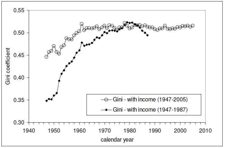
And here is the Gini index measure of the amount of income equality among U.S. individuals for the years from 1947 through 2005 (the data since 2005 is presented here - it's similar to all that recorded since 1960 in the chart below):

The relevant data in the chart above is the Gini measure indicated with the hollow circles, which is based on the "fine", or more detailed, income bins reported by the U.S. Census in its annual Current Population Survey. The other data in the chart, indicated by solid diamonds, represents income distribution data reported by the U.S. Census in larger, or more "coarse" income bins, which are less detailed and are therefore a much less accurate measure of the nation's level of income inequality in any given year.

Intersections and Connections

Looking at where all the data in these three charts intersect and overlap, What we find is that since 1960, the level of income inequality for U.S. individuals as measured by the "fine" Gini index is nearly constant, but has increased significantly for U.S. households. What has changed over that time is the composition of U.S. households, with a steady increase in the percentage of single person households.

Without a corresponding increase in the measured income inequality for U.S. individuals, the increase in the measured income inequality for U.S. households has been almost entirely driven by the increase in the number of single person households over time.

So income inequality among U.S. households isn't increasing because the rich are getting richer. That means that policies intended to right this situation by going after the rich in the name of "fairness" are guaranteed to fail, because the real cause of the increase in income inequality among U.S. households over time is something that cannot be fixed by such actions.

If only the people pushing such policies could see that....

And that concludes our eighth anniversary post. Thank you for joining us today - we greatly appreciate your choice to spend so much time with us (we really do try to draft shorter posts!)

Celebrating Political Calculations' Anniversary

Our anniversary posts typically represent the biggest ideas and celebration of the original work we develop here each year. Here are our landmark posts from previous years:

  • A Year's Worth of Tools (2005) - we celebrated our first anniversary by listing all the tools we created in our first year. There were just 48 back then. Today, there are nearly 300....

  • The S&P 500 At Your Fingertips (2006) - the most popular tool we've ever created, allowing users to calculate the rate of return for investments in the S&P 500, both with and without the effects of inflation, and with and without the reinvestment of dividends, between any two months since January 1871.

  • The Sun, In the Center (2007) - we identify the primary driver of stock prices and describe a whole new way to visualize where they're going (especially in periods of order!)

  • Acceleration, Amplification and Shifting Time (2008) - we apply elements of chaos theory to describe and predict how stock prices will change, even in periods of disorder.

  • The Trigger Point for Taxes (2009) - we work out both when, and by how much, U.S. politicians are likely to change the top U.S. income tax rate. Sadly, events in recent years have proven us right.

  • The Zero Deficit Line (2010) - a whole new way to find out how much federal government spending Americans can really afford and how much Americans cannot really afford!

  • Can Increasing the Minimum Wage Boost GDP? (2011) - using data for teens and young adults spanning 1994 and 2010, not only do we demonstrate that increasing the minimum wage fails to increase GDP, we demonstrate that it reduces employment and increases income inequality as well!

  • The Discovery of the Unseen (2012) - we go where so-called experts on income inequality fear to tread and reveal that U.S. household income inequality has increased over time mostly because more Americans live alone!

References

Kitov, Ivan. "Modeling the evolution of Gini coefficient for personal incomes in the USA between 1947 and 2005," MPRA Paper 2798, University Library of Munich, Germany. 2007.

Lopez, J Humberto and Servén, Luis. "A Normal Relationship? Poverty, Growth and Inequality". World Bank Policy Research Working Paper 3814, 2006.

Pinkovskiy, Maxim and Sala-i-Martin, Xavier. "Parametric Estimations of the World Distribution of Income". NBER Working Paper No. 15433. October 2009.

Political Calculations. The Distribution of Income for 2010: Households. 14 September 2011.

U.S. Census Bureau. Changing American Households. [PDF document]. C-SPAN. 4 November 2011. p. 6.

U.S. Census Bureau. Table P-2. Race and Hispanic Origin of People by Median Income and Sex: 1947 to 2010. [Excel spreadsheet]. September 2011.

U.S. Census Bureau. Table P-4. Race and Hispanic Origin of People (Both Sexes Combined) by Median and Mean Income: 1947 to 2010. [Excel spreadsheet]. September 2011.

U.S. Census Bureau. Table P-53. Wage or Salary Workers (All) by Median Wage and Salary Income and Sex: 1947 to 2010. [Excel spreadsheet]. September 2011.

Wendt, Phil. Income Disparity by the Numbers. Phil Wendt's Studio. 26 December 2011.