Tampilkan postingan dengan label math. Tampilkan semua postingan

Kamis, 10 Oktober 2013

How Much Would a Federal Default Affect the U.S. Economy?

Since the single topic of the press conference that President Obama staged with his party's media collaborators on Tuesday, 8 October 2013 revolved around the topic of what could happen if the U.S. government chooses to default on its debt obligations, or as will more likely be the case, doesn't default on those obligations and instead doesn't spend as much as U.S. politicians would like it to spend, we thought we would go straight to the bottom line and find out how much the U.S. economy would be affected.

But first, we'll need some numbers, which CNBC tracked down for us:

Treasury Secretary Jack Lew is about to face the very same choices confronted by any financially struggling American household: Which bills to pay and when to pay them.

If Congress fails to raise the debt ceiling by around Oct. 17, Lew, who has been in the job less than a year, will have to sit at his desk and figure out how to make due on roughly one-third less in the way of government funds for the bills he has to pay. Because he can no longer borrow, according to the Bipartisan Policy Center, government spending will fall by about 32 percent, or $108 billion in the first month.

On a side note, to put that situation in context, this is no different from what could very well happen just 20 years from now when Social Security's trust fund has been fully depleted, as expected. At that time, the federal government will reduce all payments to Social Security beneficiaries by roughly 26%, unless it significantly increases the amount it borrows. And that's if everything goes as U.S. politicians have promised without any spending reform - this is one reason why the political fight over the debt ceiling and government spending levels is taking place now, because waiting will make needed reforms so much more painful. Not to mention, more necessary.

Back now to the question at hand: how much would a government spending cut of that magnitude affect GDP?

The good news is that we can answer that question with just back-of-the-envelope math! And we can do it on a "daily" basis.

The Multiplier Effect - Source: Lion Investing That $108 billion reduction in federal government spending works out to be $3.6 billion per day. We know that the GDP multiplier for all government spending in the U.S. is 0.6, which we know from research published by the U.S. Federal Reserve applies when the nation's official unemployment rate is over 7.5%. Which is the case at present, thanks to the furloughing of federal government employees! If it were under 7.5%, we would need to use a GDP multiplier of 0.5 to account for the shock of a sudden change in government spending, as government spending is considered to deliver even less of an impact to GDP when the economy is in a healthier state.

Taking our potential government spending reduction of $3.6 billion per day, and multiplying it by our GDP multiplier for government spending of 0.6, we find that the U.S. economy will lose out the equivalent of $2.16 billion worth of GDP per each day that Uncle Sam doesn't have his credit limit reset to a higher level.

Now, to measure the impact upon GDP, just multiply that number by the number of days the U.S. federal government operates in that situation!

If played out through the remaining 78 days of 2013, assuming we stick with President Obama's planned schedule for putting the U.S. federal government into default, that would reduce the nation's GDP for the fourth quarter of 2013 by $168.48 billion.

To put that number into perspective, the fiscal drag produced by the $56.3 billion by which U.S. federal taxes will be higher in the fourth quarter of 2013 than they were in the fourth quarter of 2012 thanks to President Obama's tax hikes that took effect back in January 2013, GDP in the U.S. will be nearly $168.92 billion smaller in 2013-Q4 than it would otherwise have been given the GDP multiplier for taxes.

Why, that's almost exactly the same amount! Perhaps that explains why President Obama has been so intent on doubling down on his "no negotiation with the duly elected representatives of American citizens" strategy - he'll produce twice the negative fiscal drag on the U.S. economy in 2013-Q4 if only he and his supporters can stick with it!

And yes, numbers like those mean a recession, as the Federal Reserve's quantitative easing programs won't produce enough juice for the economy to offset that kind of fiscal drag, offsetting only somewhere between $250 billion and $290 billion of the hit if the debt ceiling isn't increased by 31 December 2013.

Of course, if the debt ceiling situation is resolved sooner than than, it is very much possible that the U.S. will have positive economic growth in 2013-Q4 - only seeing slower growth than it would have had instead. Which is pretty much the story for every quarter during President Obama's entire tenure in office.


Rabu, 02 Oktober 2013

How Much Will Furloughed Government Employees Reduce GDP?

How much will the furloughing of a reported 815,932 federal government employees, or 18.5% out of its estimated total of 4.4 million employees, which includes all military and postal service employees in addition to its civilian executive branch employees, reduce the United States' GDP?

Government Shutdown: What You Need To Know - Source: Department of Defense

Since most of the federal government's spending will be quickly caught up once the partial government shutdown ends, most of the negative impact to the nation's GDP will be felt through the loss of income that is not earned by the furloughed federal government employees. Consequently, we'll just focus on this aspect of the federal government shutdown.

Since the 815,932 furloughed employees are part of the 2,005,239 civilian members of the executive branch of the U.S. government, we'll use the average federal employee annual income of $74,436 for this portion of the federal government workforce to estimate the scope of the furlough upon the U.S. economy.

Readers should note that the average income of federal government employees is over 24% greater than the average income of $59,804 that is earned by Americans who work all-year-round in full-time jobs, and does not include the $40,000 worth of benefits that the average federal government employee also receives in compensation. We will not consider the value of these benefits in this analysis because the furlough is unlikely to last long enough for the furloughed federal employees to lose any of these benefits.

On a side note, if you'd like to see what your percentile ranking would be among the civilian employees of the federal government's executive branch, we have an app for that!

Since the impact will be measured by the number of days that these federal government employees are furloughed, we'll need to determine just how much each earns on average per work day. Since federal government employees are paid for not working on federal holidays, which is one of their benefits, we will not include federal holidays in our calculation, which means that we are assuming that federal employees will work on just 251 days in 2013, which puts the average income earned per furloughed federal government employee per work day at $296.56.

From here, we've built a tool to do the relevant math to find out how much the nation's GDP might be reduced just from furloughing these 815,932 federal government employees. You're welcome to modify the input fields to consider your own hypothetical scenario - for our part, we've entered 21 days as the hypothetical work day duration of the furlough, which would correspond to the partial federal government shutdown lasting one calendar month (because most federal government employees work only five days per week).

As always, if you're reading this article on a site that republishes our RSS news feed, click here to access a working version of this tool!


Furloughed Federal Employee Information
Input Data Values
Civilian Executive Branch Employees to be Furloughed [USD]
Average Annual Income of Civilian Executive Branch Employees
Number of Workdays per Year
Number of Workdays Federal Employees Will Be Furloughed
Nominal U.S. Gross Domestic Product [billions USD]


Impact Upon GDP
Calculated Results Values
Average Federal Employee Income per Workday
Total Income Not Earned by Furloughed Federal Employees
Percentage of U.S. GDP for Total Income Not Earned

For the default values in our tool, we find that the United States' nominal GDP would be reduced by 0.030% if the furlough of these 815,239 federal government employees extends for as long as 21 work days, which would fully cover the entire first calendar month in which the federal government might be partially shut down.

That would be a worst-case scenario.

Unemployment Line - Source: labor.mo.gov

The first thing to keep in mind is that like the public school employees who aren't considered to be employed during their schools' spring breaks, federal government employees being furloughed for an extended period of time are likely to apply for and receive unemployment insurance benefits, which will not be affected by the federal government shutdown in states that were prepared for it, and which will partially offset the impact of any loss income for these individuals.

The amount of unemployment compensation they might receive will vary by where they are stationed, their annual income and also by how long they are furloughed. Since most federal government employees are stationed in Washington D.C., Maryland and Virginia, the maximum weekly benefit they might be paid in unemployment compensation is $405, $410 or $378 respectively, which is likely what most would receive since federal employees are in the top tier of all income earners in the U.S.

While they would likely file their initial unemployment insurance claim this week, they wouldn't receive any unemployment benefits unless and until they have not been working for seven calendar days. Assuming that the furlough extends at least that length of time, once they do begin receiving this compensation, the negative economic effect to the nation of their being furloughed would be reduced by roughly 25%.

So, instead of a negative impact of 0.030% on the nation's GDP, the U.S. economy would instead experience a negative impact of just 0.022% as the result of the furloughed federal government employees not earning any income. Of course, that also doesn't consider other welfare programs of which furloughed federal government employees might soon get to take advantage, such as the Supplemental Nutrition Assistance Program (a.k.a. "food stamps"), which also is not affected by the shutdown.

The answer then to the question we asked in the original title for this post is "yes, there will be a very small and negative effect on GDP", but with numbers like these, even if the partial U.S. government shutdown continues for an extended period of time, the negative effect will be almost indistinguishable from noise.

And we're afraid that the Federal Reserve's decision to not begin tapering its QE programs sooner, when many had expected it to trim the program by $10 billion per month, almost double the amount of income that furloughed federal employees would not earn in that time, means that the Fed has already effectively acted to neuter the negative effects of the partial federal government shutdown on the U.S. economy by keeping its QE programs going at the levels they are.

Elsewhere on the Interwebs

National park expert Warren Meyer weighs in on the single most negative aspect of the partial federal government shutdown, and also on one analyst's estimate of the impact to the national government if it lasts one month. Somebody at Moody Analytics needs to do a better job in putting their decimal points in the right places!...


Kamis, 06 Juni 2013

Keeping the Big Dominoes from Falling

Can the failure of a single, small entity possibly cause the collapse of a much larger entity?

The answer, of course, is yes, provided that the failure of the small entity triggers the release of a greater amount of destructive energy than it took to make it fail. If that release of pent-up destructive energy then triggers the subsequent failure of a larger entity, then the potential for a sustained chain reaction that grows in scale exists. This is called a cascading failure.

It's kind of like dominoes, where a small domino can be set to knock down a larger one, which can then spark off a chain reaction where larger and larger dominoes can be made to fall (HT: PhysOrg).

Here, once the dominoes are lined up and have begun to fall, the only thing that can avoid the collapse of the entire system is an active intervention that creates a gap to interrupt the systemic failure.

That's kind of like how a crime wave can be suppressed in a community through a dramatic increase in police activity after it has started, provided the community wants the crime to stop. Note the parallels to a cascading failure in the basic description below for how a crime wave can take hold in the quoted passage below:

Crime can happen anywhere, but it usually doesn't.

Researchers have noticed that criminal activity seems to be concentrated in self-perpetuating hotspots. Crime leads to more crime. Then, from these epicenters, crime spreads outward through the community.

Mathematicians have a model they've used to study this kind of behavior. It's called a reaction-diffusion-advection system, and criminologists have found it a useful way to analyze issues like "near-repeat victimization" – the observation that single neighborhoods, and even single households, see a disproportionate share of crime.

What criminologists Nancy Rodríguez, Lenya Ryzhik and Henri Berestycki have recently found however is that whether a crime wave can propagate itself depends greatly upon the attitude that the people within the community have with respect to crime itself.

Here, if a community is "pro-crime" or is neutral toward crime, or rather, when a community is not positively supportive of law enforcement, a crime wave cannot be suppressed once it has begun. But if the community is opposed to crime, or is positively supportive of law enforcement, then the crime wave can be arrested, provided a large enough intervention can be deployed to create a gap in the criminal activity. It all comes down to the prevailing choice of the community.

This choice is significant, because a crime wave spreading through a pro-crime population can't be entirely stopped. You end up, Rodríguez said, "always having crime everywhere."

The news is nearly as bad when the population has a neutral attitude toward crime. Although crime primarily persists in hotspots, waves of crime are just as unstoppable.

But if the population has an overall anti-crime stance – meaning that the population is more reluctant to engage in criminal activity – two outcomes are possible. High crime rates can spread, but so can waves of zero criminal activity. And, unlike in the other scenarios, high crime rates can be stopped by adding in a "gap."

In the world of the model, the gap is a stretch of space where the incentive to commit a crime is zero. This corresponds to real-life disincentives to commit crimes, such as an increased police presence, with longer gaps representing more anti-crime efforts.

Rodríguez found that a long enough gap – a large enough police crackdown, for instance – will completely contain a crime outbreak.

The same logic applies toward financial systems, where the only thing that prevents an economic collapse from occurring after the failure of a small entity is the trust that people have in government and financial institutions for the interventions they might undertake to create sufficient gaps in the financial system to prevent the small failure from propagating into a wide-scale one.

If people increasingly distrust those institutions, then the risk of a cascading failure grows, because the interventions that might otherwise be effective in arresting a series of failures after they have begun would be rendered impotent.

That, more than anything else, is what is at stake in the abuse of power scandals and increase in crony capitalism in Washington D.C. Or for that matter, in the ongoing economic crises within the European Union.

In both cases, we'll only know if the balance has been tipped from stability toward instability as once-small failures can no longer be contained from spreading to cause larger and larger failures.

Elsewhere on the Web

The WSJ reports that the Bank of International Settlements may have finally discovered how to create the needed gap to keep the failure of a "too-big-too-fail" bank (ala Lehman Brothers) from collapsing the entire financial system.

Update 7 June 2013: A sharp-eyed reader points us directly to the BIS study.

Kamis, 06 Desember 2012

The Discovery of the Unseen

The planet Neptune has never been seen by anyone looking at the night sky through just their own eyes. So distant is it from the sun that the light it reflects toward the Earth is so faint that the planet is effectively invisible in the darkness of night. And yet, the outermost large planet of our solar system was discovered by astronomers who knew exactly where to look....

Following William Herschel's discovery of Uranus in 1781, the world's astronomers went to work to observe and describe the seventh planet of the solar system, taking detailed measurements of its trajectory in space.

Illustration of the Pull of a More Distant Planet Forty years later, French astronomer Alexis Bouvard published detailed tables describing Uranus' orbit about the sun. More than that however, his tables incorporated the lessons learned about planetary orbits from Johannes Kepler and Sir Isaac Newton to chart the path Uranus would follow into the future.

But then, something strange happened. Significant discrepancies between Bouvard's projected path for Uranus and its actual orbit began to be observed - irregularities that were not observed in the tables he had created to describe the orbital paths of the planets Jupiter and Saturn using the same methods. Soon, observations and detailed measurements confirmed that Uranus was moving along a path that was not described by Bouvard's careful calculations.

These irregularities led Bouvard to hypothesize that an as yet unseen eighth planet in the solar system might be responsible for what he and other astronomers were observing.

Voyager 2 Image of Neptune, emphasizing the 'Great Dark Spot' Over twenty years later, astronomer Urbain Le Verrier was working on the problem, taking a unique approach to resolving it.

What made Le Verrier's work unique is that he applied the math developed by Sir Isaac Newton to describe the gravitational attraction between two bodies to solve the problem. Here, he used Newton's theory to anticipate where an as yet unknown, but more distant planet also orbiting the sun would have to be to create the effects observed upon the position of the planet Uranus in its orbit.

Le Verrier completed his calculations regarding the position of the hypothetical eighth planet on 1 June 1846. A little over three months later, on 23 September 1846, the planet Neptune was observed for the first time at almost exactly the position in space where Le Verrier predicted it would be, confirming Newton's gravitational theory in the process.

We're going to do something similar today to explain why household income inequality in the United States has increased over time, even though there has been no change in individual income inequality.

From Darkness to Discovery

Our first chart below is based on data taken from the U.S. Census' data [Excel spreadsheet] on the inflation-adjusted median and mean income for all Americans from 1947 through 2010, which we've presented in terms of constant 2010 U.S. dollars. For reference, we've also indicated the NBER's official periods of recession in the U.S. during this period with the shaded red vertical bands on the chart:

U.S. Individuals Real Median Income with Recessions from 1947 through 2010

Next, we took the U.S. Census' breakdown of inflation-adjusted median income for both men and women for each of these years [Excel spreadsheet] and used the math that applies to log-normal distributions to construct the combined median income that applies to individuals. Our results are shown in the chart below, along with the actual median incomes reported by the U.S. Census so we can compare our calculated results with them:

U.S. Individuals Real Median Income by Sex with Recessions from 1947 through 2010

As you can see, our calculated results in creating a weighted median from the subsets of median income data for men and women are very close to the actual real median income numbers for all individuals. Here, because per capita income has been demonstrated to follow a log-normal distribution, we are able to use this math to either combine or extract subsets of data that have never been officially presented.

As an aside, we achieved the results above by treating the reported median income data the way we might calculate a weighted average. The beauty of the log-normal distribution math is that we can do this with medians, which we ordinarily could not do otherwise.

In the chart above, you can see the effect of the changing composition of the U.S. workforce, as the relative share of women earning incomes in the United States has increased since 1947. In 1947, the median income for individuals is much closer to the median income for men than it is for women. By 2010 however, we see that the median income for individuals is about halfway in between the median incomes for men and for women, reflecting that nearly equal share that both sexes now have among all individual income earners in the U.S.

Extracting The Unseen

The U.S. Census Bureau provides the median income data for individuals (or persons), men and women. It also reports median income data for both male and female wage or salary earners [Excel spreadsheet], whom we'll simply describe as Working Men and Working Women.

Using the math we demonstrated above with this data, we can extract the median incomes for two categories of people for whom the U.S. Census has never reported median incomes: men and women with incomes who do not earn wages or salaries, or as we'll describe them from now on, Non-Working Men and Non-Working Women! Today, we're putting what we found for all U.S. individual income earners together for the first time:

U.S. Individuals Real Median Income by Sex and Working Status with Recessions from 1947 through 2010

Constructing Households

Now, let's combine our median income earners into two-person households, pairing working men and women, working men and non-working women, non-working men and working women and finally non-working men and non-working women. We've shown our results below, along with the U.S. Census' official median income for U.S. households:

U.S. Couples Median Real Income with Recessions, 1947-2010

Well, look at that! The households formed by our single-wage and salary income earning couples from 1947 through 2010 closely parallels the actual real median income for U.S. households with a working man and non-working woman over that time (except for the years 1974 through 1977, where there seems to be an anomaly in the Census' data for working men - and here, the actual median splits the difference!) Also keeping in mind that the actual median household income might include the income contributions of additional people (say individuals between the ages of 16 and 24 who might be working part time at minimum wage jobs while also attending school and living at home with their parents), which likely accounts for the difference between the two, we've pretty much just demonstrated that we can successfully model basic U.S. households using just the data that applies for U.S. individuals.

But wait! What about single person households? Our next chart throws them into the mix as well!

U.S. Households Median Real Income with Recessions, 1947-2010

Using the figures for 2010, we approximated the income percentiles for each of our single and two-person median income earning households. The table below reveals our results (our model should put each approximated percentile within 0.2 of the actual percentile!):


Household Type 2010 Median Income Approximate Income Percentile
Working Men and Working Women $64,075 61.4
Working Men and Non-Working Women $50,026 50.7
Working Women and Non-Working Men $49,344 50.1
Non-Working Men and Women $35,295 36.7
Working Men Only $37,102 38.6
Working Women Only $26,973 27.7
Non-Working Men Only $22,371 22.4
Non-Working Women Only $12,924 11.5

It occurs to us that all we would need to increase the income inequality among households in the United States is to increase the nation's percentage of single person households among all households. That would work by increasing the number of households at the lower end of the income spectrum, even though it would have absolutely no effect upon the measured income inequality for individuals. The U.S. Census Bureau shows the change in the number of single person households since 1960:

U.S. Census Bureau: Percent of Single Person Households, 1960-2011

Here's the U.S. Census Bureau's Gini index measure of the amount of income equality among U.S. households for the years from 1947 through 2010:

Phil Wendt's Studio: Figure 1. Gini Index of Income Dispersion, 1947-2010

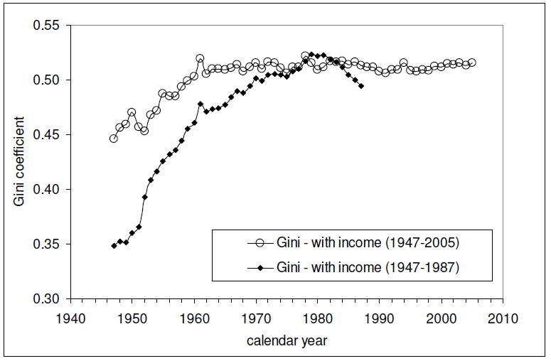
And here is the Gini index measure of the amount of income equality among U.S. individuals for the years from 1947 through 2005 (the data since 2005 is presented here - it's similar to all that recorded since 1960 in the chart below):

The relevant data in the chart above is the Gini measure indicated with the hollow circles, which is based on the "fine", or more detailed, income bins reported by the U.S. Census in its annual Current Population Survey. The other data in the chart, indicated by solid diamonds, represents income distribution data reported by the U.S. Census in larger, or more "coarse" income bins, which are less detailed and are therefore a much less accurate measure of the nation's level of income inequality in any given year.

Intersections and Connections

Looking at where all the data in these three charts intersect and overlap, What we find is that since 1960, the level of income inequality for U.S. individuals as measured by the "fine" Gini index is nearly constant, but has increased significantly for U.S. households. What has changed over that time is the composition of U.S. households, with a steady increase in the percentage of single person households.

Without a corresponding increase in the measured income inequality for U.S. individuals, the increase in the measured income inequality for U.S. households has been almost entirely driven by the increase in the number of single person households over time.

So income inequality among U.S. households isn't increasing because the rich are getting richer. That means that policies intended to right this situation by going after the rich in the name of "fairness" are guaranteed to fail, because the real cause of the increase in income inequality among U.S. households over time is something that cannot be fixed by such actions.

If only the people pushing such policies could see that....

And that concludes our eighth anniversary post. Thank you for joining us today - we greatly appreciate your choice to spend so much time with us (we really do try to draft shorter posts!)

Celebrating Political Calculations' Anniversary

Our anniversary posts typically represent the biggest ideas and celebration of the original work we develop here each year. Here are our landmark posts from previous years:

  • A Year's Worth of Tools (2005) - we celebrated our first anniversary by listing all the tools we created in our first year. There were just 48 back then. Today, there are nearly 300....

  • The S&P 500 At Your Fingertips (2006) - the most popular tool we've ever created, allowing users to calculate the rate of return for investments in the S&P 500, both with and without the effects of inflation, and with and without the reinvestment of dividends, between any two months since January 1871.

  • The Sun, In the Center (2007) - we identify the primary driver of stock prices and describe a whole new way to visualize where they're going (especially in periods of order!)

  • Acceleration, Amplification and Shifting Time (2008) - we apply elements of chaos theory to describe and predict how stock prices will change, even in periods of disorder.

  • The Trigger Point for Taxes (2009) - we work out both when, and by how much, U.S. politicians are likely to change the top U.S. income tax rate. Sadly, events in recent years have proven us right.

  • The Zero Deficit Line (2010) - a whole new way to find out how much federal government spending Americans can really afford and how much Americans cannot really afford!

  • Can Increasing the Minimum Wage Boost GDP? (2011) - using data for teens and young adults spanning 1994 and 2010, not only do we demonstrate that increasing the minimum wage fails to increase GDP, we demonstrate that it reduces employment and increases income inequality as well!

  • The Discovery of the Unseen (2012) - we go where so-called experts on income inequality fear to tread and reveal that U.S. household income inequality has increased over time mostly because more Americans live alone!

References

Kitov, Ivan. "Modeling the evolution of Gini coefficient for personal incomes in the USA between 1947 and 2005," MPRA Paper 2798, University Library of Munich, Germany. 2007.

Lopez, J Humberto and Servén, Luis. "A Normal Relationship? Poverty, Growth and Inequality". World Bank Policy Research Working Paper 3814, 2006.

Pinkovskiy, Maxim and Sala-i-Martin, Xavier. "Parametric Estimations of the World Distribution of Income". NBER Working Paper No. 15433. October 2009.

Political Calculations. The Distribution of Income for 2010: Households. 14 September 2011.

U.S. Census Bureau. Changing American Households. [PDF document]. C-SPAN. 4 November 2011. p. 6.

U.S. Census Bureau. Table P-2. Race and Hispanic Origin of People by Median Income and Sex: 1947 to 2010. [Excel spreadsheet]. September 2011.

U.S. Census Bureau. Table P-4. Race and Hispanic Origin of People (Both Sexes Combined) by Median and Mean Income: 1947 to 2010. [Excel spreadsheet]. September 2011.

U.S. Census Bureau. Table P-53. Wage or Salary Workers (All) by Median Wage and Salary Income and Sex: 1947 to 2010. [Excel spreadsheet]. September 2011.

Wendt, Phil. Income Disparity by the Numbers. Phil Wendt's Studio. 26 December 2011.

Senin, 22 Oktober 2012

The Real Trend for New Jobless Claims

What's wrong with using moving averages to assess trends in economic data? After all, it's a practice that is endorsed by the Federal Reserve.

That question arises today because of the WSJ's Josh Mitchell's analysis from last Friday, which suggests that initial jobless claims are trending down:

The number of Americans applying for unemployment insurance has fallen sharply since summer. The four-week moving average of first-time jobless claims inched up by 750 last week to 365,500. But the figure was below mid-June’s level of more than 387,000 claims. That is a sign that employers are laying off fewer workers and the job market could be healing.

And so it would seem, except there was a huge problem in the data for the week ending 6 October 2012, which might best be described as a California-sized hole in the data:

Last week, California reported a large drop in applications, pushing down the overall figure to the lowest since February 2008.

This week, it reported a significant increase as it processed applications delayed from the previous week. (Read More: Why Jobless Claims May Not Be as Good as Market Thinks.)

A department spokesman says the seasonally adjusted numbers "are being distorted ... by an issue of timing."

Since the Labor Department's four-week moving average for new jobless claims includes this data reporting anomaly, where one week's data was recorded more than 10% below where it might otherwise have been reported (if the California state government's Employment Development Department had properly processed and reported its claims from that week), this measure fails to provide an accurate depiction of the current trends for new jobless claims in the U.S.

In this case, the effect of the data reporting anomaly makes the situation for new jobless claims look better than it really is. Worse, at this writing, that data anomaly will be used to calculate the moving average in new jobless claims for another two weeks yet, which means that the distorted impression it creates will be with us through the Tuesday, 6 November 2012 national election, until it is no longer included in the Labor Department's calculation of the four-week moving average for the new jobless claims report it will issue on Thursday, 8 November 2012!

It is the moving average's inability to recognize data outliers that represents one of its greatest weaknesses. Based on only four data points, the four week moving average just isn't capable of accounting with outliers in a practical manner!

That's where the statistical control chart-style approach we've developed over the last several years can do a much better job. Here's what the recent data looks like from our perspective:

Residual Distribution for Seasonally-Adjusted Initial Unemployment Insurance Claims, 19 November 2011 - 13 October 2012

The major trends in the chart above, identified by the letters "I" through "K", are described in greater detail here (along with Trends "A" through "H"!)

The current trend, "K", began after the national average for gasoline prices fell below $3.50 per gallon in early June 2012. As gasoline prices have generally risen since that time, we've observed a generally rising trend in the number of new jobless claims filed each week.

Treating the 6 October 2012 data point as an outlier, we find that through the week ending 13 October 2012, the number of new jobless claims being filed each week, a proxy for the rate of job layoffs in the U.S., is currently rising at an average rate of over 1800 per week - a rate that is faster than at any time since the U.S. last fell into deep recession in mid-2008. This rate of increase also excludes another data point outlier for the week ending 14 July 2012, where the BLS' seasonal adjustments didn't account for a delay in the typical mid-year plant shutdowns in the automotive industry.

That's likely a bit inflated, as the state of California is playing catch up in reporting the large number of claims it failed to process in the week ending 6 October 2012. If we exclude the initially-reported data for last week, we find that the number of new jobless claims in the U.S. is rising at a rate of over 1500 per week. That would still be the fastest rate of increase recorded for new jobless claims in the U.S. since the nation fell into deep recession in mid-2008.

As for whether it ever makes sense for using a moving average to evaluate this kind of data, we'll say that it does, but only for certain unique occasions. Since our statistics based method needs at least 6 to 10 data points to establish whether a trend exists, a moving average might provide a useful picture in the limited period of time following when a break in an established trend occurs until our method can define the new trend.

But once that trend is defined, our method provides a more accurate picture of what's actually going on in the economy. Right now, the real trend for new jobless claims indicates a rising number of layoffs each week in the U.S., which is something the Labor Department's four-week moving average will confirm in the form of a sudden increase after the election.

Selasa, 14 Agustus 2012

Men, Women, Income and Recessions

We're revisiting the average and median incomes of men and women in the U.S. today because we've been using that data behind the scenes to prove out whether or not we could successfully determine these values for a combined population using only that data for the component sub-populations that make up the combined population, or vice versa.

As it happens, we could get pretty close to the actual values. The mean (average) income data was fairly easy to do, which we've shown below in our updated chart, where we've also indicated periods of recession (for the sake of not duplicating the chart we had previously posted and for providing additional context):

Mean Real Income in the U.S. by Sex, with Recessions, 1947 - 2010

The trick here for calculating the average income of the combined population was to calculated the weighted average for the sub-populations - our results nearly matched the actual values recorded by the U.S. Census.

Working with the median income data however was a bit more difficult. Here, we took advantage of the fact that the distribution of income in the U.S. follows a log-normal pattern, which means that if you calculate the natural logarithm of income before graphing the distribution, the data will follow the normal, bell-curve shaped distribution that is pretty common in statistics.

Using the math that applies for log-normal distributions, we took the mean and median income data for the sub-populations and calculated their respective population means and standard deviations. We then took the weighted average of their population means, from which we calculated the median income for the combined population in each year, from which we got results that were really close to the actual values, paralleling them from 1947 through 2010.

Median Real Income in the U.S. by Sex, with Recessions, 1947 - 2010

When we say "really close", each of our calculated values were within about 2% of the actual values recorded by the U.S. Census in its Current Population Survey results. In the chart above, we multiplied our results by a scale factor of nearly 1.02 to shift our calculated values upward to more closely align with the actual values.

This isn't just an academic exercise. The real reason we've gone through this whole procedure is because we're going to be using the same math to extract information from the Census' annual income distribution data that has never really been examined before and we needed a test case to show that it works. And while we won't have the benefit of being able to check our results against actual data, you can reasonably expect that the trends we'll be presenting in that project will directly parallel the actual ones, and will very likely be within about 2% of them as well.

That's the beauty of the math!

Kamis, 28 Juni 2012

The "Hit" Equation for Box Office Gold!

A team of Japanese physicists and mathematicians has developed a mathematical equation for predicting whether or not a movie will become a hit at the box office!

Detailed in their article, "The 'hit' phenomenon: a mathematical model of human dynamics interactions as a stochastic process" in the June 2012 edition of the New Journal of Physics, the new model replaces the traditional method of forecasting the likely revenue for a movie, which incorporates aspects such as advertising budget, strength of word-of-mouth, star power, quality, et cetera.

These aspects still have a role, but the innovation in the Japanese physicists approach is to incorporate data from social network systems, such as blogs, to quantify the less tangible aspects of the factors that influence whether or not a movie will become a blockbuster, at least at the Japanese box office.

One of the more remarkable findings of the research is that the number of positive blog posts about a movie can be used to project its revenue:

Daily blog postings for a movie are a very important signal to measure the movement of purchase intention among persons in the society. We measure the daily data of the number of posts for movies using the site Kizasi, which is a service for observing blog postings in Japan. We measure the number of blog posts for 25 movies in Japan in order to compare this information with the box office gross income for each movie in Japan....

Blog postings for each film can be distinguished into positive, negative and neutral opinions. A positive opinion means that the blogger wants to watch the film or judges the watched film in a positive way. In figure 10, we show that more than half of the blogs show a positive opinion for several movies. Moreover, we find that the ratio of positive, negative and neutral opinions is almost constant during the duration of the movie opening. Thus, the observed blog posting counts can be considered to be proportional to the counts of positive blog posts.

According to this observation, we propose to use the daily number of blog posts as the daily 'quasi-revenue.'. Quasi-revenue is very useful for analysis, because it can be defined even before the opening of the movie. We can observe the increase in anticipation of a movie.

And because they've worked out how to use the data from social networking systems to measure the anticipation for a movie, they can do very well in predicting whether a movie will actually become a hit, as well as what kind of longevity it might have if it does!

If only Hollywood had thought to do that before releasing John Carter. Or Battleship. Or Rock of Ages. Or any of these movies!

Kamis, 24 November 2011

Happy Thanksgiving!

We couldn't resist sharing the following image, stolen from here, which brings our love of food, math and Thanksgiving all together:


C/D = pi

Have a Happy Turkey Day!