Jumat, 28 September 2012

The Bike That Rides You

Are you looking for the next great fitness and personal transportation craze? If so, meet the Fliz concept bike, a contender for this year's James Dyson Award (HT: Core77)!


That's going pretty far to avoid the pain and discomfort associated with the typical bicycle seat! More thoughts here from The Droid Guy's Phalgun Shenoy....

Kamis, 27 September 2012

Applying Technical Analysis to Employment Data

How might a stock market technical analyst see the U.S. employment situation?

For us, that's a fun question because while we don't put much stock in technical analysis, we do consider it to be a very weak form of statistical analysis, so it's not as completely useless as astrology in divining data.

In practice, there's really not much more to technical analysis other than arbitrarily connecting the dots between the peaks and troughs of data points within a trend, combined with trying to divine patterns from the data, like the infamous "head and shoulders" pattern or the equally fun "dead cat bounce".

So to make it interesting, we've opted to apply it to the month-over-month change in the number of employed Americans counted by the Bureau of Labor Statistics in each month since the total employment level in the United States peaked in November 2007, just one month before the economy peaked before heading into recession, and specifically, we'll use it to try to answer the question: "how much of the jobs recovery can be attributed to policies implemented during President Bush's administration, and how much can be attributed to policies implemented during President Obama's reign in office?"

Here's what we find:

Month Over Month Change in Number of Employed Americans, November 2007 Through August 2012

In the chart, we're applying Mark Thoma's effectiveness lag for determining when a particular policy to take effect after being put into place. According to Professor Thoma, once a fiscal or monetary policy has been put into place by the U.S. government or the Federal Reserve, it takes anywhere from 6 to 18 months for its effect to impact the U.S. economy.

What we find is that the recovery from the bottom of the recession in January 2009 through June 2009, the official end of the U.S. recession, can only be attributed to policies implemented during the Bush administration, as no policy implemented by the Obama administration could have had any meaningful effect upon the economy during these six months.

That trend of improvement then continued during much of the period of overlap between the times when policies implemented during either President Bush's or President Obama's tenures in office could have affected the monthly employment data. In fact, if this were a trend in a stock price, a technical analyst would have been screaming to go "all in" at the time because of its upward momentum!

However, we see that the trend of improvement established during President Bush's administration dies out toward the end of that overlap period, as the trend in the employment situation in the U.S. during the period where only policies implemented during President Obama's time in office would have a stronger and stronger effect.

Here, those policies had at first a negative impact, as they killed off the trend of improvement that had already taken root when President Obama came into office (here we note that the bottom for job loss during the recession had been postponed by a month by actions taken by President Bush, who sought to delay the largest layoffs in the automotive industry's history until after the Christmas holiday in 2008.) Since ending the trend of improvement for jobs however, they've had what might be described as a neutral effect, as the policies adopted by President Obama and the Federal Reserve since January 2009 have had little effect on the change in month-over-month employment other than to see it drift sideways in a very weak recovery - one incapable of restoring the jobs lost during the recession.

Perhaps the strong recovery they inherited explains why President Obama's economics team predicted that the U.S. unemployment rate would never exceed 8% in the four years from 2009 through 2012 - they were counting on that positive momentum to continue. Little did they know that the economic policies they adopted in the early days of President Obama's administration would prove to be so impotent, acting instead to kill off the recovery they actually inherited and leaving the nation's economy adrift in the economic doldrums in all the years since....

Rabu, 26 September 2012

The Recovery in Housing Prices

Housing prices in the U.S. appear to have stabilized, at least in the short term, at a level of affordability about 14-16% above the typical levels recorded in the ten years preceding the U.S. housing bubble:

How Overpriced Are New Homes in the United States? (1987-2011)

To achieve that level of stability, the U.S. Federal Reserve had to push long-term interest rates below the levels the market would otherwise set to all-time low levels, which it has primarily done using its quantitative easing programs of the last several years. Since the beginning of the long-anticipated new round, QE 3.0 (or "QE Infinity" since the program would appear to not have a planned termination date), 30 year mortgage rates have fallen to 3.49%, an all-time low.

US 30-Year Mortgage Rates - Source: YCharts

The following chart shows the relationship between U.S. median new house prices and median household income, which provides the basis by which we can measure the relative affordability of houses over time:

Median New House Prices vs Median Household Income in the United States, 1967-2011

In a sense, U.S. housing prices are being stabilized by one of the main factors that enabled the formation of the bubble in U.S. real estate markets in the first place: the Fed's policies of holding interest rates below the levels that the market would otherwise support. Should that artificial support be removed, we would anticipate that U.S. housing prices would fall sharply in response to the higher interest rates that would follow.

Selasa, 25 September 2012

The Zero Deficit Line in 2012

Now that the U.S. Census has released its newest estimate of median household income in the United States, it's time to consider where the U.S. federal government spending per U.S. household stands with respect to the Zero Deficit Line, which is the amount of spending that the typical American household can actually afford. The chart below shows those two measures for each year since 1967, when the Census first began reporting its median household income figure:

Looking at the chart, we see that for the third year in a row, the amount of U.S. federal government spending per household is hovering just below $30,000 per U.S. household. Our tool below will reveal how much spending can actually be supported by the typical American household given its annual income of $50,054 (or whatever median household income level you might choose to enter!)


Median Household Income Data
Input Data Values
Median Household Income


How Much Federal Spending Per Household Can the U.S. Really Afford?
Estimated Results Values
Federal Spending per U.S. Household

Using our tool, we find that in reality, the typical American household can only afford to have the federal government spend no more than $21,059.

On a side note, do you remember the old Warner Brothers' Road Runner cartoons? The ones where Wile E. Coyote would be chasing after the bird, then suddenly find himself suspended in mid-air beyond the edge of a cliff, until he looked down and finally crashed back to earth?

The level of federal spending per household since 2008 and the lack of meaningful growth in the incomes of U.S. households under President Obama, combined with all the talk these days of the approaching "fiscal cliff" suggests that there is one giant "splat" sound in the near future for the U.S.

Senin, 24 September 2012

The Present According to Dividends: U.S. Entering Recession

Last month, we stumbled across a unique potential indicator for measuring the current health of the U.S. economy: the number of publicly-traded U.S. companies acting to cut their dividend payments each month.

Since then, we now have data for two additional months, July and August 2012. Our chart below, focusing on the number of U.S. companies declaring that they will acto to decrease their dividends in each month since January 2004:

Number of Public U.S. Companies Posting Decreasing Dividends, January 2004 through August 2012

The chart represents data collected and published by Standard and Poor for U.S. companies whose common stock is traded on the American Stock Exchange, the New York Stock Exchange and various Nasdaq stock exchanges. Since January 2004, the data reported by S&P covers the information for anywhere from a low of 2,148 companies (January 2010) to a high of 3,716 companies (December 2011) in any given month.

In the chart, we've identified recession territory as being consistent with more than 10 U.S. companies per month acting to cut their dividend payments to investors. We observe that when the number of companies cutting their dividends in any given month is below that level, the U.S. economy would appear to be in relatively good health.

In August 2012, we find there were 17 U.S. companies that acted to cut their dividends, suggesting that recessionary forces are presently at work in the U.S. economy.

Jumat, 21 September 2012

A Sharply Increasing Trend in U.S. Layoffs

The BLS' report on the number of new jobless claims filed in the week ending 15 September 2012 indicates that the pace of layoffs in the United States is accelerating at the fastest pace since the 2007 recession began.

Closeup of Residual Distribution for Weekly Seasonally-Adjusted Initial Unemployment Insurance Claims, 26 March 2011 through 15 September 2011

At present, the average rate of increase in the number of initial unemployment insurance benefit claims filed each week since the most recent trend began on 7 July 2012 has reached 2,800 per week. That figure is greater than the average rate of increase of 1,641 layoffs per week that was recorded as the U.S. entered into recession in December 2007. That figure held through 26 July 2008, when high oil and gasoline prices accelerated the recession into high gear, increasing the rate of new layoffs in the U.S. to 7,599 per week.

You can see how today's rate of increase in the rate of new jobless claims being filed compares with those observed in the 2007 recession in our chart showing the residual distribution of the major trends for layoffs since the beginning of 2006 (see here for a description of the primary trends indicated on our chart below):

Like the sharp increase in 2008, we believe that today's high oil and gasoline prices are driving the sharp increase in the trend for U.S. layoffs.

Unlike previous situations when the price of gasoline increased beyond the $3.50 per gallon threshold that we've observed seems to mark the level for "high" gasoline prices in the United States, it appears that employers did not react as suddenly to the onset of these prices as they have in the past.

Instead, following the sudden decrease in oil and gasoline prices in late June 2012, which marked the beginning of a sudden improvement in the U.S. economy, it appears that employers have ridden the boomlet that followed instead of suddenly reacting to the spike in gas prices to high levels as they have in the past, with the result being a relatively steady increase in the trend for new jobless claims, rather than a sudden upward adjustment.

Jim Hamilton describes why the employer response to high gas prices may be playing out so differently this time:

It's also interesting to look at how the response of consumer sentiment to gasoline prices has changed over time. The blue line in the graph below shows the same real gasoline price series plotted in Figure 1 above, except now drawn on a negative scale (shown on the right-hand axis); that is, the lower the blue line, the higher the price of gasoline. I plot it this way to highlight its relation to consumer sentiment, shown in black and labeled on the left-hand axis. When real gasoline prices first reached $3.50/gallon in 2005, consumer sentiment plunged sharply. When it happened again in 2006, the response was more modest, and on the third time in 2007, it didn't seem to faze consumers. It was only when gasoline prices went on from there to make new highs in 2008 that we saw sentiment plunge again.

[...]

By the second time gas threatened $4/gallon in the spring of 2011, the memory of 2008 had receded somewhat, and consumer sentiment fell sharply. It was much more muted when the same thing happened again just one year later. And right at the moment? Consumers seem to be shrugging it off. Nobody is surprised this time, having seen the same thing twice before over the last year and a half. Many of the adjustments people are making today were in fact set in motion 4 years ago.

There is quite a bit of empirical support for the claim that the second or third time oil prices move back near a previous high, the economic disruption is significantly less than the first time; see for example the evidence and literature reviewed in my 2003 Journal of Econometrics paper (ungated version here) and two recent surveys [1], [2].

$4/gallon? Been there, done that.

And though the adjustment of employers to high gasoline prices in the U.S. would indeed appear to be different this time, with a steady rather than a sudden adjustment, the outcome is still the same: an increasing number of layoffs each week in the U.S.

We've been there and done that too!

Kamis, 20 September 2012

Visualizing Income Inequality Since 1994

How is income inequality changing over time?

To find out, we've updated our chart showing the trends we find for U.S. individuals, families and households according to their Gini Coefficient as recorded by the U.S. Census since 1994 in the Annual Social and Economic Supplement it provides for its Current Population Survey, where a value of 0 indicates perfect equality (everyone has the same income) and a value of 1 indicates perfect inequality (one person has all the income, while everyone else has none):

U.S. Income Inequality for Individuals, Families and Households, 1994 to 2011

Why only from 1994? That's because the Census only began publishing its data online in an easy to access electronic format after 1993 (note the left hand margin here). The Census has published its older data online, but in the form of scanned documents that require a lot of manual effort to extract the data, which is also not as detailed as the newer versions.

Besides, it's not like the data since 1994 doesn't show the key trends for income inequality in the United States! Going to our chart, here is what we find:

  • The level of income inequality for individuals is essentially unchanged over time, holding flat within a fairly narrow range.

  • Once we begin combining individuals into families, we see a rising trend in income inequality over time.

  • Likewise, once we combine individuals into households, we also see a rising trend in income inequality over time.

Since income is predominantly earned by individuals (note that your paycheck is made out to you, not your spouse, roommate, parents or children), the only way these patterns can exist is if high income earning individuals are increasingly combining together over time to form families and households, or as is more likely the case, low income earning individuals are becoming less and less successful in forming families and households.

To see what we mean, here are the median incomes for individuals, households and families:

  • Individuals: $26,588

  • Households: $50,054

  • Families: $60,974

Note that the median income for families is more than twice that for individuals. That indicates that high income earners are indeed combining together to form these social units more often than low income earners.

Now, going back to the apparently unchanging level of income inequality over time for individuals, the only meaningful conclusion from data that can only be driven by economic, rather than social, factors. Russian physicist Ivan Kitov did the heavy lifting in calculating the population distribution functions that apply for the Personal Income Distribution (PID) in the United States. Here's what he found in looking at the same data since 1994:

Figure 4 depicts the population density functions, PDFs, for the years between 1994 and 2010. First, the estimates presented in Figure 1 were normalized to the total population for a given year. Then we reduced the income scale for individual years, i.e. from 1995 to 2010, by the total growth of real GDP. This allows normalizing the curves to the total income, i.e. we reduce all scales to that of 1994. Finally, we normalize the portions of populations in given bins to their widths for individual years and obtain the population density functions. Figure 4 proves that the distribution of personal incomes has not been changing over time in relative terms, i.e. a given portion of population always has a given portion of total income.

Some might say that the Census' data doesn't provide a full picture of the income distribution in the U.S., preferring instead to point to the IRS data for tax collections, which includes the effect of capital gains (much of which may be traced to once-in-a-lifetime events.)

As it happens, Kitov has examined that data too, going back to 1996 (when the IRS began reporting its statistics of income online):

Let’s take a look the data they used to prove the increasing inequality. The IRS measured incomes are usually referred to. Without loss of generality, we have retried “Table 1.1 Selected Income and Tax Items, by Size and Accumulated Size of Adjusted Gross Income, Tax Year 2009”. (Any other year between 1996 and 2009 is good as well.) This Table lists individual incomes in various income bins from $1 to $10,000,000. There are also 8274 reports of income above $10,000,000. We cannot use the latter incomes but definitely can plot the population density function for all incomes below $10,000,000. Figure 2 depicts the whole PID and Figure 3 its high income portion. The higher incomes are well approximated by a power low with an exponent of -3.07. (The difference of ~1.0 from the exponent for the BLS PDF (-4.1) is completely explained by the normalization to the total personal income reported by the BLS. It means that both exponents are identical.) It is likely that the same power law is valid at incomes higher than $10,000,000. Hence, there is no significant deviation (except measurement errors) from the Pareto distribution even at very high incomes and our extrapolation of the BLS incomes along the power law is valid for the calculations of Gini coefficients.

Conclusion: there is no growth in income inequality. Krugman et al. definitely exaggerate. As a Russian physicist, I have no political or any other emotional prejudice to the income distribution in the USA. I just calculate it.

Different data sets measuring the income distribution in the U.S., competent (and solid) analysis, same conclusion: there has been no meaningful change in the income inequality found among individuals for nearly the last two decades. The increase in the income inequality found for families and households over that time is the result of social, rather than economic, factors.

Rabu, 19 September 2012

Charting the Growth Rates of the S&P 500

Since we referred to the growth rate of dividends per share in discussing our rather dismal outlook for 2013 yesterday, we thought we'd take look at the growth rate of trailing year dividends per share and stock prices for the S&P 500 today. We'll first look at the S&P 500's trailing year dividends per share from January 1997 through this point in mid-September 2012:

S&P 500 Trailing Year Dividends per Share, January 1997 through 13 September 2012

Looking at the trailing year data, there seems little to be concerned about for 2013, however that might change rapidly should the the currently expected lackluster quarterly dividend growth for 2013 continue much longer.

Next, let's look at the year-over-year growth rate of stock prices over the same period of time:

S&P 500 Price Dividend Growth Rate Ratio, January 1997 through 13 September 2012

As a bonus, our third chart shows the ratio between the growth rate of stock prices and the growth rate of dividends per share for the S&P 500 from January 1997 through mid-September 2012:

S&P 500 Year-Over-Year Stock Price Growth Rate, January 1997 through 13 September 2012

The reason this chart is a bonus is because we've found that the price dividend growth ratio is a key measure of the level of distress in the stock market (or the economy) at any given time. In fact, whenever the ratio spikes (hits a relative peak), we can expect stock prices will trough (hit a relative bottom) within a two month long window of the spike some 81.1% of the time (it's basically a given for a three month long window of time). Or at least that's what's happened according to the all the data we have going back to January 1871!

Make of this what you will: At present, the price dividend growth rate ratio is rising....

Selasa, 18 September 2012

The Future According to Dividends, Through 2013-Q3

First the good news: we can now peer ahead to the end of the third quarter of 2013 and see what is in store for the quarterly dividends of the S&P 500! The chart below reveals what we see in that future:

S&P 500 Quarterly  Dividends per Share, 2009-Q1 Through 2012-Q2, with Expected Future Dividends per Share Through 2013-Q3

Taking the change in dividends over time as a good measure of the health of the U.S. economy, 2013 thus far appears to be destined for spectacularly lackluster growth, as dividends would seem to be set to stall out during the year, losing the momentum they've sustained since mid-2010.

Here, instead of increasing at a year-over-year rate of anywhere from $0.84 to $1.49 per share as they have since mid-2010, the S&P 500's dividends from the third quarter of 2012 to the third quarter of 2013 would appear to be set to rise by just $0.56 per share. At this writing, that low figure indicates that investors expect a rather dramatic slowdown in the economy to take place by the third quarter of 2013.

To put that observation into a larger context, our next chart shows the S&P 500's quarterly cash dividends per share going back for each quarter since 1988-Q1. Why only go back to this quarter? That's because the first quarter of 1988 is as far back as Standard and Poor provides this data in quick and easy to access spreadsheet format!

S&P 500 Quarterly Cash Dividends per Share, 1988-Q1 Through 2011-Q4, with Futures Through 2013-Q3

Here, we see that what happens with the S&P 500's quarterly dividends provides a pretty good indication of what's going on with the U.S. economy, and in particular the U.S.' employment situation, as growing levels of dividends generally correspond with a growing job market, while falling or flat dividend levels correspond with a poor job market.

Even falling dividend levels from a previous quarter correlate to periods of poor economic performance in the U.S., which we've referred to as microrecessions. And from this vantage point, 2013 would appear to be set to have at least two of them during the year. Or maybe that's just us being optimistic in our reading of the data....

That, of course, assumes that the future will play out as investors currently expect. As best as we can tell, there is clearly not much optimism for the fate of the economy going into 2013.

Senin, 17 September 2012

What's Your Income Percentile?

Where do you rank in the U.S. income spectrum?

Update 20 September 2013: Before going any further, please note that we've posted a newer version of this tool based on the most recently available data! Go here to find out more!

Now that the U.S. Census has released its total money income data it collected as part of its 2012 Annual Social and Economic Supplement survey, we can tell you almost exactly where you rank among American individuals, men (if you're a man), women (if you're a woman). Or, once you consider the combined income for your family or the members of your household, we can determine your percentile rank among each of those kinds of groupings!

It all starts below! Just enter your personal income, your family's income, which includes the incomes of your spouse and any dependents you might have, regardless of whether they live with you or not, and also the combined income of just the people who live within the same four walls of the household that you do and we'll tell you where you rank (if you're accessing this article through a site that republishes our RSS feed, click here to access the tool on our site.) And if you live outside the United States, be sure to convert your income into U.S. dollars first!


Income Data
Input Data Values
Your Personal Total Money Income
Your Family's Combined Total Money Income
Your Household's Combined Total Money Income


Cumulative Distribution of Total Money Income for U.S. Individuals, 2011Your Income Percentile
Individuals
- Men
- Women
Families
Households
   

The default data we've presented in the tool above represents the average total money income of U.S. individuals, families and households in 2011.

In the tool above, your percentile ranking indicates the percentage of Americans who either share your income or earn less than you do. As such, it tells you what percentage of the population you're above in the income earning food chain.

For example, a percentile ranking of zero would indicate that you are at the very bottom end of the American income spectrum, while a percentile ranking of 100 indicates that you are effectively at the very top end. A percentile rank of 50.0 would indicate that you're within spitting range of being the middle of all Americans (our tool should be able to place most people within 0.2% of their actual percentile ranking.)

In considering your percentile ranking, here's how many income-earning people, families and households there were in 2011:

  • Individuals: 214,559,000

    • Men: 106,228,000

    • Women: 108,332,000

  • Families: 80,529,000

  • Households: 121,084,000

And here are our charts showing the cumulative distribution for U.S. families (left) and households (right). Click the images for larger versions:

Cumulative Distribution of Total Money Income for U.S. Families, 2011 Cumulative Distribution of Total Money Income for U.S. Households, 2011

The U.S. Census will report the data it collects for income earned in 2012 sometime in September 2013.


Jumat, 14 September 2012

Update: Major Trends in New Jobless Claims

Today, we're updating our ongoing statistical analysis of the major trends in the weekly number of new jobless benefit claims in the U.S. since the end of 2005.

The big change is that since our last major update in April 2012, we've seen the end of one primary trend, gone through another, and have now started a third. Goodbye Trend I. Sayonara Trend J. Hello, Trend K!

Primary Trends in Seasonally-Adjusted Initial Unemployment Insurance Claims, 7 January 2006 - 8 September 2012

The table below summarizes each of the periods identified with letters of the alphabet in our updated chart showing each of the major trends over the period from January 2006 through the present:


Timing and Events of Major Shifts in Layoffs of U.S. Employees
Period Starting Date Ending Date Likely Event(s) Triggering New Trend (Occurs 2 to 3 Weeks Prior to New Trend Taking Effect)
A 7 January 2006 22 April 2006 This period of time marks a short term event in which layoff activity briefly dipped as the U.S. housing bubble reached its peak. Builders kept their employees busy as they raced to "beat the clock" to capitalize on high housing demand and prices.
B 29 April 2006 17 November 2007 The calm before the storm. U.S. layoff activity is remarkably stable as solid economic growth is recorded during this period, even though the housing and credit bubbles have begun their deflation phase.
C 24 November 2007 26 July 2008 Federal Reserve acts to slash interest rates for the first time in 4 1/2 years as it begins to respond to the growing housing and credit crisis, which coincides with a spike in the TED spread. Negative change in future outlook for economy leads U.S. businesses to begin increasing the rate of layoffs on a small scale, as the beginning of a recession looms in the month ahead.
D 2 August 2008 21 March 2009 Oil prices spike toward inflation-adjusted all-time highs (over $140 per barrel in 2008 U.S. dollars.) Negative change in future outlook for economy leads businesses to sharply accelerate the rate of employee layoffs.
E 28 March 2009 7 November 2009 Stock market bottoms as future outlook for U.S. economy improves, as rate at which the U.S. economic situation is worsening stops increasing and begins to decelerate instead. U.S. businesses react to the positive change in their outlook by significantly slowing the pace of their layoffs, as the Chinese government announced how it would spend its massive economic stimulus effort, which stood to directly benefit U.S.-based exporters of capital goods and raw materials. By contrast, the U.S. stimulus effort that passed into law over a week earlier had no impact upon U.S. business employee retention decisions, as the measure was perceived to be excessively wasteful in generating new and sustainable economic activity.
F 14 November 2009 11 September 2010 Introduction of HR 3962 (Affordable Health Care for America Act) derails improving picture for employees of U.S. businesses, as the measure (and corresponding legislation introduced in the U.S. Senate) is likely to increase the costs to businesses of retaining employees in the future. Employers react to the negative change in their business outlook by slowing the rate of improvement in layoff activity.
G 18 September 2010 2 April 2011 Possible multiple causes. Political polling indicates Republican party could reasonably win both the U.S. House and Senate, preventing the Democratic party from being able to continue cramming unpopular and economically destructive legislation into law, bringing relief to distressed U.S. businesses. Fed Chairman Ben Bernanke announces Federal Reserve will act if economy worsens, potentially restoring some employer confidence. The White House announces there will be no big new stimulus plan, eliminating the possibility that more wasteful economic activity directed by the federal government would continue to crowd out the economic activity of U.S. businesses.
H 9 April 2011 26 November 2011 Rising oil and gasoline prices exceed the critical $3.50-$3.60 per gallon range (in 2011 U.S. dollars), forcing numerous small businesses to act to reduce staff to offset rising costs in order to prevent losses. The trend ends when average motor gasoline prices in the U.S. fall back below the $3.50 level in the week between 5 November 2011 and 12 November 2011 - the corresponding improvement in business outlook shows up in the data with the next full pay cycle (2-3 weeks later, or rather, the week ending 26 November 2011!)
I 3 December 2011 11 February 2012 With average gasoline prices in the U.S. having fallen below the critical $3.50 per gallon level, employers respond to the improving business outlook by reducing the number weekly layoffs at a faster rate, as both businesses and consumers benefit from lower transporation and fuel costs, while consumers gain more disposable income. Trend I ended shortly after gasoline prices rose back above the $3.50 per gallon mark in late January 2012.
J 18 February 2012 23 June 2012 With average gasoline prices continuing to be a high levels through the spring and summer, the pace of layoffs in the U.S. steadily increased until June 2012, when the national average price of gasoline in the U.S. finally dropped back below the $3.50 per gallon mark.
K 30 June 2012 Present Trend K began with a sudden shift downward in the number of new jobless claims as gasoline prices fell below the $3.50 per gallon mark in June 2012, and although the average price of gasoline in the U.S. has since risen back above that level, there has been no sudden upward shift in new jobless claims. Instead, the number of initial unemployment insurance benefit claims filed in the weeks since has been rising at a faster rate than at any time since on the onset of the 2007 recession.

We can see that faster rate of increase in our close-up view of the residual distribution of the four most recent primary trends, covering the period of time since 26 March 2011:

In determining the primary trend for Trend K, we should note that we have omitted the data for the weeks ending 7 July 2012 and 14 July 2012. Both weeks were suspected to be atypical given the delay in the timing of annual automotive industry plant holidays in 2012, which was not compensated for in the BLS' seasonal adjustments. As it happens, the data for 7 July 2012 appears to be right in line with the primary trend we determined using all the weekly data reported in the period since 21 July 2012, while the data for 14 July 2012 appears as an outlier.

We also note that the data for the most recent week ending 8 September 2012 also includes roughly 9,000 additional layoffs due to the effect of Hurricane Isaac. In the context of our statistical analysis, the effect of the hurricane appears to be consistent with typical natural variation in the data.

Finally, we observe that new jobless claims in the U.S. appear to be rising at the fastest rate recorded since the onset of the 2007 recession. As such, this measure indicates that the health of the U.S. job market is currently declining, although we continue to anticipate stronger economic growth in 2012-Q3 than occurred in 2012-Q2.


Kamis, 13 September 2012

Summer 2012: To Whom Does the U.S. Government Owe Money?

Through 30 June 2012, the U.S. government had racked up some $15.855 trillion in debt. Our chart below shows to whom most of it was owed:

Summer 2012: To Whom Does the U.S. Government Owe Money?

Although the United States' total public debt outstanding has now exceeded 16 trillion dollars, at least as of 31 August 2012, the relative percentages for the major holders of all the debt issued by the U.S. government shown above are likely unchanged.

Taking that larger national debt figure into account, as well as the likely growth in the number of U.S. households, we estimate that the current national debt burden per U.S. household is roughly $131,113. Over the last four years, that's up by $49,129 per U.S. household from the $81,984 per U.S. household figure set in 2008.

Data Sources:

U.S. Treasury Department. Major Foreign Holders of Treasury Securities. Accessed 8 September 2012 (with data shown through 30 June 2012).

U.S. Treasury Department. Monthly Statement of the Public Debt of the United States, June 30, 2012. Table III – Detail of Treasury Securities Outstanding, June 30, 2012.

Rabu, 12 September 2012

Programming and Other Notes

Today, at 7:00 AM PDT (10:00 AM EDT), the U.S. Census will be releasing its income data for the U.S. population in 2011. While we were on top of that data release last year, releasing our tool modeling the distribution of income for individuals within minutes of that event, this year, we're going to do something a little different, which is going to take a bit more time to develop. We expect to have something interesting posted on that count soon!...

In the meantime, as long as we're on the subject of the income distribution of Americans, we'd like to also note that we still have never been contacted by the incredibly incurious "journalist" Jonathan Chait to discuss our findings that there has been effectively no change in the income inequality for individuals in the U.S. since at least 1994, as he apparently prefers to discuss our work with his uninformed readers and at least one lightweight "academic expert".

Perhaps that's not so surprising after the last go-round, which didn't go so well for Chait, as we raised a number of questions that he has never answered. Or even bothered to ask!

As it happens, a real expert on the topic, Richard Burkhauser, came out with a paper that not only reinforces our findings, but answers many of the questions we raised that could have been asked by Chait, if only he were not such an incredibly incurious journalist! But don't take our word for it - that paper is the subject of this Econtalk podcast from 9 April 2012.

Highly recommended - and not just for the vindication of our findings and the quality of our data sources!

Selasa, 11 September 2012

The S&P 500: Through the Loop!

Back on 5 June 2012, we featured the following chart showing that the S&P 500 was, with respect to its dividends per share, about to "complete the loop" it began after December 2007:

S&P 500 Index Value vs Trailing Year Dividends Per Share, December 1991 Through May 2012

Today, we're updating our chart to reveal that the S&P 500 has made it through the loop!

S&P 500 Index Value vs Trailing Year Dividends Per Share, December 1991 Through 7 September 2012

As you can see, aside from tweaking the horizontal axis to show the S&P 500's trailing year dividends per share from $12 to $32 (instead of the range from $10 to $30), the biggest change we've made on our chart was to adjust the purple "trajectory zone" to extend further outward to accommodate the market's higher stock prices and dividend per share values.

Now that the Fed seems to be committing to a new round of quantitative easing, aka "QE 3.0", one thing we would look for based on the prior two rounds is for stock prices to shift upward with respect to their current trajectory, by about 10-15%.

That would put the trajectory of stock prices with respect to their underlying dividends per share roughly in line with their trajectory from June 2003 through December 2007, just as it did during QE 1.0 and QE 2.0.

However, that may be harder for the Fed to achieve this time around, given the ongoing fiscal crisis in Europe, which has sent government bond investors to U.S. Treasury auctions for their relative safety, and which in turn, has depressed the yields of U.S. treasuries. Those reduced yields leave less room for the Fed to lower long term interest rates, which would then limit the Fed's ability to boost stock prices by the same percentages it was able to achieve in its earlier rounds of quantitative easing, given the relationship between long term interest rates and stock prices.

We would then expect that stock prices will be boosted in QE 3.0, but by less than the 10-15% increases achieved during QE 1.0 and QE 2.0.

Previously on Political Calculations

Senin, 10 September 2012

President Obama's "Cash for Clunkers" Summer Jobs Program for Teens

Why was the August 2012 employment situation report so bad?

In a nutshell, it is because the companies that committed to participate in President Obama's latest ham-handed intervention in the economy, the 2012 Summer Jobs+ program, met their obligation and released their teen employees from their payrolls. The vast majority of the teens who were given summer jobs as part of the program have now gone back to school, and because they have done so, are no longer considered to be part the U.S. civilian labor force.

Change in Number of Employed by Age Group Since Total Employment Peak Reached in November 2007, through August 2012

The removal of so many individuals from the ranks of the U.S. work force accounts for much of the reduction in the official U.S. unemployment rate from 8.3% to 8.1%.

Breaking down the August 2012 jobs numbers by age, we find that 204,000 teens are no longer being counted as being employed, while 250,000 fewer young adults between the ages of 20 and 24 are also being counted as having jobs.

Meanwhile, the number of individuals Age 25 or older counted as having jobs increased by 333,000. The resulting net change from July 2012 for the number of employed Americans was a loss of 119,000 jobs.

As of August 2012, there were 4,344,000 teens, 13,114,000 young adults and 124,643,000 adults Age 25 or older counted as being employed in the U.S. work force. The sudden disappearance of 202,000 jobs for teens represents a sudden decrease of four and a half percent in their numbers from the preceding month.

The following chart shows how that change affects both the unemployment rate for teens and what Age 16-19 unemployment rate would be if teens had the same labor force participation rate that they did in January 2009, when President Obama was sworn into office:

What Would the U.S. Teen Unemployment Rate Be If the Age 16-19 Labor Force Participation Rate Was the Same As it Was in January 2009?

We've been tracking the influence of President Obama's 2012 Summer Jobs+ initiative upon the nation's jobs situation since the June 2012 jobs report came out, which showed an unexpected increase in the number of employed teens, seemingly at the expense of older members of the U.S. work force. That unusual pattern where teens, who lack the experience, education and skills that all older members of the U.S. work force have, suddenly seemed to be favored so much more by employers, continued in July 2012, even though the data clearly indicates that the program's hiring at its peak fell far short of stated expectations.

And now that the teen summer jobs program for 2012 has run its course, the employment data indicates that the "success" of the program was not sustained, with employment and labor force participation rate levels for U.S. teens immediately falling back to what they were before the program occurred. As far as the U.S. economy is concerned, it might as well never have happened.

Worse, it appears from the data that teens actually displaced older individuals from the U.S. job market while the program ran. The data for August 2012 suggests that the U.S. job market is going through somewhat of a correction, which we see in the sudden increase in the number of older individuals being counted as employed as compared to both June and July 2012, as they are no longer being directly displaced by the teens who gained employment as a result of the President's summer jobs program.

In a way, what we've just observed in the summer employment numbers for teens in the U.S. work force resembles President Obama's failed efforts to stimulate the auto industry with its "Cash for Clunkers" program in 2009 or to sustainably stimulate the housing market in 2010.

Like those economic policy failures, President Obama's latest economic initiative only succeeded in the equivalent of shifting around the deck chairs of the Titanic, imposing unnecessary additional costs on the U.S. economy at a time when it can not afford them. As a result, we must find that President Obama's economic policies are hurting the American people more than they are helping them.

Jumat, 07 September 2012

Your GPA on Facebook

Facebook (NASDAQ: FB) CEO Mark Zuckerberg is one of Harvard University's most famous dropouts, leaving the school to launch his company on the way to becoming a billionaire. But could he be responsible for setting a number of college students infatuated with his creation on the path to unintentionally follow suit, although with much, much less success?

Although we suspect that the real answer to that question will be settled by tort lawyers in the future, what we're really looking at today is how excessive time spent by college students on Facebook affects their grades.


Your Potential GPA and Facebook Usage
Input Data Values
Your Potential GPA (the GPA you reasonably think you can earn in this school session.)
How many minutes do you spend on average on Facebook every day?


Your GPA on Facebook
Calculated Results Values
Your Likely GPA given your Facebook usage level

Here, researcher Reynol Junco has published a study that indicates that too much time spent on Facebook lowers the Grade Point Average (GPA) of college students. Finding that the average college students spends an average of 106 minutes (1 hour, 46 minutes) on Facebook each day, Junco documented that each additional 93 minutes per day beyond that level lowers a college student's GPA by 0.12.

That may not seem like much, but when the maximum GPA that can be earned at most universities is just 4.00, tenths of a point matter. That's especially true for students with GPAs in the margins between major letter grades, where missing the mark might mean potential employers pass over their résumés.

The reason why that would be the case is that time spent on Facebook is stolen from time available for study. Or sleep. Or physical activities. Or time that if used for other productive purposes has been noted to provide a positive effect on student grades.

But time on Facebook, not so much apparently!

That's why we've created our featured tool today, which college students can use to estimate how much their grades might be negatively affected for spending too much time on the dominant social networking site.

Just enter the average amount of time you spend on Facebook daily, along with the GPA you think you're capable of obtaining this quarter (or semester), and we'll let you know if you're liking Facebook a little too much this session.

If you're not happy with the GPA we show you, just cut back your Facebook time to more reasonable levels. Trust us, neither you nor anyone on your wall is that interesting.

And despite the movie and millions of dollars, neither is Mark Zuckerberg!...


Kamis, 06 September 2012

Enabling Disability Fraud - Part 2

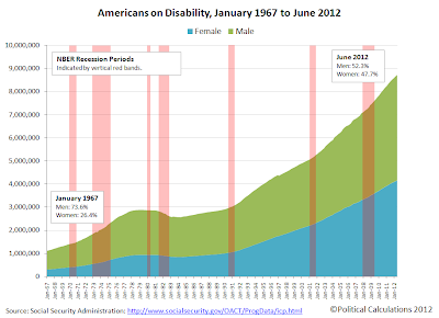
Americans Receiving Social Security Benefits, January 1967 through June 2012

Today, we're going to demonstrate that the policies of multiple agencies of the U.S. federal government are responsible for enabling criminal disability fraud in the United States, with the cost of the fraud accelerating the pending insolvency of Social Security's Disability Insurance Trust Fund, which will put the program's legitimate beneficiaries at high risk of having their benefits cut after the fund has been exhausted.

Current projections indicate that the Social Security trust fund for disability will be fully depleted in 2016, just four years from the present. The projections from the previous year had indicated that would not happen until 2018. The large shift in the timing of the projected trust fund depletion toward the present in just a year's time indicates a strongly deteriorating fiscal situation for the government "safety net" program.

In Part 1 of our series, we discovered that the U.S. Social Security Administration has effectively established a "no-challenge" policy for disability insurance claims made by applicants over the age of 50, which allows these individuals to obtain Social Security disability benefits far more easily than individuals Age 49 or younger. This arbitrary policy is what enables these individuals to receive Social Security disability insurance payments, even though they might not otherwise be able to obtain those benefits if they were held to the same standards as those under Age 50.

Increase in Number of Social Security Disabled Workers from Previous Year's One Year Younger Age Group, 2005-2011

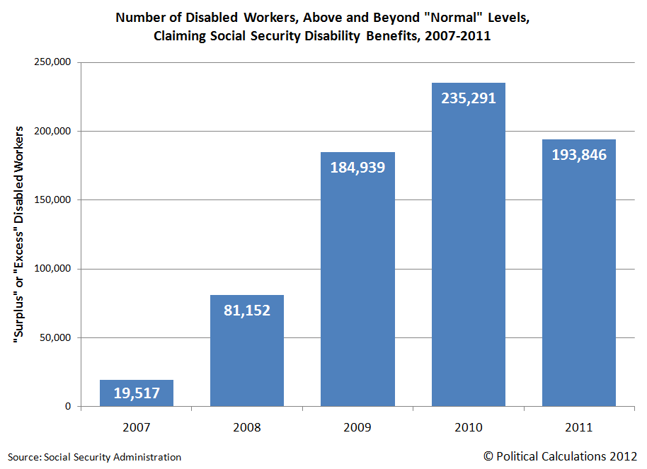
We observe the likely greater incidence of disability fraud as we more closely examine the surge in the number of Social Security disability beneficiaries in the years since 2007, which coincide with the Great Recession. Here, we found that approximately 695,000 more individuals have been added to the nation's government disability rolls during this time than the level that would be consistent with those of pre-Great Recession years.

Number of Disabled Workers, Above and Beyond

The chart above, showing the number of "surplus" or "excess" Social Security disability beneficiaries added in each year since 2007, indicates that the recession is the driving factor behind the increased number of individuals obtaining government disability payments, as the timing of the surge coincides with the expiration of government unemployment insurance benefits for individuals who were negatively impacted by the economic contraction, which officially ran from December 2007 through June 2009. The nation's sluggish economic recovery accounts for the decline in the number of surplus or excess Social Security disability program beneficiaries measured in 2011.

That connection between unemployment insurance benefits and disability insurance benefits brings us to where outright fraud is taking place today:

As many as 117,000 Americans simultaneously collect unemployment benefits and federal disability each year, a form of double-dipping that investigators say costs taxpayers $850 million annually and should be ended.

To understand why such "double-dipping" constitutes fraud, please note the following general requirements for each program:

  • To receive unemployment insurance benefit payments, claimants must state that they are able to work.

  • To receive disability insurance benefit payments, claimants must state that they are unable to work.

While there can be some small overlap in the detailed eligibility requirements for these programs that would legitimately allow a handful of individuals to receive benefits from both simultaneously, the vast majority of individuals currently receiving both unemployment insurance benefit payments and disability insurance payments do not fall within that narrow category and are therefore committing acts of fraud. In general, legitimate beneficiaries of these social safety net programs can draw funds from one program, or the other, but not both at the same time.

That multiple government agencies are involved in enabling this form of fraud is confirmed because the U.S. Department of Labor is responsible for administering the unemployment insurance program, while the Social Security Administration administers the Disability Insurance program. But worse than that is the reason why the fraud has been allowed to continue:

The reason for the double-spending, investigators at the Government Accountability Office reported this week, is good old-fashioned lack of communication.

Put simply, the Labor Department that funds unemployment benefits and the Social Security Administration that funds disability payments don't compare notes, leavings tens of thousands of Americans each month to collect two checks from a stretched-thin government treasury.

It would seem that the bureaucrats and politicians who are responsible for overseeing these programs learned nothing from the failure of government agencies to share information among themselves that enabled the criminal terrorist murders of 2,996 Americans on 11 September 2001 to proceed unchallenged.

This time however, the Government Accountability Office's report indicates that the annual savings that might be realized by ending this kind of fraud adds up to $850 million.

That's a savings of roughly 1 dollar out of each $1400 that is currently projected to be consumed in the nation's projected deficit of 1.21 trillion dollars for 2012! And it would be painless, because the people who are honestly playing by the rules would not be affected!

This is exactly the sort of thing that should be a no-brainer for a fiscally responsible politician - it's as close to low-hanging fruit as there is to be found anywhere in the U.S. federal government's budget. We wonder if any political candidate will rise to the occasion of acting to end the government's practices and policies that enable such costly fraud.