Selasa, 31 Januari 2012

The Millionaire Decay Function

Did you know that the most downwardly mobile members of society are millionaires?

Millionaires Unlikely to Stay Millionaires for Long, 1999-2007 It's true, and what's more, we have the data and math to prove it!


Our featured chart today was originally produced by Veronique de Rugy of the Mercatus Institute, which is based upon data from the IRS and analysis by the non-profit Tax Foundation.


Here, the story begins in 1998, when the IRS reports that there were approximately 675,000 tax returns with adjusted gross incomes of $1 million, or more.


[Side note: The traditional definition of a millionaire was someone who had accumulated at least one million dollars in total assets. However, since the word was first documented back in 1826, the effect of inflation is such that perhaps a more modern definition would be those who earn incomes of at least one million dollars in a year. In any case, $45,000 in 1826 dollars is roughly the equivalent of $1 million in 2012, going just by changes in the Consumer Price Index.]


Then, beginning in 1999, following the tax returns filed by the same people, the number of those with incomes over $1 million begins to drop dramatically - by nearly 50% in the first year!


Time After Earning $1 Million
Input Data Values
Number of Years After Having Earned $1 Million


The Odds of Still Being a Millionaire
Calculated Results Values
Odds of Earning $1 Million in Each of the Entered Number of Years


And then, it continues, at an ever declining rate, until by 2006, some eight years later, of the 675,000 millionaires of 1998, only 17,000 made a million dollars or more, just 2.5% of the original number.


Expressed a different way, the probability that a millionaire after eight years would be able to make $1 million or more is just 2.5%!


And that's the math our newest tool tries to estimate! Just enter the number of years after which a millionaire has made a million dollars, and we'll give you the odds that they will have done it again!


In a sense, this is very similar to an exponential decay function, such as might apply for things like the decay of radioactive materials, or pesticides. Unlike those things however, the half life of a millionaire is much, much shorter!


One thing we do note from the actual data is that the number of millionaires after nine years begins to increase (38,000 represents 5.6% of the original number of millionaires in 1998). We suspect this is due to a combination of factors, including the effect of inflation from 1999 through 2007 and also the economic expansion that peaked in that year.


It would be very interesting to see how those millionaires have fared in the years since! How many would you think are still making over $1 million per year for the recession years of 2008 through today?


Update 4 February 2012: A sharp-eyed reader has a different take on what the data presented in the chart is actually communicating:


It seems that the number in column N is not the number of "those who were in the original 675,000 while still making a million N years later" as you suggested in your paper. According to that interpretation people would be counted repeatedly in several columns, and it would be a miraculous coincidence that the numbers in all nine columns add up to exactly to the total 675,000 (and the percentages adding up to exactly 100).


My guess is that the number in column N seems to mean the number of people who made it to the end of year (N-1) but not to the end of year N (Except the last column). Or equivalently, it is the number of those fell of the line during year N (Except the last column). It is the number of those being a millionaire for exactly N year and no more. That's why the horizontal axis is called "the number of years as a millionaire". In that case the sum certainly equals to 675,000 since the columns are just an exclusive division of the total number.


If I'm right the number of millionaires by the end of the 8th year is not 17000, but rather 38000. More generally, the percentage of "those who remain millionaires N years later" should be 50, 35, 27, 20, 16, 13, 9, 6. Naturally this curve is much smoother and fit better with an exponential than the original figure which designate the differences between these numbers.


Also, the "increasing" in the last column you mentioned would not surprising at all and may not need any special explanation. This is because the 38000, unlike each of the columns on its left which designates those remain millionaires for exactly N years, designates all those who remain millionaires for 9 years, 10 years, 11 years and more. It's just the sum of all the residue part of the declining curve.


Although, I'm really confused since the original article seems to suggest the same interpretation as yours. But if that's the right interpretation then I do not know how to make sense of the fact that those numbers sum up to exactly 675,000, among other things.


Our reader's interpretation of the data is right on the money - we've re-done our tool to match!


Senin, 30 Januari 2012

Forecasting GDP: Looking Backwards (2011-Q4) and Forwards (2012-Q1)

The advance GDP estimate for the fourth quarter of 2011 was released on Friday, 27 January 2012, with that quarter's inflation-adjusted GDP figure being reported at $13,422.4 billion, in terms of constant 2005 U.S. dollars.


That value is just 0.29% higher than what we would forecast using our Modified Limo method for projecting the value of GDP in the next quarter, using the final value of $13,331.6 billion for the third quarter of 2011.


Real GDP vs Climbing Limo Forecast vs Modified Limo Forecast, 2003 - Present (as of 27 January 2012)

On a side note, since Political Calculations was on our annual year-end hiatus when that final value for 2011-Q3 GDP was reported, and because we had never updated our previous public projection of $13,393.3 billion, the advance figure for 2011-Q4 real GDP is just 0.21% higher than our last posted forecast.


In any case, we anticipate that this figure will be revised lower by the time the BEA's third estimate for 2011-Q4's GDP is recorded.


Looking forward and assuming that the forecast given our Modified Limo methods follows a normal distribution with respect to the trajectory of real GDP, we currently anticipate the following for GDP in the first quarter of 2012, in terms of constant 2005 U.S. dollars:


  • A 68.2% probability of falling between $13,357.5 billion and $13,640.0 billion.
  • A 95.0% probability of falling between $13,216.3 billion and $13,781.3 billion.
  • A 99.7% probability of falling between $13,075.0 billion and $13,922.5 billion.


The midpoint for our forecast range for real GDP in 2012-Q1 is currently $13,498.8 billion. We will revise these projections as the U.S. Bureau of Economic Analysis revises its estimate of real GDP in 2011-Q4. The BEA will release its second and third estimates of real 2011-Q4 GDP in February 2012 and March 2012 respectively.


At present, it appears that our overall forecast of U.S. economic performance remains on track. We continue to anticipate that the most recently reported pace of economic growth will begin decelerating in the first quarter of 2012.


For our GDP forecasts, any major deviation from our projections is an indication that the U.S. economy is undergoing a significant change in its overall economic trajectory, which you can see in our chart above whenever the economy goes through a major turning point. One advantage of our methods is that the results are useful, even on those rare occasions when they turn out to be off target.


If you'd ever like to play along at home, we've created a tool that will calculate the midpoint of our forecast range!

Jumat, 27 Januari 2012

How Good Are Earnings Forecasts?

How good are stock market earnings forecasts?


Well, if you go by our chart below, which we constructed by sampling data we obtained from S&P roughly one-year apart (at the dates indicated) and mostly looking one-year-ahead in time, the answer is: not good at all!


One-Year-Ahead Forecasts of S&P 500 <br />Trailing Twelve Month Earnings per Share, 2009-2012

The moral of the story: future earnings projections are not necessarily very good indications of actual future earnings!

Kamis, 26 Januari 2012

New Jobless Claims: Still on Track, But Increasingly Volatile

Two weeks ago, we observed that the number of seasonally-adjusted initial unemployment insurance claims being filed each week was still following the same trend it has since 9 April 2011, but that it was becoming increasingly volatile, suggesting that the trend is beginning to break down:


Today's number also underscores the increasing level of volatility in the data - when the current trend was establishing itself, it was characterized by relatively small changes in the number of new jobless claims being filed from week to week.


Today new data marks the fourth time in the last six weeks in which the size of the change in the reported numbers from week to week has exceeded one standard deviation. That's specifically what we're looking at when we suggest that the established trend may be beginning to break down.


The chart below reveals that if anything, that volatility has increased, although it still appears to be following the established trend of an improving (falling) number of claims over time at this point.


Residual Distribution for Seasonally-Adjusted Initial Unemployment Insurance Claims, 26 March 2011 - 21 January 2012

If we look just at the micro-trend established since 26 November 2011, when the level of volatility in the data really took off, the data suggests that the rate of improvement in the number of new jobless claims filed each week is leveling off between 370,000 and 380,000.


Hopefully, things will settle back down and the number of new jobless claims filed each will will continue to improve until they reach the average level of 318,000 that was typically recorded in the months prior to the most recent recession.

Rabu, 25 Januari 2012

The President's Failing Focus on Jobs

In his 2012 State of the Union Address, President Obama sought to "embrace manufacturing". Since the President has been in office for three years now, we thought we would take a look at how well he's done so far in embracing manufacturing, by his own terms.


Our first chart shows the seasonally-adjusted number of individuals employed in the Manufacturing and the closely-related Transportation and Warehousing industries (aka "the supply chain"), which is based upon data collected by the Bureau of Labor Statistics in its Current Employer Survey, as of 22 January 2012, from November 2007 through December 2011.


Employment in Manufacturing and Supply-Chain Service Industries, November 2007 to December 2011

In the chart above, we've emphasized several points with bold text indicating the number of employed at various points of interest. These points correspond to the month preceding the start of the "Great Recession", the month President Obama was sworn into office, the bottom of job loss for the recession, and the most recent month for which we have data, December 2011.


Here, we find that the number of individuals counted as being employed in the manufacturing and supply chain industries has fallen considerably from November 2007 through the present, with 1,583,000 fewer being employed in Manufacturing and 1,964,000 fewer being employed in Transportation and Warehousing as of December 2011. Together, these two sectors of the U.S. economy represent almost 3 out of 5 of all the jobs that have disappeared from the U.S. economy since November 2007.


Change in U.S. Jobs by Industrial Sector, January 2009 through December 2011 Starting the clock from January 2009, we find that 946,000 jobs in manufacturing evaporated before job losses in the economy finally bottomed in February 2010, eight months after the recession officially ended, while the number of individuals employed in the transportation and warehousing industries fell by 1,097,000. Combining these figures, we find that these two sectors of the U.S. economy account for over 47% of the 4,317,000 total jobs that were lost according to the BLS' data during the first 13 months of President Obama's tenure.


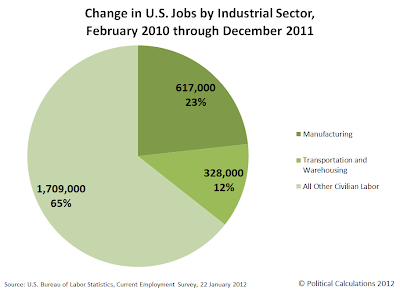
Since job losses in U.S. manufacturing and supply chain-related industries bottomed in February 2010, some 617,000 jobs in manufacturing and 328,000 in transportation and warehousing have been added to the U.S. economy. These two sectors account for 35.6%, or a just over 1 out of 3 of the 2,654,000 total jobs that have been added to the U.S. economy since February 2010.


Change in U.S. Jobs by Industrial Sector, February 2010 through December 2011 Going by the post-recovery figures, we find that President Obama hasn't been paying much attention to manufacturing, either during the recession or during the recovery, as its share of jobs lost and created has been essentially identical during his three years in office.


If anything, it appears that the President's focus on "creating" jobs has been in any area outside of manufacturing or supply chain-related industries, as these areas have seen a disproportionate gain compared to jobs lost during the President's first three years in office.


But perhaps the bigger story is the extent to which President Obama hasn't been paying attention to boosting jobs in the Transportation and Warehousing sector of the U.S. economy. This is the unglamorous industry that ties together all U.S. manufacturers, from the most upstream makers of parts that go into other products all the way through the final link in the chain that reaches the final consumer, moving and storing manufactured goods as value is added through each stage of manufacturing production.


We'll close by sharing our final chart, spanning all the time the President has been in office at this writing, showing the net change in jobs by industrial sector from January 2009 through December 2011:


Change in U.S. Jobs by Industrial Sector, January 2009 through February 2010

Perhaps the President should have "pivoted to jobs" more often in the first three years of his Presidency. Especially those unglamorous ones that don't make for good photo ops, as his agenda today suggests is his real focus....

Selasa, 24 Januari 2012

The Poison Pill

Thermometer Pill - Source: NASA On 23 December 2011, the Republican party majority in the U.S. House of Representatives caved in on its opposition to President Obama and the Democratic party majority in the Senate's proposal to provide a two-month long extension for the President's payroll tax cut.


Here, the percentage that individuals must pay in their taxes that support Social Security was maintained at 4.2% through the end of February 2012, after which, the rate is set to rise back up to the 6.2% level it had been for the two decades from 1990 through 2010.


With President Obama's State of the Union address scheduled for tonight, there is little doubt that he will seek to extend the payroll tax cut through the end of the year, which will have to be supported by increased deficit spending in order to pay out benefits to today's SOcial Security recipients, which will increase the national debt as the program is set to continue running more deeply in the red.


Given the political damage from the collapse of the Republican's political strategy in December 2011, it seems unlikely that the party's senior leaders will seek to oppose the President's payroll tax cut again. They might be able to get some traction by letting the payroll tax cut expire by cutting federal income (and withholding tax) rates, however that would depend upon the President and Senate Democrats to go along, which seems even more unlikely given their late-year political victory.


If that outcome is not really possible then, perhaps the best strategy that congressional Republicans might follow would be to allow the President and Senate Democrats to have another small victory, but one that would cost them dearly in the November 2012 elections.


It's often said that "people vote their pocketbooks", meaning that economic conditions have a lot to do with the choices people make at the ballot box. For example, if conditions are stable, good, or improving, then it would be more likely that incumbent politicians, such as the President and many Senate Democrats, will hold onto the offices that they hold so dear.


But if conditions are bad or worsening, then they would be more likely to be voted out of office.


The trick then would be to give them the bill they want, but with one key addition - a "poison pill" that they cannot resist ingesting, one that seems like a good idea to them, but that would have the effect of sealing their fate through the damage it might cause to the economy.


It would also have to be something that would have a relatively small effect, because if it works, you'd only want a relatively small mess to have to clean up pretty easily.


To that end, we would suggest raising the federal minimum wage in the U.S. to $8.00 per hour, with the increase taking effect in April 2012.


Missouri Unemployment Line - Source: mo.gov

Even with a growing economy, the amount of that increase would enough to decrease the number of jobs that might otherwise exist in the U.S. economy by roughly 300,000. Since it takes roughly six months for the full effect of a change in the minimum wage to take hold in the economy, that would put the greatest job loss in October 2012, just ahead of the 6 November 2012 election.


Better still, the action would not leave any real political fingerprints, as the reduction in jobs would mostly be in the form of jobs not being created, where the most affected would be teens and young adults, who can have their unemployment more easily concealed since their attendance at school would keep them from being counted as being part of the U.S. workforce.


It's an intriguing idea. And it's very unlikely that the President and Senate Democrats would even consider resisting it, given their beliefs! We wonder if any U.S. politicians have ever tried doing it before....

Senin, 23 Januari 2012

Using the F-Score to Detect Accounting Fraud

Magnifying Glass for Fighting Fraud If you're just an average investor, how can you pick up on whether or not a company is cooking its books?


Craig Newmark recently pointed to one of the neater ways in which someone might be able to determine if the numbers they're examining are following a natural pattern as opposed to an artificially-contrived one using Benford's Law, but unless you have access to reams and reams of internal company data, it's pretty unlikely that you as an individual without that kind of access could find out if something shady might be going on.


But for publicly-traded companies, you can get access to a company's publicly-reported financial statements, such as their annual reports or the 10-K statements they file with the United States Securities and Exchange Commission (SEC). And with that information, you can calculate a company's "fraud score" or "F-Score", which can provide a pretty good indication of whether or not the people inside the company might be manipulating their accounting.


Using math originally developed by Patricia M. DeChow, Weili Ge, Chad R. Larson and Richard G. Sloan in 2007 using data from 1982 through 2002, and updated in 2010 to include all years from 1982 through 2005, we've updated our tool for calculating the F-Score for any publicly-traded company for which you can obtain the indicated data below!


For that, you'll need consecutive years worth of the company's annual data - our tool below provides that using Enron's data for the years 1998 (two years prior), 1999 (one year prior) and 2000 (year of interest).


Income Statement Data
Input Data Year of Interest
One Year Prior
Two Years Prior
Sales (Revenues)
Net Income Before Extraordinary Items or Cumulative Effect of Accounting Changes
Balance Sheet Statement Data
Input Data Year of Interest
One Year Prior
Two Years Prior
Cash and Cash Equivalents
Short Term Investments
Receivables (Total)
Inventories (Total)
Property, Plant and Equipment (Total Net)
Total Assets
Preferred Stock (Total)
Total Shareholder's (or Owner's) Equity
Statement of Cash Flows Data
Input Data Year of Interest
One Year Prior
Two Years Prior
Issuance of Long-Term Debt
Issuance of Common or Preferred Stock


Probability of Accounting Manipulations
Calculated Results Values
F-Score


Here, a result greater than a value of 1 indicates a statistically higher than expected likelihood that the numbers the company in question has published have been misstated, which is "accountingese" for suggesting that the company's books may have been cooked! The following guide, developed by the F-score's creators, may be used to interpret the tool's results ("F-Score 1" corresponds to the specific model used in our tool):


Interpreting F-score 1 - Source: Dechow, et al, 2010

We should note that the math is somewhat sensitive - the formula's creators indicate it will produce a high frequency of false positives, which means that an F-Score greater than one should be taken as an indication that an average investor should be much more diligent in reviewing a company's business before making investing decisions related to it.


The tool above provides different results from our original version of the F-Score formula, which was based upon the original 2007 math.


This update to our original tool is the result of a collaborative project with Pasi Havia, who was seeking to implement a Finnish-language version of the tool. We owe our thanks to Pasi for his detective work in finding that the formula for calculating a company's F-score had changed from 2007 and for developing the new and improved code to calculate the F-Score!


If you compare the results between Pasi's version and ours above, you'll find that the results between the two tools are nearly identical - the difference comes down to how the rounding for the value of the mathematical constant e in the formula was done (Pasi rounded it to 8 decimal places for the sake of matching the authors' results in their paper, while we just let it run!)


Related Tools at Political Calculations


Predicting Bankruptcy

How likely is it that a publicly traded company will declare bankruptcy in the next year? Our tool for calculating the company's Altman Z-Score can answer! It predicted General Motors failure years before the company failed!


Liquidity

Does that publicly-traded company have enough money flowing through its veins to keep operating?


Jumat, 20 Januari 2012

The Core Business of Planned Parenthood

How much of the revenue Planned Parenthood generates through its health center affiliates comes from performing abortion procedures?


The question arises because of a chart Planned Parenthood provided in its 2009-10 annual report. In it, Planned Parenthood indicates that abortion services account for just 3% of all the health services it provides:


Planned Parenthood 2009-10 Annual Report, Percentage Breakdown of Health Services Pie Chart

We suspect this chart was generated to attempt to underemphasize the extent to which Planned Parenthood's provision of abortion services add to its bottom line through the health centers the organization's affiliates operate. [As an aside, that contribution is even visually understated in Planned Parenthood's pie chart, in that abortion services are depicted in a very understated gray tone, where all the other procedures are shown in bright color.]


Since we've already worked out the average price paid for the majority of abortions performed by annual caseload volume of non-hospital abortion providers in the United States for 2008-09, we'll go back to Planned Parenthood's 2008-09 annual report to work out how much of the revenue it generated from abortion services contributed to its overall revenue for all the health services it provided in that year.


Will it be just 3%, as the pie chart depicting all of the health services Planned Parenthood provided in 2009-10 suggests? Our pie chart below provides the answer:


Planned Parenthood Health Center Revenue [Millions of U.S. Dollars], 2008-09

In 2008-09, Planned Parenthood reported that it generated $404.9 million in revenue through the health centers operated by it and its affiliates. Our low end estimate of $135.6 million for the 324,008 abortion services the organization performed in that year would then represent at least one-third of all the revenue generated by the organization through its health centers.


To put that into the context of Planned Parenthood's total revenue for 2008-09, the amount of revenue the organization generates through abortion services would account for 12.3% of all its annual income, or very nearly 1 out of every 8 dollars:


Planned Parenthood Total Revenue [Millions of U.S. Dollars], 2008-09

As such, despite representing just 3% of Planned Parenthood's reported number of health services provided each year, abortion represents the core business of the organization.


Previously on Political Calculations


Kamis, 19 Januari 2012

The Volume Pricing of Abortion

Now that we've revealed the pace at which the most prolific abortion providers in the United States conduct their business, it's time to consider their primary motivating factor behind achieving such economies of scale: revenue.


To do that, we'll need to determine the average amount of money collected for each abortion performed in the United States based upon their annual caseloads. Fortunately, the Guttmacher Institute has once again collected the data we need to construct a model by which we can estimate the average price paid for an abortion in the U.S. depending upon the annual volume of abortions performed by the provider.


We've summarized what we found in the chart below, which applies to all abortions provided in non-hospital settings that are performed at approximately 10 weeks of gestation. (As we noted in our previous post, abortions performed in hospitals predominantly are done for medical reasons, where at least a portion of the price paid might be covered by a patient's health insurance.) This data then encompasses the average prices paid that apply for over 80% of all abortions performed in the United States.


Average Price Paid for Abortions at 10 Weeks of Gestation by Annual Caseload of Abortion Provider, 2009

The graph above somewhat resembles a demand curve from economics, where the lowest amount of a quantity demanded corresponds to the highest price, and the greatest amount of a quantity demanded corresponds to the lowest price.


We next took the mathematical relationship we modeled based upon the Guttmacher Institute's data and built a tool, which will allow us to estimate the average price paid for an abortion according to the provider's annual caseload for the procedure. Given the difference between these average prices and the median price charged by non-hospital abortion providers as reported by the Guttmacher Institute, we believe our tool's results will be within 5% of the actual values.


We then went the extra mile to estimate the abortion provider's annual revenue from performing abortions.


Abortion Provider Data
Input Data Values
Annual Caseload


Average Price Paid and Annual Revenue
Calculated Results Values
Average Price Paid for Abortion
Annual Revenue for Abortion Provider


For the default data, we find that an abortion provider that performs 1000 abortions per year will collect an average of $484 from each patient, generating over $484,100 in a year.


Plugging in Planned Parenthood's total reported abortion count of 324,008 for 2008 into the tool suggests that the average price paid by a patient at their clinics is $418.61, which would put their annual revenue for performing this volume of abortions at $135,633,517.


That annual revenue figure could actually be higher though, since we omitted later term abortion price data from our model. Consequently, this value would represent a low-end estimate of Planned Parenthood's total revenue from performing abortion procedures in 2008.


Reference


Jones, Rachel K. and Kooistra, Kathryn. Guttmacher Institute. Abortion Incidence and Access to Services in the United States, 2008: TABLE 6. Charges and average amount paid for nonhospital surgical abortions at 10 and 20 weeks’ gestation and for early medication abortions—all by provider type and caseload, 2009. Perspectives on Sexual and Reproductive Health. Volume 43, Issue 1. 10 January 2011.

Rabu, 18 Januari 2012

The Throughput of Abortion Providers

Stopwatch - Source: CDC.gov How many abortion procedures do the highest volume abortion providers perform every day?


Having previously determined the number of abortions performed by the various types of abortion providers in the United States, we're digging deeper into the Guttmacher Institute's report on Abortion Incidence and Access to Services in the United States, 2008 to do some basic math to find out the typical throughput for the various types of abortion providers.


"Throughput" is a term that comes from high volume manufacturing operations, which refers to the amount of material that is processed within a given amount of time, or in the case of computers, the number of operations that are performed within a set time interval.


The question arises because of the great differences we observed in the annual caseloads for the various types of abortion providers. Our first chart below shows the percentage distribution for the 1,793 abortion providers counted in 2008 with the number of abortions procedures performed by each:


Number of Abortion Providers and Number of Abortions by Provider Type, 2008

As you can see, nearly 70% of all abortions are performed in just 378 abortion clinics, while another 24% are performed in 473 "other" clinics. A balance of just under 6% of the total are split between 942 hospitals and physicians' offices.


But the Guttmacher Institute's researchers went a step future and also determined the number of abortions provided by each type of abortion provider according their annual caseload - the number of abortions performed by each in 2008.


We decided to drill down into the data for abortions performed in dedicated abortion clinics and other clinics, since these two types of abortion providers account for just over 94% of all abortions performed in the United States.


Our next chart shows what we found when we looked at abortions performed in the 378 dedicated abortion clinics in the United States:


Number of Abortion Providers and Number of Abortions at Abortion Clinics by Annual Caseload, 2008

Our next chart repeats the same exercise for the "other" clinics. One immediate difference between the two providers is that no clinics that are counted among the 378 dedicated abortion clinics performed fewer than 30 abortions in 2008.


Number of Abortion Providers and Number of Abortions at Other Clinics by Annual Caseload, 2008

We next determined the following average throughput values by assuming a seven-day per week operating schedule, which might be common for these high-volume abortion providers.


  • An annual caseload of 30 represents 0.08 abortions per day, or roughly one abortion approximately every 12 days.

  • An annual caseload of 400 represents 1.1 abortions per day, or 11 abortions every 10 days).

  • An annual caseload of 1,000 represents roughly 2.7 abortions per day.

  • An annual caseload of 5,000 represents 13.7 abortions per day.


For the 29 abortion clinics with an annual caseload over 5,000 abortion procedures per year, which performed 188,320 abortion procedures in 2008, the average daily throughput works out to be approximately 17.8 abortions per day.


But for the two "other" clinics that weren't counted among the specialized abortion clinics, but still had an annual caseload exceeding 5,000 abortion procedures per year, the average throughput is approximately 25 per day.


For a standard 8-hour work day, that last throughput value equates to 3.1 per hour.


To put that value into perspective, since most of these procedures represent surgical abortions, if there were only one doctor performing these procedures at these clinics, they would rank among the fastest in the world.


Notes About the Various Types of Abortion Providers


The Guttmacher Institute provides the following description of each type of abortion provider:


Types of Providers and Abortion Caseloads


Clinics. The 378 specialized abortion clinics accounted for 21% of all abortion providers, but performed 70% of all abortions in 2008 (Table 4). Most of these facilities reported 1,000 or more abortions during the year. A total of 473 nonspecialized clinics accounted for 24% of all abortions; some were similar to abortion clinics in having caseloads of 1,000 or more abortions per year. Overall, the number of very large providers (those performing 5,000 or more procedures) increased by more than 50% between surveys: Twenty facilities of this size accounted for 12% of all abortions in 20051, whereas 31 such facilities provided 17% of abortions in 2008.


Hospitals. Thirty-four percent of abortion providers were hospitals in 2008, but these facilities accounted for only 4% of all abortions. Many hospitals provide abortions only in cases of fetal anomaly or serious risk to the woman’s health, and a majority (65%) performed fewer than 30 abortions in 2008. Twenty-two hospitals reported 400–999 abortions during the year, and only nine reported 1,000 or more.


Physicians’ offices. Some 19% of providers were physicians’ offices, but these facilities accounted for only 1% of all abortions. A majority of these offices (57%) reported fewer than 30 abortions; our survey may have missed a number of small providers in this category.


Reference


Jones, Rachel K. and Kooistra, Kathryn. Guttmacher Institute. Abortion Incidence and Access to Services in the United States, 2008. Perspectives on Sexual and Reproductive Health. Volume 43, Issue 1. 10 January 2011.

Selasa, 17 Januari 2012

The Providers of Abortion in the U.S.

Who provides abortions in the United States?


The chart below reveals what we found for the year 2008, which corresponds to the most recent year for the U.S. Centers for Disease Control has published data regarding the racial distribution of who obtains abortions in the U.S., which we referenced in our previous post on the topic. The sources for the information in the chart below is the Guttmacher Institute and Planned Parenthood:


Number of U.S. Abortion Providers by Type, 2008

Overall, just over 94% of all abortions in the United States were performed in clinics, as opposed to hospitals or physician offices, with just under 70% of the total of 1,212,350 abortions in the U.S. in 2008 being performed in just 378 specialized abortion clinics. There were 1,793 abortion providers in the United States in 2008.


Planned Parenthood, the largest provider of abortion services in the United States, accounted for 26.7% of all abortions performed in 2008.


Data Sources


Jones, Rachel K. and Kooistra, Kathryn. Guttmacher Institute. Abortion Incidence and Access to Services in the United States, 2008. Perspectives on Sexual and Reproductive Health. Volume 43, Issue 1. 10 January 2011.


Planned Parenthood Federation of America. Fact Sheet. Planned Parenthood Services. September 2010.

Senin, 16 Januari 2012

Race, Poverty and Abortion

How are the number of annual abortions in the United States distributed by race? And how does that compare to the distribution of the potential child-bearing (Age 15-44) population of the United States by race? Or for that matter, how does that compare to the racial distribution of the poor in the United States, as measured by enrollment of the non-elderly in Medicaid?


Our chart below provides the demographic snapshot of what we found in answering each question asked above, for the years spanning 2008 through 2010:


Percentage of U.S. Population, Annual Reported Abortions and Non-Elderly Medicaid Recipients by Race, 2008-2010

Data Sources


Centers for Disease Control and Prevention. Abortion Surveillance - United States 2008. Table 21. Reported Abortions, by Known Race/Ethnicity, Age Group, and Marital Status of Women Who Obtained an Abortion --- Selected States, United States, 2008. 60(SS15);1-41. 25 November 2011.


Kaiser Family Foundation. Distribution of the Nonelderly with Medicaid by Race/Ethnicity, States (2009-2010), U.S. (2010).


U.S. Census Bureau. Statistical Abstract of the United States, 2012. Table 10. Resident Population by Race, Hispanic Origin, and Age: 2000 and 2009.


U.S. Census Bureau. 2009 Population Estimates. T4-2009: Hispanic or Latino by Race.

Jumat, 13 Januari 2012

Technology's End

All technology eventually becomes obsolete.


Think of things like buggy whips, or Commodore 64 computers, or newspapers, or DVDs. What all these things have in common is that they either have already been replaced by something that works better to satisfy people's needs, or are in the process of being replaced by things that work better to satisfy people's needs.


1875 Wheelchair

Some technologies last for a really long time before they become obsolete. Newspapers are a still current example of things that are becoming obsolete that have been around for centuries, but which are unlikely to continue existing in anything like their old, familiar form thanks to the onset of newer, better technologies.


And then some technologies hang on because there really isn't any way they can become obsolete, although technology can be applied to make them better satisfy people's needs.


One example of that is the wheelchair. Designed to make it possible for people who cannot walk to be able to move themselves around, or so that others can move them around more easily, wheelchairs today are essentially unchanged from what they looked like over a hundred years ago.


Modern Manual Wheelchair

It's not that technology has been idle. Wheelchairs are now made from different materials so they can hold up to use better than older designs could. Some have been paired with electric motors, which makes it easier for some to move around. Others have been optimized to be used in sporting events.


But no matter its current form, the wheelchair of today would be instantly recognizable to a time traveler from the past for what it is: a chair that rides on wheels for transporting people who can't walk.


But then, suppose that one day, the wheelchair as we have known it suddenly became obsolete. What could possibly replace it?


The day of the wheelchair's technological obsolescence may be here sooner than you think (HT: Core77):


Ekso Bionics Exoskeleton


This year, California-based Ekso Bionics will begin shipping their eponymous product, a robotic exoskeleton that will enable paraplegics to do the unthinkable: Walk. New York's Mount Sinai Hospital and other rehabilitation clinics in the U.S. and Europe are expected to purchase commercial models once performance and reliability trials are cleared--trials overseen, interestingly enough, by America's Food & Drug Administration.


Ekso Bionics began as Berkeley Bionics in 2005, and early military cooperation helped the firm produce the HULC, a militarized version of the exoskeleton designed to help able-bodied soldiers tirelessly lug heavy payloads through rugged terrain. Lockheed Martin (whose somewhat creepy company motto is "We Never Forget Who We're Working For") licensed the technology in 2009, freeing the company now known as Ekso to begin focusing on its civilian version. The company's work has since earned it a 2012 Edison Award nomination.


It's hard not to be moved by the video of an early product tester, a woman who has not walked since sustaining a spinal injury nearly 20 years ago. For some reason Ekso has rendered the video unembeddable, but it can be freely viewed here.


Can you imagine what might replace the exoskeleton that makes it possible for paraplegics to walk? Because that's something that will happen someday.


All technology eventually becomes obsolete.

Kamis, 12 Januari 2012

The Number of New Jobless Benefit Claims for the First Week of 2012

How many people filed for new unemployment insurance benefits in the first week of January 2012?


We'll find out the answer to that question later this morning, but in the meantime, we can make a pretty good guess using our updated forecast chart for the number of seasonally-adjusted initial unemployment insurance claims filed each week!


Residual Distribution for Seasonally-Adjusted Initial Unemployment Insurance Claims, 26 March 2011 - 31 December 2011

Assuming the trend established since 9 April 2011 remains intact, and that the variation of individual data points with respect to that mean trend line follows a normal, bell-curve kind of distribution, we can give the following odds that the number of seasonally-adjusted new jobless claims for the week ending 7 January 2012 will fall within the indicated ranges:


  • There is a 50% chance the number will be above 384,593. Likewise, there is a 50% chance the number will be below 384,593.

  • There is a 68.3% chance that the number will be between 372,552 and 396,634.


  • There is a 95.4% chance that the number will be between 360,510 and 408,676.


  • There is a 99.7% chance that the number will be between 348,469 and 420,717.


Using our statistical control chart-inspired methodology, should the number of seasonally-adjusted initital unemployment insurance claim filings for the week ending 7 January 2012 come in either below 348,469 or above 420,717, it would be an indication that the trend established since 9 April 2011 is potentially breaking down.


As you can see though, it's been going pretty strongly for nearly eight full months now. If it continues through the end of March 2012, it will be very unlikely that we'll see the number of new jobless claims climb above the 400,000 mark, where it spent much of 2011.


In looking deeper at the chart, we see some indications that the established trend may indeed be breaking down. Here, in going from 17 September 2011 to 24 September 2011 and then again from 26 November 2011 to 10 December 2011, we see that the volatility in the number of new unemployment benefit claim filings being recorded each week has increased.


If that continues, the big unknown for us right now is that we don't know yet which way the numbers will break!


Update (12 January 2012, 9:36 AM: Here's the updated chart, incorporating the data from today's report:


Residual Distribution for Seasonally-Adjusted Initial Unemployment Insurance Claims, 26 March 2011 - 7 January 2012

Today's new jobless claim value of 399,000 was just outside our 68.3% probability range. Given the BLS' track record in under-reporting the actual number of new jobless claims each week, we can reasonably expect that the figure for the week ending 7 January 2012 will be revised upward in the next report to be 400,000 or higher.


Today's number also underscores the increasing level of volatility in the data - when the current trend was establishing itself, it was characterized by relatively small changes in the number of new jobless claims being filed from week to week.


Today new data marks the fourth time in the last six weeks in which the size of the change in the reported numbers from week to week has exceeded one standard deviation. That's specifically what we're looking at when we suggest that the established trend may be beginning to break down.


Rabu, 11 Januari 2012

Cavalcade of Risk #148

Danger! Welcome to the 148th edition of the Cavalcade of Risk!


For our readers who see our posts through sites that pick up its RSS news feed, the Cavalacade of Risk is a throwback to the early days of social media on the web, where individual bloggers (aka "the host") would solicit other bloggers to contribute posts to which they would link, usually related to a given theme (such as personal finance, or to use today's example, risk.)


In those old days, blog carnivals were a way that new or little known bloggers could attract more traffic to their sites. The bloggers who would host a particular carnival would change with every edition.


Today, blog carnivals are essentially obsolete - they've fully been replaced by what might be described as Social Media 3.0 - where sites like Facebook or Twitter rule in driving traffic to what people might find interesting to read.


Obsolete Stamp

Now, since it's fallen to us to host the 148th edition of the Cavalcade of Risk, we should point out that the risk of finding your endeavors becoming obsolete is a very real risk - we can't count the number of blog carnivals that have fallen by the wayside just because no-one thought they were worth continuing.


But the Cavalcade of Risk is a bit different - it has benefited from an organizing force in the form of Insureblog's Hank Stern, who has managed to make it last 148 editions.


Or 149, if you count the next edition, which will be hosted in two weeks time at the NotWithStanding blog!


But to get back to our contribution to this week's Cavalcade of Risk, having a solid organizing force behind an endeavor then is essential for sustaining it over the long term - thus, reducing the risk of obsolescence and having your endeavor fall by the wayside!


Now, onto the Cavalcade of Risk - all those who contributed posts for consideration to this 148th edition of the cavalcade are presented below for your reading pleasure!


Cavalcade of Risk #148


Date Contributed Post Title Blog Name Rating Remark
2012-01-03 How Much of Your Investment Portfolio Can You Afford to Lose? Arbor Asset Allocation Model Portfolio Bb2 Ken Faulkenberry argues that all investors need to have a plan for controlling their investment losses, as a way to avoid losing money!
2012-01-05 Insurance Regulation 2012: Reading the Tea Leaves Insurance Regulatory Law Bb2 Van R. Mayhall, III outlines the many ways that insurance regulation will dominate governmental affairs in 2012, particularly at the state level.
2012-01-05 Pollution Coverage in the New York Business Auto Policy Ask Tim Bb3 If you're a fuel dealer in New York state, Tim Dodge's contribution will be of special interest to you - for everyone else though, not so much! (Somebody needs to ask Tim more interesting questions....)
2012-01-05 The Year in Review: Weird Claims in 2011 Risk Management for the 21st Century Aa2 Nancy Germond reviews the wacky year that was to identify the most unexpected risks that resulted in big settlements!
2012-01-05 Insurance Policies to Avoid at All Costs Free Money Wisdom Bb3 Jon the Saver really doesn't like three different kinds of insurance: extended warranties, credit card life insurance and ID theft insurance. That's pretty much it....
2012-01-06 Health, Risk and History Insureblog Bb2 Hank Stern points to a blog post at Frank Jacobs' wonderful Strange Maps blog, which features a map dividing 19th century American into medical insurance underwriting zones.
2012-01-07 The Ineffectiveness of Asset Testing for Public Health Insurance Eligibility Colorado Health Insurance Insider Bb2 Louise Norris protests against state legislators' attempts to apply means testing to Medicaid recipients, which would keep people with millions in assets, but not in the form of income, from drawing Medicaid benefits, arguing that the federal government's grants to the state prohibit the practice.
2012-01-08 Geographical Areas for Insurance Underwriting Chatswood Consulting Limited Ba2 Russell Hutchinson picks up on Hank Stern's map pointer, and reveals that what seems to be a strange concept from history to Hank in the U.S. is not so strange elsewhere in the world (and provides examples!)
2012-01-09 Health Wonk Review, OSHA, State Reports, and the Single Best Thing for Your Health Workers' Comp Insider Ab2 Julie Ferguson offers her own homemade blog carnival expansion for the Cavalcade of Risk, complete with links to a number of workers' comp-related links from around the web and blogosphere! And best of all, a video that describes the single best thing you can do for your health in 2012!


Say, What Are Those Ratings?


Blog Post Rating System for Blog Carnivals
Topicality
[Capital Letter]
Information Quality
[Small Letter]
Readability
[Number]
A - Fully On Topic
B - Related Topic
C - Way Off Topic
D - Spam
a - Makes You Smarter
b - Makes You Informed
c - Makes You Stupider
1 - Highly Readable
2 - Average Quality
3 - Potentially Painful


Every so often, the Cavalcade of Risk's hosts have to deal with the problem of people contributing posts that are either totally unrelated spam or that don't have much to do with the concept of risk. Normally, they ignore those kinds of posts, but still have to go to the time and trouble of reading and reviewing them only to find out that they wasted their time because the contributor chose to ignore the guidelines for contributing posts to each edition of the Cavalcade of Risk.


So, back when we first hosted the Cavalcade of Risk (Edition #66), we concocted the idea of adapting the rating system for bonds and other debt instruments to evaluate the quality of posts contributed to the Cavalcade! The table showing our Blog Post Rating System for Blog Carnivals describes how to interpret the ratings we've awarded above!


Apparently, the message got out this week, because we didn't have to downgrade any contributions to the dreaded Dc3 rating. But then, others weren't so lucky for the previous editions of the Cavalcade of Risk we've hosted: