Tampilkan postingan dengan label demographics. Tampilkan semua postingan

Selasa, 23 April 2013

The Incomes of Women Without Wages

Who is the median woman who doesn't earn a wage or a salary?

The question arises because of something we did last year. Specifically, when we extracted data for this demographic category of American income earner from other data published by the U.S. Census Bureau.

What makes this particular demographic category so interesting is that U.S. women who do not earn wages or salaries make up what is perhaps the lowest income earning group within the United States. To see what we mean, >our chart below shows the inflation-adjusted median incomes earned by women from 1947 through 2010 in terms of constant 2010 U.S. dollars:

Women's Median Real Income in the U.S., with Recessions, 1947 - 2010

So just who is the median woman who doesn't earn a wage or a salary, who is part of the lowest ranks of income earners in the United States?

The answer came to us when we were looking at the history of average Social Security retirement and survivors benefits paid out over time, for which the Social Security Administration provides data for selected years going back to 1956. Our chart below shows what we found:

Real Annual Incomes of U.S. Women Without Wage or Salary Incomes, <br />1956-2010 [Constant 2010 U.S. Dollars]

What we find is that the income earned by the median U.S. woman without a job paying a wage or salary for the years from 1956 through 2010 is largely consistent with benefits paid by Social Security, which means the median U.S. woman who doesn't earn a wage or salary is of retirement age - typically Age 62 (for those taking a reduced benefit) or older (for those taking non-reduced benefits).

We note that for much of the data, the median income is less than the average income. This is a characteristic of the lognormal distribution of income. However, we do observe an upward shift in the data over time, which we believe corresponds to the increasing number of women with wage and salary income in the United States, whose incomes reflect their growing share among Social Security recipients.

The variation in the median income data would also appear to be somewhat consistent with having an increasing portion of income derived from investments, such as those that might be earned through an Individual Retirement Account or 401(k)-type retirement investment programs, which we recognize in the surges for median income earned in 1986-1989, 1997-1999 and later in 2005-2006, which coincide with booming periods for the U.S. stock market.

Once again, that would be very consistent with the kind of income that would be earned by a woman of retirement age in the United States, who it would seem collectively make up the lowest income earning demographic group within the United States!

Kamis, 14 Maret 2013

Single Person Households in the U.S. Since 1900

How many single person households were there in 1909? Or 1945? Or 2011?

Those aren't necessarily easy questions to answer, but today, we're going to first by visualizing the number of single person households in the United States since 1900, and then by presenting a tool to extract the data from our visualization. To do that, we'll use all the data we've been able to obtain from the U.S. Census Bureau, which up until 1960, isn't very much. That limitation is what makes those questions not so easy to answer!

To get around that limitation, we've created a model of the percentage share of single person households for each year since 1900 for the data that we do have available, which we can then use to estimate the number of single person households over time in conjunction with our previously introduced model describing the total number of U.S. households since 1900!

All that work comes together in our chart below:

Number of U.S. Households and Single-Person U.S. Households Since 1900 (Through 2011)

You can use the following tool to extract the estimated number of households or single person households for any given year shown in the chart above, along with the percentage of single person households among all U.S. households.


Year of Interest
Input Data Values
Select Year


Estimated Number of Households
Calculated Results Values
Total U.S. Households
Single-Person Households
Percentage Share of Single Person Households

If you are accessing this content on a site that republishes our RSS news feed, please click this link to access a fully functional version of this tool in our original post.

References

Political Calculations. Modeling U.S. Households Since 1900. 8 February 2013.

U.S. Census Bureau. Statistical Abstract of the United States: 2003. Table No. HS-12. Households by Type and Size: 1900 to 2002. [PDF Document].

U.S. Census Bureau. Demographic Trends in the 20th Century. Table 13. Households by Size for the United States: 1900 to 2000. [PDF Document].

U.S. Census Bureau. Table HH-4. Households by Size: 1960 to Present. Excel Spreadsheet].

Social Indicators 1976. Selected Data on Social Conditions and Trens in the United States. Table 2/17. Average Household Size, Single-Person Households as a Percent of All Households, and Number of Divorces per 1,000 Population, Selected Countries and Years: 1955-1975. [Online Book]. December 1977.

Jumat, 08 Maret 2013

The Demand Curve for the U.S. Minimum Wage

How much will President Obama's 2013 State of the Union proposal to increase the federal minimum wage to $9.00 per hour affect the teens and young adults who make up roughly half of all those who earn the minimum wage or less in the United States?

We've been dancing around that question as we've been considering the recent history of minimum wage increases in recent weeks, but today, we're finally going to answer it!

Or rather, you are, because we've built a tool that you can use to do the math for yourself! Here, you just need to enter either President Obama's or your own proposed minimum wage (ideally in terms of constant 2011 U.S. dollars), and our tool will do the rest!


Minimum Wage Data
Input Data Values
Proposed Minimum Wage [U.S. Dollars per Hour]


Approximate Quantity of Americans Age 15-24 with Incomes
Calculated Results Values
... After Minimum Wage Increase

For those of you accessing this tool through a site that republishes the RSS feed for our posts, click here to access the original functioning version of the tool above!

Using President Obama's proposed minimum wage of $9.00 per hour, we estimate that the number of 15-24 year old Americans with incomes would decline by over 1.8 million from 2011's figure of 26,014,000 to the 24,192,580 figure estimated by our tool above, assuming no major shifts of the demand curve for American teens and young adults.

Here's how we get to that figure. We built a demand curve for the minimum wage using the income data that the U.S. Census Bureau has collected and reported in an easy-to-use digital format for each year from 1994 to 2011 (until this September, this will be the most recent year for which this data is available.)

In doing that, we considered the timing of when changes in the U.S. federal minimum wage occurred in the years they were implemented, and weighted them accordingly.

And then, we considered the situation where a number of states have set their minimum wage levels above the federal minimum wage. Since the minimum wage that applies in those states is the greater of the federal or state minimum wage level, we then took into account the percentage of the U.S. population that might be affected by that difference, and weighted the effective national minimum wage level by the affected state populations exposed to higher minimum wage levels as well.

Our last step was to then adjust the resulting effective national minimum wage level for inflation, with the results recorded in terms of constant 2011 U.S. dollars.

The results of that hour's worth of work on our part is presented in the chart below, in which we visualize the demand curve for the U.S. minimum wage.

Demand Curve for Age 15-24 Income Earners, 1994-2011 Weighted for State Population, Constant 2011 U.S. Dollars

We next identified the years that coincide with the Dot-Com Bubble, which ran from April 1997 through June 2003, since the effect of the bubble first caused the demand curve for Age 15-24 Americans to shift to the right during the inflation phase of the bubble (April 1997 to August 2000) before shifting back to the left during the deflation phase of the bubble (August 2000 to June 2003) and ending up roughly where it started.

Having identified the years that were affected by the dynamics of the Dot-Com Bubble's inflation and deflation phases, we then excluded the data for these years from the linear regression analysis of the remaining data, as they are clearly the result of an atypical situation for the U.S. economy. Here, we assume that the demand curve follows a mostly linear path for the prices and quantities involved outside the years affected by the Dot-Com Bubble.

And that's how we created the demand curve for teens and young adults based on the empirical evidence we've documented below!

Now, some of our economically-minded readers might wander if using the minimum wage per hour is the right "price" to use in our chart.

It is, and here's why. Since we're spanning the years of 1994 through 2011 in our analysis, we considered the changes that have been recorded with respect to the distribution of the total money income earned by Age 15-24 individuals over that time. We adjusted the 1994 distribution of income for this age group to be in terms of constant 2011 U.S. dollars, then determined the net change in the number of individuals at a number of income increments between 2011 and 1994. The results of that exercise are presented graphically below:

Net Change in Number of Age 15-24 Total Money Income Earners from 1994 to 2011 by $2,500 Increments

From 1994 through 2011, the most recent year for which the data is currently available at this writing, the U.S. Census Bureau reports that there has been a net decrease of 1,012,000 teens and young adults with incomes. As you can see in our chart above, virtually all of the negative change in the number of Americans Age 15-24 with incomes has occurred at annual incomes that fall below $15,000.

At the current U.S. federal minimum wage of $7.25 per hour, the annual income earned by an individual earning that wage today while working full-time (40 hours per week), year-round (52 weeks) is $15,080. That means that virtually *all* of the decline in the number of Americans Age 15-24 with incomes from 1994 to 2011 have occurred at the income levels that were the most directly impacted by minimum wage increases over that time.

Recall also that after adjusting for the effect of inflation, the total amount of income earned by American teens and young adults in 1994 and in 2011 is virtually identical. Increasing the minimum wage does not increase the amount of money available to pay wages and salaries, so it provides no benefit to the nation's GDP.

In effect, what this empirical data demonstrates is that increases in a price floor like the minimum wage simply locks out those who find themselves falling below the floor from the job market, without doing much to really benefit those who are at or above that threshold.

Maybe a good question to ask right now is just why President Obama hates American teens and young adults so much?...

On a closing note, using the President's proposed minimum wage level of $9.00 per hour and the quantity of 24,192,580 teens and young adults estimated in our tool above in our economic deadweight loss analysis tool puts the approximate deadweight loss to the U.S. economy with respect to 1994 at just over $5.6 million per hour in terms of 2011 U.S. dollars. And that doesn't even begin to reflect the increased costs to U.S. families and taxpayers who will be additionally burdened to support this portion of the U.S. population.

Data Sources

Southern Regional Education Board. Population and Demographics. Age Distribution of the Population - Total Population. [Excel Spreadsheet]. June 2012. Accessed 6 March 2013.

U.S. Census Bureau. Current Population Survey. Detailed Person Income (P60 Package). Table PINC-01 - Selected Characteristics of People 15 Years Old and Over, by Total Money Income in 1994, Work Experience in 1994 and Sex. Both Sexes, All Races. [HTML Document]. Accessed 6 March 2013.

U.S. Census Bureau. Current Population Survey. Detailed Person Income (P60 Package). Table PINC-01 - Selected Characteristics of People 15 Years Old and Over, by Total Money Income in 1995, Work Experience in 1995 and Sex. Both Sexes, All Races. [HTML Document]. Accessed 6 March 2013.

U.S. Census Bureau. Current Population Survey. Detailed Person Income (P60 Package). Table PINC-01 - Selected Characteristics of People 15 Years Old and Over, by Total Money Income in 1996, Work Experience in 1996 and Sex. Both Sexes, All Races. [HTML Document]. Accessed 6 March 2013.

U.S. Census Bureau. Current Population Survey. Detailed Person Income (P60 Package). Table PINC-01 - Selected Characteristics of People 15 Years Old and Over, by Total Money Income in 1997, Work Experience in 1997 and Sex. Both Sexes, All Races. [HTML Document]. Accessed 6 March 2013.

U.S. Census Bureau. Current Population Survey. Detailed Person Income (P60 Package). Table PINC-01 - Selected Characteristics of People 15 Years Old and Over, by Total Money Income in 1998, Work Experience in 1998 and Sex. Both Sexes, All Races. [HTML Document]. Accessed 6 March 2013.

U.S. Census Bureau. Current Population Survey. Detailed Person Income (P60 Package). Table PINC-01 - Selected Characteristics of People 15 Years Old and Over, by Total Money Income in 1999, Work Experience in 1999, Race, Hispanic Origin and Sex. Both Sexes, All Races. [HTML Document]. Accessed 6 March 2013.

U.S. Census Bureau. Current Population Survey. Detailed Person Income (P60 Package). Table PINC-01 - Selected Characteristics of People 15 Years Old and Over, by Total Money Income in 2000, Work Experience in 2000, Race, Hispanic Origin and Sex. Both Sexes, All Races. [HTML Document]. Accessed 6 March 2013.

U.S. Census Bureau. Current Population Survey. Detailed Person Income (P60 Package). Table PINC-01 - Selected Characteristics of People 15 Years Old and Over, by Total Money Income in 2001, Work Experience in 2001, Race, Hispanic Origin and Sex. Both Sexes, All Races. [HTML Document]. Accessed 6 March 2013.

U.S. Census Bureau. Current Population Survey. Annual Social and Economic (ASEC) Supplement. Table PINC-01 - Selected Characteristics of People 15 Years Old and Over, by Total Money Income in 2002, Work Experience in 2002, Race, Hispanic Origin and Sex. Both Sexes, All Races. [HTML Document]. Accessed 6 March 2013.

U.S. Census Bureau. Current Population Survey. Annual Social and Economic (ASEC) Supplement. Table PINC-01 - Selected Characteristics of People 15 Years Old and Over, by Total Money Income in 2003, Work Experience in 2003, Race, Hispanic Origin and Sex. Both Sexes, All Races. [HTML Document]. Accessed 6 March 2013.

U.S. Census Bureau. Current Population Survey. Annual Social and Economic (ASEC) Supplement. Table PINC-01 - Selected Characteristics of People 15 Years Old and Over, by Total Money Income in 2004, Work Experience in 2004, Race, Hispanic Origin and Sex. Both Sexes, All Races. [HTML Document]. Accessed 6 March 2013.

U.S. Census Bureau. Current Population Survey. Annual Social and Economic (ASEC) Supplement. Table PINC-01 - Selected Characteristics of People 15 Years Old and Over, by Total Money Income in 2005, Work Experience in 2005, Race, Hispanic Origin and Sex. Both Sexes, All Races. [HTML Document]. Accessed 6 March 2013.

U.S. Census Bureau. Current Population Survey. Annual Social and Economic (ASEC) Supplement. Table PINC-01 - Selected Characteristics of People 15 Years Old and Over, by Total Money Income in 2006, Work Experience in 2006, Race, Hispanic Origin and Sex. Both Sexes, All Races. [HTML Document]. Accessed 6 March 2013.

U.S. Census Bureau. Current Population Survey. Annual Social and Economic (ASEC) Supplement. Table PINC-01 - Selected Characteristics of People 15 Years Old and Over, by Total Money Income in 2007, Work Experience in 2007, Race, Hispanic Origin and Sex. Both Sexes, All Races. [HTML Document]. Accessed 6 March 2013.

U.S. Census Bureau. Current Population Survey. Annual Social and Economic (ASEC) Supplement. Table PINC-01 - Selected Characteristics of People 15 Years Old and Over, by Total Money Income in 2008, Work Experience in 2008, Race, Hispanic Origin and Sex. Both Sexes, All Races. [HTML Document]. Accessed 6 March 2013.

U.S. Census Bureau. Current Population Survey. Annual Social and Economic (ASEC) Supplement. Table PINC-01 - Selected Characteristics of People 15 Years Old and Over, by Total Money Income in 2009, Work Experience in 2009, Race, Hispanic Origin and Sex. Both Sexes, All Races. [HTML Document]. Accessed 6 March 2013.

U.S. Census Bureau. Current Population Survey. Annual Social and Economic (ASEC) Supplement. Table PINC-01 - Selected Characteristics of People 15 Years Old and Over, by Total Money Income in 2010 (Based on Census 2010 Population Controls), Work Experience in 2010 (Base on Census 2010 Population Controls), Race, Hispanic Origin and Sex. Both Sexes, All Races. [Excel Spreadsheet]. Accessed 6 March 2013.

U.S. Census Bureau. Current Population Survey. Annual Social and Economic (ASEC) Supplement. Table PINC-01 - Selected Characteristics of People 15 Years Old and Over, by Total Money Income in 2011, Work Experience in 2011, Race, Hispanic Origin and Sex. Both Sexes, All Races. [Excel Spreadsheet]. Accessed 6 March 2013.

U.S. Department of Labor. Bureau of Labor Statistics (BLS). Current Price Index - All Urban Consumers. Not Seasonally Adjusted. [HTML Document]. Accessed 6 March 2013.

U.S. Department of Labor. Wage and Hour Division (WHD). Changes in Basic Minimum Wages in Non-Farm Employment Under State Law: Selected Years 1968 to 2013. [HTML document]. Accessed 6 March 2013.

U.S. Department of Labor. Wage and Hour Division (WHD). History of Federal Minimum Wage Rates Under the Fair Labor Standards Act, 1938-2009. [HTML Document]. Accessed 6 March 2013.

Kamis, 21 Februari 2013

The Rejection of America's Volunteer Military

Today, we're revisiting the topic of the ages of those who served in the U.S. armed forces during World War 2, because we have new information to add to it!

Before we go any further, the reason we're doing this is because this information plays a key part in one of the projects we're developing behind the scenes here at Political Calculations, which we'll be presenting in bits and seemingly unrelated pieces throughout this year.

So what information are we adding today? Well, it's about the end of volunteerism and the institutionalization of mandatory conscription for filling the ranks of the U.S. Army, Army Air Corps, Navy and Marines during the Second World War.

Air Force Magazine's John T. Correll explains more about how the American tradition of volunteering for military service came to be rejected by the executive order of President Franklin D. Roosevelt:

In 1936, an obscure Army major, Lewis B. Hershey, was appointed the executive officer of the Joint Army-Navy Selective Service Committee, set up to prepare for possible mobilization. The panel consisted of two officers and two clerks. Hershey was a former schoolteacher who joined the National Guard in 1911 and transferred to the regular Army after World War I. Nobody, least of all Hershey, dreamed the job would last for decades....

When Germany in 1940 invaded the Low Countries and France, Congress authorized the first peacetime draft in American history. Inductions began in November 1940. The following year, Hershey was promoted to brigadier general and named director of the Selective Service.

A total of 10.1 million men were drafted during World War II. At the beginning of the war, men rushed to enlist, but, from Hershey’s perspective, that ruined orderly conscription. He persuaded President Roosevelt in December 1942 to end voluntary enlistments except for men under 18 and over 38.

Prior to President Roosevelt issuing Executive Order 9279 on 5 December 1942, American men between the ages of 21 and 36 were subject to the military draft. In his executive order, in addition to eliminating volunteerism and fixed-term enlistments, President Roosevelt also took advantage of legislation passed by the U.S. Congress on 11 November 1942 to expand the eligible age range to be subject to the draft to include all men from the ages of 18 through 37. Volunteering for service was only permitted for those under the age of 18 and up to the age of 45 who claimed they could satisfy the military's enlistment requirements.

The birth years that coincide with these age ranges are shown in our updated chart below:

Year to Which an Average U.S. Man or Woman Can Expect to Live, Provided They Have Reached Age 65 and Have Average Remaining Life Expectancy for Birth Years of 1885 through 1945

The end of volunteerism with the draft explains why the average age of those who served in World War 2 is 26 - it is the middle of the range from which the pool of those conscripted were drawn into service in the years from 5 December 1942 through the end of the war in 1945.

But more importantly, with how the draft worked during World War 2, by lottery, the age distribution of those conscripted into military service in a given year would be fairly even, rather than being heavily concentrated around a given age. The size of any bell-curve that might normally have formed was therefore minimized as a result of the policy.

That evenness of age distribution among those who served in the armed forces during World War II, in turn, explains a lot of things that turn up repeatedly in various datasets after the war. And that is something we'll be revisiting throughout the year....

Jumat, 08 Februari 2013

Modeling U.S. Households Since 1900

Did you ever wonder how many households there were in the United States in 1925? Or maybe you just want to project how many there will be in 2015?

If so, you've come to the right place! Our latest tool takes data collected by the U.S. Census every 10 years from 1900 through 1940, and then annually beginning in 1947 to estimate the number of households there were in the U.S in a given year.

You just need to select your year of interest in the tool below and click the "Calculate" button!


Year of Interest
Input Data Values
Select Year


Number of U.S. Households
Calculated Results Values
Estimated Number of Households

Although we've modeled the number of households in the U.S. as a function of time, in reality, it would be more proper to describe it as being a function of population, demographics and income. Time simply works as a catchall for these factors.

In building the tool however, we realized that there are two distinct periods in U.S. history where the number of households is concerned: the period up to and including 1947 and the period ever since. Our chart below illustrates those two periods:

Thousands of U.S. Households, 1900 to 2011

As best as we can determine, the shift between the two periods was caused by a technological change - the introduction of mass-production techniques in U.S. home construction by William Levitt in 1947.

These technological improvements were quickly adopted by home builders across the United States, transforming the industry from a large number of local builders who might only construct three to four homes in a year, to one dominated by regional and national builders capable of constructing hundreds or even thousands of dwellings per year.

References

U.S. Census Bureau. Statistical Abstract of the United States: 2003. Table No. HS-12. Households by Type and Size: 1900 to 2002.

U.S. Census Bureau. Table HH-4. Households by Size: 1960 to Present. [Excel Spreadsheet]. Accessed 3 February 2013.

Rabu, 30 Januari 2013

The Distribution of Net Wealth in the United States

We didn't know this until yesterday, but apparently, our "What's Your Income Percentile?" tool is the second most highly ranked result on Google if you search for "household wealth percentile". Which we found out only because someone who works for the Federal Reserve Board came to our site after performing that exact search on Monday, 28 January 2012!

Well, that's not good enough, is it? We want to own the #1 result for that particular Google search and we're going to get it by building a tool that you can use to see how your household's net worth ranks among all U.S. households!

But first, we'll need to you to determine your household's net worth, for which we'll point you to Bankrate.com's Net Worth Calculator.

Once you have it, enter your household net worth into our tool below, and we'll estimate your percentile ranking among all Americans (as recorded by the U.S. Census in 2010!) [If you're among those Americans who owe far more on your loans than you have assets or who are still underwater on your mortgage and have a negative net worth as a result, enter your net worth as a negative value - just like the default value!]


Household Net Worth Data
Input Data Values
Your Household Net Worth


Your Household's Net Worth Percentile Ranking
Calculated Results Values
Your Household Net Worth Percentile

And now you know just what percentage of U.S. households have a net worth that is equal to or lower than yours! Our chart below shows our model for the distribution of net worth in the United States and how it compares to the data recorded by the U.S. Census.

U.S. Distribution of Net Worth, 2010

That dot in the upper right hand corner? That's the highest net worth we could find for an American, which according to Bloomberg, turns out to be Bill Gates, who had a net worth of over $64.4 billion on Monday, 28 January 2013.

Data Source

U.S. Census Bureau. Net Worth and Asset Ownership of Households: 2010. [Excel Spreadsheet]. Accessed 28 January 2013.

Update 9 March 2013: Retitled from "The Distribution of Net Worth in the United States".

Selasa, 29 Januari 2013

Find Your Age-Based Income Percentile Rank

Building on our previous data visualization exercise, we've now gone the extra mile and built a tool you can use to estimate what your percentile income ranking is for your age group!

U.S. Distribution of Income by Age Group, 2012

Just enter your data in our tool below, and we'll do the math, which is based on the age-based distribution of income in the United States for 2012 as reported by the U.S. Census Bureau.


Age and Income Data
Input Data Values
Select Your Age Group
Enter Your Total Money Income


Where You Rank Among Your Age Group
Calculated Results Values
Your Income Percentile Ranking Within Your Age Group

Some quick notes - the data from which we built this tool doesn't provide a lot of detail at either the lowest end of the income spectrum or at the highest end. As a result, if your entered income places you below the 5th percentile or above the 95th percentile for your age group, we can only tell you that you fall into that percentile range as our tool's accuracy appears to break down below and above those levels.

We're also experimenting with how to incorporate the code behind our tool directly in this post. If you find the tool doesn't work when you first try to access it on our site, please check back later - we'll have it up and running as soon as our time allows.


Selasa, 22 Januari 2013

How Long Do You Have Left to Live at Age 65?

We have a project we're working on behind the scenes here at Political Calculations, where we keep having to work backward in time to figure out when an average American man or woman who has reached Age 65 in a given year was born, and then forward in time to project the year to which they can reasonably expect to live if they have the same average remaining life expectancy of a man or woman who reached Age 65 in the year that they did!

So rather than keeping doing the math, we've constructed a couple of visual aids to make it quicker to get our answers. First, we've tapped the U.S. Centers for Disease Control's data for remaining life expectancy for people who reached Age 65 in each year from 1950 through 2009:

Remaining Life Expectancy at At 65, 1950 - 2009

And then, using that data, for the birth years that correspond to the year in which the American men or women turned 65, we worked out the year to which these individuals can reasonably expect to live given the CDC's remaining life expectancy estimates, which we've presented in our second chart below.

Well, not so fast. Since that data, while useful for our purposes, would make for a pretty uninteresting chart to share with all of you, we've added some extra information to it. We've identified the range of birth years that would correspond to the legal minimum (17) and maximum (45) ages of enlistment for military service in World War 2, along with a special range that corresponds to those who would have been 26 years old during the war - the average age of U.S. servicemen in the Second World War.

Year to Which an Average U.S. Man or Woman Can Expect to Live, Provided They Have Reached Age 65 and Have Average Remaining Life Expectancy

If you look closely, those aren't straight lines in the chart above - they actually curve upward ever so slightly!

Some Cool Facts

The oldest living Congressional Medal of Honor winner from World War 2, Nicholas Oresko, just turned 96 years old on 18 January 2013, which puts his birth year of 1917 right in the middle of our highlighted "Age 26 during World War 2" range.

We note that the youngest legally-enlisted servicemen, those born in 1928 who would have been Age 17 in 1945, could reasonably have expected to live to 2008, given the average life expectancy for people born in that year who later turned Age 65 in 1993. By that standard, every veteran of WW2 alive today is someone who has lived longer than the average American born in the same year they were.

Here's hoping that all the remaining veterans of WWII continue to exceed the average American's lifespan expectations!

Jumat, 18 Januari 2013

Visualizing the 2012 Distribution of Income in the U.S. by Age

Where do you fit in the 2012 ranking of total money income by age group in the United States?

While we've previously built a tool where you can find out your percentile ranking among all individuals, men, women, families and households in the U.S., we thought it might be fun to break the data for individuals down a little differently - by age group!

Our chart below reveals what that distribution looked like for 2012, as indicated by the curves showing the major income percentiles from the 10th through the 90th percentile for each indicated age group on the horizontal axis.

U.S. Total Money Income Distribution by Age, 2012

The data in the chart represents the income distribution for the estimated 194,271,175 Americans from Age 15 through Age 74. As such, the space between each of the percentile curves on the chart then covers the total money income of some 19.4 million individual Americans.

What stands out most in the chart are the changes in the vertical spread between the 10th, 50th and 90th percentiles by age group, which might be taken as a measure of the relative income inequality for each age group. For example, we see the Age 15-24 group seems to have the greatest income equality, with the least amount of vertical separation between each of the income percentile thresholds.

We said "seems" for the Age 15-24 group, because believe it or not, this group has the highest income inequality of any age group as measured by the Gini index. The reason why has to do with the high concentration of very low income-earning individuals within this age range (for example, about 50% of all minimum wage earners are found in this age group!), against which a relative handful of very talented young people, including entertainers and star athletes, go straight from their school years to multi-million dollar incomes, often before many of these individuals see their careers flameout before they even make it into the next age group. The same phenomenon isn't true for the older age groups, who all tend to gain in income as they gain greater experience, as their Gini index values do follow the pattern we observe in the chart above.

Speaking of which, one thing that's pretty clear in the chart is that incomes at each major percentile threshold increase across the board as individuals accumulate work experience up through the Age 40-44 group. Above that point, that's would seem to only be true for above-median income-earning individuals.

Going back to the overall patterns we observe in this income distribution visualization, we see that the greatest vertical spread between the 10th and 90th percentiles occurs for the Age 50-54 group, which corresponds to the peak earning years for Americans.

But that vertical spread indicating income inequality diminishes rapidly for older age groups, which is consistent with the transition from earning wages and salaries to only having retirement income. It's especially interesting to see that the peak the retirement-associated decline occurs earlier for the 90th percentile income-earners, while it occurs around Age 55-59 for the lower income-earning percentiles.

The vertical spread between the 10th and 50th percentiles are interesting as well. Here, see see that after rising rapidly for the young, the 50th percentile income level begins to plateau for those around Age 35-39, then holds fairly level through Age 55-59, after which it declines as older individuals increasingly leave wage and salary-earning jobs they've had for years for retirement.

We'll revisit this chart in an upcoming post, where we'll conduct something of a thought experiment....

Notes

We took the age-based total money income data presented by the U.S. Census to construct cumulative income distributions for each included age group, then used ZunZun's curve-fitting tools to develop mathematical models for each to calculate the income that goes with a particular income percentile. The indicated incomes in the chart above are typically within a few hundred dollars of the IRS' published data.

As another hint to what's coming soon here at Political Calculations, those mathematical models just might show up in the future as a new tool that you can use to see exactly what your income percentile ranking is within your own age group!

Reference

U.S. Census Bureau. Current Population Survey. 2012 Annual Social and Economic Supplement. Table PINC-01. Selected Characteristics of People 15 Years Old and Over by Total Money Income in 2011, Work Experience in 2011, Race, Hispanic Origin, and Sex. [Excel Spreadsheet]. 12 September 2012.

Kamis, 10 Januari 2013

U.S. vs Canada: Assault Edition (Part 2)

Over the holidays, we updated and corrected our original analysis of the rate of assaults in both the United States and Canada. It turns out that one of our original charts had only shown the number of Level 2 and 3 assaults for Canada rather than all nonfatal, nonsexual assaults and our calculation of the total assault rate for Canada was also off by about 30 assaults per 100,000 Canadians.

Today, we're going to revisit that analysis and then take things one step further and do a more direct comparison of the rate of assaults between the populations of the two nations by extracting the assault rate data for the portion of the U.S. population that is most demographically similar to the entire population of Canada.

First, let's take a look at the total number of nonfatal, nonsexual assaults for the entire populations of both nations in 2006 in the following chart:

Nonfatal, Nonsexual Assaults for Canada and the United States, 2006

Here, we see that Canadians experienced some 253,704 assaults in 2006, while Americans recorded 1,598,706 nonfatal, nonsexual assaults in the same year.

Next, because the size of the two nations' populations is so different, let's compare the rate of assaults for each 100,000 people in both nations in our next chart. Note that the U.S. data is based upon the entire population, include the nation's very large black and Hispanic sub-populations, which are nearly absent in Canada (Canadian blacks make up about 2% of that nation's population, while the percentage share of Hispanics in Canada make up less than 1% of Canada's population.):

Nonfatal, Nonsexual Assaults per 100,000 People for Canada and the United States, 2006

We find that Canada's total assault rate per 100,000 inhabitants is 802.23, while the U.S. total assault rate for each 100,000 Americans is 535.80, as Canadians are considerably more likely to become victims of assault than are Americans.

Originally, that was as far as we took our analysis, because of a quirk with the U.S. data - we weren't directly able to compare the rate of assault between Canada and the portion of the U.S. population most demographically similar to Canada's population because a very large fraction of the data from the U.S. WISQARS database doesn't directly identify the U.S. demographic group into which assault victims fall. The table below illustrates what we found for 2006:


U.S. EthnicityAssaults (2006)Population (2006)Assault Rate (2006)
White, Non-Hispanic534,789199,200,396268.47
Black, Non-Hispanic431,35839,857,1071,082.26
Hispanic189,18142,468,693445.46
Other, Non-Hispanic70,38016,853,716417.59
Not Stated372,997N/AN/A
Total1,598,705298,379,912535.80

Those 372,997 assaults where the race or ethnicity of the victims was not stated represents over 23% of all nonfatal, nonsexual assaults in the United States and is the reason why we didn't break the data down for our international comparison previously. But, it has occurred to us that we can allocate those assaults into the other demographic categories reported in the WISQARS database by the frequency of assaults for those categories.

For example, the number of known white, non-Hispanic assault victims represent 43.6% of the total number of assault victims where the race or ethnicity of the victims has been recorded, so it might be reasonable to allocated 43.6% of the number of assault victims whose demographic details are not stated into that category. And we can do similar math for the remaining categories - our next table reveals the results of that process.


U.S. EthnicityAssaults (2006)Population (2006)Assault Rate (2006)
White, Non-Hispanic697,531199,200,396350.17
Black, Non-Hispanic562,62539,857,1071,411.61
Hispanic246,75142,468,693581.02
Other, Non-Hispanic91,79716,853,716544.67
Total1,598,705298,379,912535.80
White + Other, Non-Hispanic789,329216,054,112365.34

In this table, we've combined the totals for the "White, non-Hispanic" and "Other, non-Hispanic" portions of the U.S. population, which represents the portion of the U.S. population that is the most demographically similar to the entire population of Canada. In doing that, we find that this portion of the U.S. population experiences less than half the rate of assault per 100,000 members of the population as do Canadians, with 365.34 nonfatal, nonsexual assaults per 100,000 Americans as compared to 802.23 per 100,000 Canadians. That difference is visualized in our final chart:

Nonfatal, Nonsexual Assaults per 100,000 People for Canada and the Portion of the United States Population Most Demographically Similar to the Canadian Population, 2006

Put another way, Canadians are victimized by assault a little over twice as often as the Americans most demographically similar to them are, with 337 more nonfatal, nonsexual assaults per 100,000 inhabitants occurring in Canada.

By contrast, we already found that this same population experiences just one less homicide per 100,000 than do their demographic peers in the U.S., which might be attributed to Canada's more restrictive gun control laws.

So the question for gun control advocates in the U.S. comes down to this - would you trade that one less homicide per 100,000 for an additional 337 assaults per 100,000 (if we limit ourselves to only considering crimes that involve the risk of direct physical injury or death for the victims)?

Because that would appear to be the trade off that Canadians have made for their more restrictive gun control laws. All on top of having more brutal murders that increasingly involve other kinds of deadly weapons.

Data Sources

Juristat. Canadian Centre for Justice Statistics. Statistics Canada - Catalogue No. 85-002, Vol. 28, No. 7. Crime Statistics in Canada, 2007. Table 2. Selected Criminal Code Incidents, by most serious offence, Canada, 2006 and 2007. Accessed 1 January 2013.

U.S. Centers for Disease Control. WISQARS Nonfatal Injury Reports. Accessed 1 January 2013.

Senin, 17 Desember 2012

The Growth Trend of Americans Living Alone

Following on the heels of our finding that the increase in the share of single person households over time is the primary factor in the observed increase in U.S. income inequality for households over the last six decades, we thought it might be interesting to share what we found in the U.S. Census' data from 1940 onward regarding the growth trend of Americans living alone.

Our chart below reveals the general trend for how single person households grew from 7.7% of all U.S. households in 1940 to an estimated 27.5% in 2011.

Percentage of Single Person Households in the United States, 1940-2011

Here, we find that the percentage share of single person households in the U.S. doubled in the 28 years from 1940 to 1968. It then took another 20 years for the percentage share of single person households to more than triple its 1940 level, reaching that mark in 1988. Since that time, the growth rate of householders living alone has sharply decelerated. The percentage share of single person households has only increased by 3.5% in the last 23 years.

In essence, the number of single-person households in the U.S. grew exponentially from 1940 into the mid-1960s, then steadily from then until about the early 1980s and at a decelerating pace in the years since.

Data Sources

U.S. Census Bureau. Households by Size: 1960 to Present. [Excel spreadsheet]. Accessed 16 December 2012.

U.S. Census Bureau. Historical Census of Housing Tables: Living Alone. Accessed 16 December 2012.

Kamis, 06 Desember 2012

The Discovery of the Unseen

The planet Neptune has never been seen by anyone looking at the night sky through just their own eyes. So distant is it from the sun that the light it reflects toward the Earth is so faint that the planet is effectively invisible in the darkness of night. And yet, the outermost large planet of our solar system was discovered by astronomers who knew exactly where to look....

Following William Herschel's discovery of Uranus in 1781, the world's astronomers went to work to observe and describe the seventh planet of the solar system, taking detailed measurements of its trajectory in space.

Illustration of the Pull of a More Distant Planet Forty years later, French astronomer Alexis Bouvard published detailed tables describing Uranus' orbit about the sun. More than that however, his tables incorporated the lessons learned about planetary orbits from Johannes Kepler and Sir Isaac Newton to chart the path Uranus would follow into the future.

But then, something strange happened. Significant discrepancies between Bouvard's projected path for Uranus and its actual orbit began to be observed - irregularities that were not observed in the tables he had created to describe the orbital paths of the planets Jupiter and Saturn using the same methods. Soon, observations and detailed measurements confirmed that Uranus was moving along a path that was not described by Bouvard's careful calculations.

These irregularities led Bouvard to hypothesize that an as yet unseen eighth planet in the solar system might be responsible for what he and other astronomers were observing.

Voyager 2 Image of Neptune, emphasizing the 'Great Dark Spot' Over twenty years later, astronomer Urbain Le Verrier was working on the problem, taking a unique approach to resolving it.

What made Le Verrier's work unique is that he applied the math developed by Sir Isaac Newton to describe the gravitational attraction between two bodies to solve the problem. Here, he used Newton's theory to anticipate where an as yet unknown, but more distant planet also orbiting the sun would have to be to create the effects observed upon the position of the planet Uranus in its orbit.

Le Verrier completed his calculations regarding the position of the hypothetical eighth planet on 1 June 1846. A little over three months later, on 23 September 1846, the planet Neptune was observed for the first time at almost exactly the position in space where Le Verrier predicted it would be, confirming Newton's gravitational theory in the process.

We're going to do something similar today to explain why household income inequality in the United States has increased over time, even though there has been no change in individual income inequality.

From Darkness to Discovery

Our first chart below is based on data taken from the U.S. Census' data [Excel spreadsheet] on the inflation-adjusted median and mean income for all Americans from 1947 through 2010, which we've presented in terms of constant 2010 U.S. dollars. For reference, we've also indicated the NBER's official periods of recession in the U.S. during this period with the shaded red vertical bands on the chart:

U.S. Individuals Real Median Income with Recessions from 1947 through 2010

Next, we took the U.S. Census' breakdown of inflation-adjusted median income for both men and women for each of these years [Excel spreadsheet] and used the math that applies to log-normal distributions to construct the combined median income that applies to individuals. Our results are shown in the chart below, along with the actual median incomes reported by the U.S. Census so we can compare our calculated results with them:

U.S. Individuals Real Median Income by Sex with Recessions from 1947 through 2010

As you can see, our calculated results in creating a weighted median from the subsets of median income data for men and women are very close to the actual real median income numbers for all individuals. Here, because per capita income has been demonstrated to follow a log-normal distribution, we are able to use this math to either combine or extract subsets of data that have never been officially presented.

As an aside, we achieved the results above by treating the reported median income data the way we might calculate a weighted average. The beauty of the log-normal distribution math is that we can do this with medians, which we ordinarily could not do otherwise.

In the chart above, you can see the effect of the changing composition of the U.S. workforce, as the relative share of women earning incomes in the United States has increased since 1947. In 1947, the median income for individuals is much closer to the median income for men than it is for women. By 2010 however, we see that the median income for individuals is about halfway in between the median incomes for men and for women, reflecting that nearly equal share that both sexes now have among all individual income earners in the U.S.

Extracting The Unseen

The U.S. Census Bureau provides the median income data for individuals (or persons), men and women. It also reports median income data for both male and female wage or salary earners [Excel spreadsheet], whom we'll simply describe as Working Men and Working Women.

Using the math we demonstrated above with this data, we can extract the median incomes for two categories of people for whom the U.S. Census has never reported median incomes: men and women with incomes who do not earn wages or salaries, or as we'll describe them from now on, Non-Working Men and Non-Working Women! Today, we're putting what we found for all U.S. individual income earners together for the first time:

U.S. Individuals Real Median Income by Sex and Working Status with Recessions from 1947 through 2010

Constructing Households

Now, let's combine our median income earners into two-person households, pairing working men and women, working men and non-working women, non-working men and working women and finally non-working men and non-working women. We've shown our results below, along with the U.S. Census' official median income for U.S. households:

U.S. Couples Median Real Income with Recessions, 1947-2010

Well, look at that! The households formed by our single-wage and salary income earning couples from 1947 through 2010 closely parallels the actual real median income for U.S. households with a working man and non-working woman over that time (except for the years 1974 through 1977, where there seems to be an anomaly in the Census' data for working men - and here, the actual median splits the difference!) Also keeping in mind that the actual median household income might include the income contributions of additional people (say individuals between the ages of 16 and 24 who might be working part time at minimum wage jobs while also attending school and living at home with their parents), which likely accounts for the difference between the two, we've pretty much just demonstrated that we can successfully model basic U.S. households using just the data that applies for U.S. individuals.

But wait! What about single person households? Our next chart throws them into the mix as well!

U.S. Households Median Real Income with Recessions, 1947-2010

Using the figures for 2010, we approximated the income percentiles for each of our single and two-person median income earning households. The table below reveals our results (our model should put each approximated percentile within 0.2 of the actual percentile!):


Household Type 2010 Median Income Approximate Income Percentile
Working Men and Working Women $64,075 61.4
Working Men and Non-Working Women $50,026 50.7
Working Women and Non-Working Men $49,344 50.1
Non-Working Men and Women $35,295 36.7
Working Men Only $37,102 38.6
Working Women Only $26,973 27.7
Non-Working Men Only $22,371 22.4
Non-Working Women Only $12,924 11.5

It occurs to us that all we would need to increase the income inequality among households in the United States is to increase the nation's percentage of single person households among all households. That would work by increasing the number of households at the lower end of the income spectrum, even though it would have absolutely no effect upon the measured income inequality for individuals. The U.S. Census Bureau shows the change in the number of single person households since 1960:

U.S. Census Bureau: Percent of Single Person Households, 1960-2011

Here's the U.S. Census Bureau's Gini index measure of the amount of income equality among U.S. households for the years from 1947 through 2010:

Phil Wendt's Studio: Figure 1. Gini Index of Income Dispersion, 1947-2010

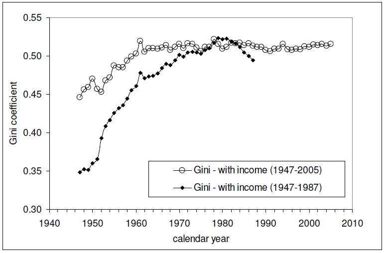
And here is the Gini index measure of the amount of income equality among U.S. individuals for the years from 1947 through 2005 (the data since 2005 is presented here - it's similar to all that recorded since 1960 in the chart below):

The relevant data in the chart above is the Gini measure indicated with the hollow circles, which is based on the "fine", or more detailed, income bins reported by the U.S. Census in its annual Current Population Survey. The other data in the chart, indicated by solid diamonds, represents income distribution data reported by the U.S. Census in larger, or more "coarse" income bins, which are less detailed and are therefore a much less accurate measure of the nation's level of income inequality in any given year.

Intersections and Connections

Looking at where all the data in these three charts intersect and overlap, What we find is that since 1960, the level of income inequality for U.S. individuals as measured by the "fine" Gini index is nearly constant, but has increased significantly for U.S. households. What has changed over that time is the composition of U.S. households, with a steady increase in the percentage of single person households.

Without a corresponding increase in the measured income inequality for U.S. individuals, the increase in the measured income inequality for U.S. households has been almost entirely driven by the increase in the number of single person households over time.

So income inequality among U.S. households isn't increasing because the rich are getting richer. That means that policies intended to right this situation by going after the rich in the name of "fairness" are guaranteed to fail, because the real cause of the increase in income inequality among U.S. households over time is something that cannot be fixed by such actions.

If only the people pushing such policies could see that....

And that concludes our eighth anniversary post. Thank you for joining us today - we greatly appreciate your choice to spend so much time with us (we really do try to draft shorter posts!)

Celebrating Political Calculations' Anniversary

Our anniversary posts typically represent the biggest ideas and celebration of the original work we develop here each year. Here are our landmark posts from previous years:

  • A Year's Worth of Tools (2005) - we celebrated our first anniversary by listing all the tools we created in our first year. There were just 48 back then. Today, there are nearly 300....

  • The S&P 500 At Your Fingertips (2006) - the most popular tool we've ever created, allowing users to calculate the rate of return for investments in the S&P 500, both with and without the effects of inflation, and with and without the reinvestment of dividends, between any two months since January 1871.

  • The Sun, In the Center (2007) - we identify the primary driver of stock prices and describe a whole new way to visualize where they're going (especially in periods of order!)

  • Acceleration, Amplification and Shifting Time (2008) - we apply elements of chaos theory to describe and predict how stock prices will change, even in periods of disorder.

  • The Trigger Point for Taxes (2009) - we work out both when, and by how much, U.S. politicians are likely to change the top U.S. income tax rate. Sadly, events in recent years have proven us right.

  • The Zero Deficit Line (2010) - a whole new way to find out how much federal government spending Americans can really afford and how much Americans cannot really afford!

  • Can Increasing the Minimum Wage Boost GDP? (2011) - using data for teens and young adults spanning 1994 and 2010, not only do we demonstrate that increasing the minimum wage fails to increase GDP, we demonstrate that it reduces employment and increases income inequality as well!

  • The Discovery of the Unseen (2012) - we go where so-called experts on income inequality fear to tread and reveal that U.S. household income inequality has increased over time mostly because more Americans live alone!

References

Kitov, Ivan. "Modeling the evolution of Gini coefficient for personal incomes in the USA between 1947 and 2005," MPRA Paper 2798, University Library of Munich, Germany. 2007.

Lopez, J Humberto and Servén, Luis. "A Normal Relationship? Poverty, Growth and Inequality". World Bank Policy Research Working Paper 3814, 2006.

Pinkovskiy, Maxim and Sala-i-Martin, Xavier. "Parametric Estimations of the World Distribution of Income". NBER Working Paper No. 15433. October 2009.

Political Calculations. The Distribution of Income for 2010: Households. 14 September 2011.

U.S. Census Bureau. Changing American Households. [PDF document]. C-SPAN. 4 November 2011. p. 6.

U.S. Census Bureau. Table P-2. Race and Hispanic Origin of People by Median Income and Sex: 1947 to 2010. [Excel spreadsheet]. September 2011.

U.S. Census Bureau. Table P-4. Race and Hispanic Origin of People (Both Sexes Combined) by Median and Mean Income: 1947 to 2010. [Excel spreadsheet]. September 2011.

U.S. Census Bureau. Table P-53. Wage or Salary Workers (All) by Median Wage and Salary Income and Sex: 1947 to 2010. [Excel spreadsheet]. September 2011.

Wendt, Phil. Income Disparity by the Numbers. Phil Wendt's Studio. 26 December 2011.